Park / Apu
-
 25-February 12
- Views 2,937
- Downloads 722
- Fans 0
- Comments 10
-
 60.00%(required: 65%)
 Design Submission

Kumba 70% Louis! 70% wheres_walto 70% 5dave 65% CedarPoint6 65% prodigy 65% JDP 60% Liampie 60% tyandor 60% K0NG 55% Phatage 55% Roomie 55% SSSammy 55% Wicksteed 45% robbie92 35% 60.00% -
 No fans of this park
-
 Download Park
722
-
 Objects
254
-
 Tags
Tags
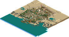
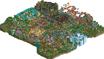
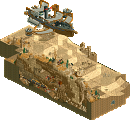
But i think it looks better if you had more bushes on the mountian and other places
And the ice on the top on the mountain doesn't quite fit in with the rollercoaster, maybe a that rock landscape?
And i don't like the name very much but thats just my opinion.
But for the rest it looks really good.
foilage was a let down, well the lack of foilage.
archy was nice. could have been better in places.
overall i think this should have won. i duno what robbie thought. i guess we'll find out soon.
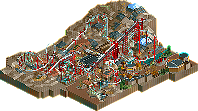
Looking back, my vote was low, but I wouldn't see myself voting any higher than Wicksteed, rendering my vote obsolete no matter the situation. My biggest gripe with this was that it felt nowhere near what I know you can do, and it felt supremely rushed. What probably left the worst taste in my mouth for this when I first saw it was the layout. It's almost a blatant copy of disneylhand's in BGNA up to the MCBR, albeit without the same flow or aesthetics; it's as if you copied it but made it less unique in the process. To add to that, the theme was completely unclear. I know that Apu was a South American god, but other than a few statues, nothing screamed South America or the Incan civilization for me. Also... PEEPS. Please! They'll add so much life to your work, as evidenced in your recent screens, and the lack of them here only contributed to this sense of rushed-ness behind it. On a positive note, your archy and foliage are improving a ton, so good job on that.
Overall, I think part of my low vote for this was more out of me feeling diappointed; I regret giving it that low of a vote, but I couldn't see myself going more than 10% higher. Please don't think this is because I don't like your work or anything, as I'm really really pumped for that Asian design you have coming up.
^
^I see what you did there.
What there is...is average; just average. It's really nothing new.
The lack of foliage is really hurting (Is not Peru almost entirely dense jungle and mountains? The sand and dead grass here doesn't really make sense.), and I agree with highroller in that the space between the reverse Immelmann (dive loop) and the vertical loop is unnecessary and hurts the overall "flow" of the ride.
Wicksteed Offline
Then I really disliked how you cut of the map as close to anything as possible. So many designs released at the moment do this (Phantom for example). Why for God's sake? It completely kills any flow or atmosphere, when you theme you coaster mainly with black space and vertical land. In your case it also makes the map look very unbalanced, you have large spaces of bare land, and then all kinds of buildings cramped into one small corner of the map, looking as if they could fall out into the black at any moment. Am I the only one who thinks this?
Airtime Offline
Love the landscape interaction.
If there layout was a little stronger it would of been a really solid design for me.