Park / Six Flags Colorado

Park_2235 Six Flags Colorado

19 Comments

  • Comment System%s's Photo
  • BelgianGuy%s's Photo
    that was awfully close, will review later
  • SixFlagsTexas1994%s's Photo
    I'm actually shocked that it got that close...Oh well, practicce makes perfect and the last time I will use WW or TT.
  • Fizzix%s's Photo
    Wow. If you improved your foliage a bit, and remove WW and TT, you're next park will win for sure. So close!
  • nin%s's Photo
    No! I wanted this to grab bronze quite badly. With the likes of Six Flags Washington and Pine Hills grabbing silver and gold, I question as to what people consider bronze these days. This was much more enjoyable than both of those in my opinion.

    I guess what I could tell you to is just refine your style a bit more. Possibly advertise your park next time to get some feedback mid-construction. Will help that park, and your parks in the future.

    Overall, I quite liked this. Sure it lacked refinement but it was definitely one of the most 'fun' theme parks released lately. I'm tired of these small-scaled, intentionally-lame parks.
  • posix%s's Photo
    I too felt this should have won and waiting for more votes to come was the reason why it had to sit for so long. In the end it still couldn't quite break the 50% mark. Oh well.

    I hope to see more from you!
  • MorganFan%s's Photo
    I really liked this, but I can sort of see why this didn't make it. The layouts were fine, but sharp turns can be useful too... I can also see that you basically took Six Flags Over Texas, rearranged it, and spat it back out, so be as original as you can.
    I really loved the scenery. You have a great style, just apply it everywhere, and don't get lazy.
  • CoasterCreator9%s's Photo
    Wow, that's crazy close. I'll review in a bit.
  • BC(rct2)%s's Photo
    I really liked your park!
    The layouts look amazing, the atmosphere looks amazing too, but you need
    to get better in the architecture. But your park is great! Congrats!
  • SixFlagsTexas1994%s's Photo

    No! I wanted this to grab bronze quite badly. With the likes of Six Flags Washington and Pine Hills grabbing silver and gold, I question as to what people consider bronze these days. This was much more enjoyable than both of those in my opinion.

    I guess what I could tell you to is just refine your style a bit more. Possibly advertise your park next time to get some feedback mid-construction. Will help that park, and your parks in the future.

    Overall, I quite liked this. Sure it lacked refinement but it was definitely one of the most 'fun' theme parks released lately. I'm tired of these small-scaled, intentionally-lame parks.


    Thanks nin!- My main problem is that an error trapper somehow made it's way into the park and it simply would not let me open the bare park in the editor. I would have though gone back and removed WW and TT, as well as upgrade the arcitecture inside and outside the park. Speaking of which how does an "error" happen? Because now I cannot even open the scenario editor without switching computers!
  • Louis!%s's Photo
    We held this back for so, so, so long to try and get another vote to make it a bronze. But alas, :(

    Seriously Bronze worthy work in here, I plead with everyone to view it.
  • chorkiel%s's Photo
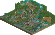
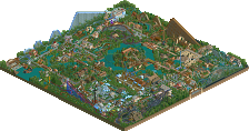
    Can someone perhaps post some pictures. I'm quite curious to what it looks like, zoomed in.
  • SixFlagsTexas1994%s's Photo
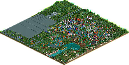
    This is way late but here are some pics for those who cannot view because of my TT selfishness :)

    [attachment=13031:Batman 1.jpg]
    Batman: The Ride

    [attachment=13032:Mr. Freeze.jpg]
    Mr. Freeze

    [attachment=13033:Intimidator Layout.jpg]
    Intimidator

    [attachment=13034:SCR23.jpg]
    Gotham City Plaza

    [attachment=13036:SCR24.jpg]
    Spain Section
  • Ling%s's Photo
    Not bad, but not great. If you ditch the expansions and spent a little more time on just your supports and foliage, I think your work will be much better received - granted, architecture is probably your biggest problem, but that's a much larger and more complex animal to tackle. Foliage and supports are pretty easy to sort out though and don't take tons of time - once you've become good at those, they'll be second nature, and you can focus on buildings.

    Since you've only shown two layouts, and both are essentially recreations, I can't really comment on your ride design skills - but you should start working again immediately. Improvement through practice and all.
  • Goliath123%s's Photo
    If you guys need votes for WW and TT i can help you out. i to thought this park was bronze worth, onya mate
  • BelgianGuy%s's Photo

    No! I wanted this to grab bronze quite badly. With the likes of Six Flags Washington and Pine Hills grabbing silver and gold, I question as to what people consider bronze these days. This was much more enjoyable than both of those in my opinion.


    Amen to that one brother...
  • Austin55%s's Photo
    One of the most fun I've had looking at a park. I know Nin and I share a love for huge SF parks even if there not the greatest quality. I love it.

    Also, I assume your home park is SFOT, mine to, and I'm 18 (94) to.
  • SixFlagsTexas1994%s's Photo
    Thank You, and yes it is my home park...the best in the chain if I can say so myself :p
  • salsaontop%s's Photo
    ^Living in the UAE I can't confirm but I know SFOT is one of the better parks.
    SFT1994 I really enjoyed your park. Its given me a few ideas. (Thanks) You just seemed to have so much space although your park is full of rides. A typical SF park well done. :nod:
  • SixFlagsTexas1994%s's Photo

    Its given me a few ideas. (Thanks)

    :mantis: