Park / Arch Angel
-
 13-August 05
- Views 5,745
- Downloads 2,421
- Fans 3
- Comments 27

-

-
 83.13%(required: none)
 Design

5dave 90% csw 85% Fisch 85% MCI 85% wheres_walto 85% Xeccah 85% Cocoa 80% Liampie 80% Stoksy 80% Poke 75% 83.13% -
3 fans
 Fans of this park
-
 Download Park
2,421
-
 Objects
238
-
 Tags
Tags

![park_3367 [H2H7 R4] The Wild West](https://www.nedesigns.com/uploads/parks/3367/aerialt3772.png)


![park_3324 [H2H7 R1] Circus Circus & Adventuredome Atlantic City](https://www.nedesigns.com/uploads/parks/3324/aerialt2970.png)


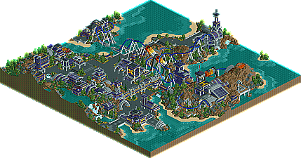
Totally outstanding, without a doubt the best steel twister coaster I have laid my eyes on in rct. Freaking fantastic pacing, elegent layout - smooth and concise. Theming was extraordinary. I never thought a superhero theme could be pulled off so lovely and beautiful. The landscaping, and architecture is untouchable! Loved every bit of it; and congrats Titan.
Architecture, coaster, landscaping, and atmosphere was all incredible.
aside from that, i guess it's commendable that you came up with this whole tunnel concept for making buildings. It's nice, i'll give you that. Aside from that, i thought the building weren't too great. They all seemed to grasp at the same high tech diner concept after a while. I'm agreeing with Kumba here, it got repetitive (I also agree on his favorite part, the corkscrew... definitely mine as well). I'm not saying you should have put less buildings, i'm saying some of them could've had more to them.
To the phenonemal part, the landscaping. I love you for that. Great landscaping all over the place. I love the waterfall, it looks perfect. I want to make one just like it! and those 1/4th tile blocks, used perfectly. Very impressive.
And the whole thing does come together, definitely making this one really nice design, congrats. I'll see you in the pro tour, i guess.
I'm not happy at all that it took this long. Having basicly zero RCT inspiration was alot harder than I thought it would be. Unfortunately, I couldn't even find non-RCT inspiration. And that's what made it even harder. After the first few buildings, I really got lost. I rebuilt about everything and am still only happy with a select few of the buildings.
As for the layout, I thought I would throw in some new stuff. I guess Hydra inspired me too much. I really like the layout myself, far from perfect as I made many mistakes, but still probrably my favorite one I've made to date.
Thanks for all the comments. And thanks to Iris for posting it.
Great job, Titan.