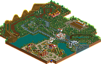
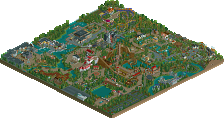
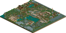
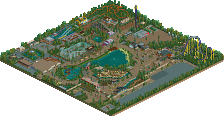
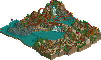
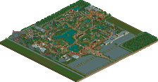
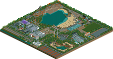
Thanks for posting my park, this was a park i've made on RCT guide for a contest
I just like to have some professional comments on my building style so i can improve my buildings,rides etc.
Looks nice, but overall too much coaster, Less flatrides.
Try to find a balance between thoose two.
also try to put more attention in layouts. never seen a floorless B&M with too much straight pieces and only one element of inversions. I sure like the wooden coaster and nothing is wrong with that.
Landscaping is done well and foliage also.
But, Try to get a little more tention to your architecture and buildings.
Just a tip for next time.
Looks nice, but overall too much coaster, Less flatrides. Try to find a balance between thoose two. also try to put more attention in layouts. never seen a floorless B&M with too much straight pieces and only one element of inversions. I sure like the wooden coaster and nothing is wrong with that.
Landscaping is done well and foliage also. But, Try to get a little more tention to your architecture and buildings. Just a tip for next time.
The main problem here is the lack of substance. Sure, you have a few coasters ( that are mediocre ) that are in the park, but there is nothing interesting in every part of the park, as it should be ( anything can go here, but leaving it as flat land is a bad idea), this'll get more positive towards the end.
The layout is the second worst problem, you have a main way ( which is good ), but you branch off without any connections. The island just seperates this more.
Your architecture in some places is VERY good, while in others its bad. The entrance is pretty fucking amazing, but everything lacks in comparison.
The coasters are meh. You should make the woodie more interesting and give the dual coasters a more intersting color scheme.
Landscaping is both good and bad. Your foliage is pretty good ( you can make it better by adding more shubbery ) but the land for the most part is flat. Bad.
Overall, this is good for a first park. As you said, you're a newbie and this stuff will generally get better through experience.
Since the ride ratio has been mentioned several times, I'll just say there are too many colors, not enough details, and not enough textures. So focus on that.
13 Comments
Comment System Offline
Baros Offline
I just like to have some professional comments on my building style so i can improve my buildings,rides etc.
Dont be 2 hard i'm noob
Flap Offline
Try to find a balance between thoose two.
also try to put more attention in layouts. never seen a floorless B&M with too much straight pieces and only one element of inversions. I sure like the wooden coaster and nothing is wrong with that.
Landscaping is done well and foliage also.
But, Try to get a little more tention to your architecture and buildings.
Just a tip for next time.
Baros Offline
Sorry for late comment , thanks for the tips
BC(rct2) Offline
Xeccah Offline
The layout is the second worst problem, you have a main way ( which is good ), but you branch off without any connections. The island just seperates this more.
Your architecture in some places is VERY good, while in others its bad. The entrance is pretty fucking amazing, but everything lacks in comparison.
The coasters are meh. You should make the woodie more interesting and give the dual coasters a more intersting color scheme.
Landscaping is both good and bad. Your foliage is pretty good ( you can make it better by adding more shubbery ) but the land for the most part is flat. Bad.
Overall, this is good for a first park. As you said, you're a newbie and this stuff will generally get better through experience.
Ling Offline
Ruben Offline
Baros Offline
Baros on RCT Guide , liampie and Levis , I think they stil know who I am
Liampie Offline
Ruben Offline
Well, cool stuff man. I'm a newbie compared to you then. In that case I'd love to see some more recent stuff!
Baros Offline
Baros Offline
RCTER2 Offline