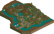
Park / american adventure
-
 12-January 12
- Views 1,854
- Downloads 662
- Fans 0
- Comments 10
 10 Comments
-

 Comment System
Offline
-
 -Piggynator-
Offline
why didn't you finish it
 -

 robbie92
Offline
It's really depressing to see this go unfinished like this. Your original take on that CCI layout is better than any of the NEDC entries, and everything seemed to shape out beautifully. I only hope you'll give us another finished release, even if its another design only. It's clear how far out of everyone else's league you are, it's not even funny.
 -

 K0NG
Offline
Yeah, dude...some seriously brilliant shit on that map. I would have so liked to see this complete.
 -

 RRP
Offline
lack of time is why i didnt finish it
 -

 BelgianGuy
Offline
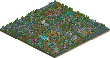
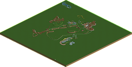
the map size is your problem I think, you have a 256x256 map, try to build something smaller on a 70x70, its unreal to fill a map this big with the level of detail you put in...
 -

 RRP
Offline
I was going to black tile out all around the edge.I chose the big map so i could experiment around the outside area without using the final park size area
-

 K0NG
Offline
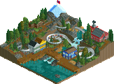
Thought I'd add that the queue for Grave Digger might be the best queue I've ever seen. Absolutely flawless.
 -

 RRP
Offline
cheers kong
 -

 highroll3r
Offline
hey rrp how come youve submitted all of your projects? what are you currently working on?
 -

 robbie92
Offline
I agree with K0NG. That queue was flawless; spot-on atmosphere, excellent integration of theming, and innovative with your use of land for the queue pattern. I'm still not over this park...
-
 No fans of this park
-
 Download Park
662
-
 Objects
233
-
 Tags
Tags
