Park / Thrill Point: Worlds of Adventure
-
 12-January 12
- Views 15,335
- Downloads 1,713
- Fans 4
- Comments 17
-

-
 71.15%(required: 70%)
 Gold
Gold

5dave 80% Dimi 80% robbie92 80% tyandor 80% wheres_walto 80% Maverix 75% CedarPoint6 70% K0NG 70% Liampie 70% prodigy 70% Phatage 65% Wicksteed 65% JDP 60% Levis 60% Loopy 60% 71.15% -
4 fans
 Fans of this park
-
 Full-Size Map
-
 Download Park
1,713
-
 Objects
483
-
 Tags
Tags
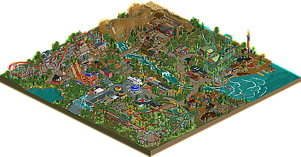
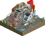
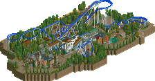
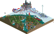
![park_2390 [H2H6] R2 - The Replacements - Tivoli Gardens](https://www.nedesigns.com/uploads/parks/2390/aerialt2133.png)
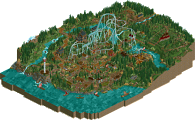
a.)Why are there staff wandering around in the area beyond Gunpowder?
b.)The patrol areas were incomplete; nearly all of the rides-excluding the roller coasters-were broken down almost constantly due to inefficient mechanic coverage.
c.)It seems like the staff could have been cleaned up a little more before the park was released...but maybe that's just me.
Other than that, I enjoyed this. Out of all the areas, I'd have to pick oriental just from the quality of its theming. The Shinto shrines that the coaster went through were a nice touch, and the pagoda roofs were well done. I do think that the coaster's line could have used a little more glitz and glamor in that exposed area.
And of course, the log flume. Seems to be your signature ride
From the overview this is very nice. I'm a fan of your work to be quite honest. We should work on something together very soon!
Should have scored a little better IMO. I wasn't a fan of the mainstreet, it looked sterile compared to the other areas. The path-ride ratio was a little tight, I have the same problem in my parks as well. Maybe next time you could broaden the paths 1-2 tiles to get a more realistic park feel. The themes were nicely executed. No out-of-the box themes but still very nice. I thought the coasters were nice too. Good to see unusual rides like the Maurer Söhne.
The pirate area in the back had a strange bottleneck and sticks too much to the map edge, didn't like that much. The big oak tree was slightly overused in my opinion. I'd use more vanilla RCT-trees and the oak tree just in a few prominent occasions.
Ride interaction is your strong point. How the rides interact with landscape, queue and other rides is awesome. Love that!
My advice for next park: Bigger, wider paths and work a little on the archy and you have yourself a spotlight!
Keep it up!
"MFG"
I stand by what I said.
All in all a great park though. My favorite area was easily the wild west area, especially around the bridge and the woodies drop. Gratz on gold
Plus, an Edith.
I'll give my comments on the park when I have time.
honestly I was just blown away by the quality of this park. kudos to you, you really exceeded my expectations of you as a parkmaker. most of this park was excellently crafted with beautiful architecture, layouts, interaction, etc etc. frankly, I'm quite jealous
I could maybe say that the medievel area seemed a bit rushed and awkward or get nitpicky about some things, but I honestly don't want to as this is an amazing park and I just want to focus on the the great bits. congratulations, I see a bright future for you.
I just saw the last PM you had sent me the other day, and I hadn't responded and I felt like a douche bag for ignoring you. But then I've pretty much ignored the whole site the past few months. If you don't have a spotlight under your belt in the next 2 years or so I will be surprised. You certainly have the ability and vision. I know your upset about me forgetting about this and the situation with K0NG, but I really hope is doesn't distract you from your game cause its awesome.