Park / Dragonslayer
-
 15-November 05
- Views 12,227
- Downloads 706
- Fans 0
- Comments 32
-

-
 70.00%(required: none)
 Design

csw 75% Liampie 75% ][ntamin22 75% 5dave 70% Cocoa 70% inthemanual 70% MCI 70% alex 65% G Force 65% nin 60% 70.00% -
 No fans of this park
-
 Full-Size Map
-
 Download Park
706
-
 Tags
Tags


Corkscrewed Offline
NE is proud to present two new designs after a freakin' long layoff due to a combined lack of time, lack of submitted content, and lack of... well, caring (on Iris' park
Some of you may have heard that Iris wanted to organize an IAAPA 2, a collection of Designs by different parkmakers as an exhibit of cool RCT work.
Well, like most collabos, that fell apart, but we did get some nice work that was too skilled to be simply released on the forums... so we made them Designs!
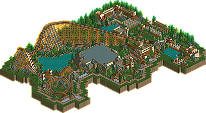
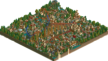
The first two are a LL creation and a RCT 2 creation linked by the common allusion to furious beasts. Kumba's Genus: Carcharodon references the Great White Shark while posix's Dragonslayerreferences, well, killing fire lizards.
Both are great pieces of work and well worth a look, so congrats, fellas! Hope to see stuff for the Pro Tour 2 as well!
Kumba, this didn't really grab me, but I can see what you were going for, and I think you achieved that. It
certainly is interesting to watch, with all the little things swimming around.
albert, you know, i like you, i really do. you've done a lot of good things to this site and you have a nice character...
but, why would you keep removing my carefully worded welcome messages to my projects ?! i just don't get it ...
i love your description of the coaster though. you have perfectly understood the "background story" to the coaster which makes me happy. i was worried it wouldn't come across properly.
the indoor part is meant as a cave by the way
did you also do the logo? i love it. the best logo one of my projects has ever got. great work.
also good job on releasing so soon after i sent it.
Posix that is one hell of a wooden coaster, great layout and a very nice atmosphere.
I hope you guys enjoy my Design, most of it came right out of my Oceanography text book and I had a great time making it. Also like Cork said, check out the underwater stuff, its full of sealife, small celled floating things and a few hydrothermal vents. IMO its my best coaster layout ever, just a bit to slow at the VERY end, oh and the station sucks, so does all the archy except by the see-tank
I'll comment futher tonight when I get home and download them...
wonderful looking designs, you two, i'm about to go look at them now.
Corkscrewed Offline
Wait, there was a welcome message???
Crap, musta been too damn late last night. Um, lemme fix that.
Or, next time, to prevent this, just .zip the file yourself!
Kumba, my one glaring comment about your coaster layout is that you fell into that trap of poor "half allotment." You've got this wonderful first half, then you hit the brakes, and then the second "half" is like a third as long. Very awkward IMO, because it makes the MCBR almost completely unnecessary. Just a note.
And you sure you didn't mean "sea tank?"
Posix's was nice too, with work like that its easy to see why your the master of creating the perfect atmosphere! I thought the layout was perfect in every way, the helix was brilliant- the transfer track idea was well thought out too.
-X-
thanks x250.
looking back at it now though, i noticed i threw the transfer device in. the track has no mid- or final brake before the transfer device which makes it rather unrealistic.
i will work on that next time.
Corkscrewed Offline
Also, NE Fun Fact: the subtitle in the Dragonslayer logo is simply what I got from Alta Vista's Babelfish when I typed in "SLAY THE BEAST" and had it translate to Greek. Even though the theme itself is probably not even the most remotely related to Greece... but they didn't have Latin, so whatever.
Corkscrewed Offline
X was commenting on your last two banked turns before end brakes, where it goes under 20.
RMM Offline
I looked at posix's. And it was pretty nice. Great landscaping, great station, the line was nice too. It just looked so nice together. I also really liked the black pathing to get rid of the extra map to make it blend more.
But can I ask where the red tile is? The lava? I can't find it.
Nice ideas tho.
Edited by RMM, 15 November 2005 - 05:10 PM.
i first had the map set to use lava instead of water to better create the idea. but then i noticed i couldn't go without little lakes, changed back to water and the lava to red grid.
that's also the reason why the lake enclosed by track and cave is so choppy. i did the landscaping first because i thought i'd just leave the middle a meadow ...
Dragonslayer was completely awesome. Just what I wanted from a design. Simple, yet charming and beautiful. The coaster layout was splendid. I want more from you posix!! You better finish your pt2 entry.