Park / The Black Mask
-
 24-December 11
- Views 9,943
- Downloads 771
- Fans 0
- Comments 13
-
-
 67.31%(required: 65%)
 Design

BelgianGuy 80% SSSammy 80% Louis! 75% robbie92 75% wheres_walto 75% Wicksteed 75% Liampie 70% nin 70% turbin3 70% prodigy 65% Maverix 60% tyandor 60% K0NG 55% 5dave 45% JDP 40% 67.31% -
 No fans of this park
-
 Full-Size Map
-
 Download Park
771
-
 Objects
176
-
 Tags
Tags
![park_2080 [NEDC] City by the sea - #5/9](https://www.nedesigns.com/uploads/parks/2080/aerialt1879.png)
This was great and I really enjoyed it. Now finish Six Flags Extreme Holland!
Felipe// Offline
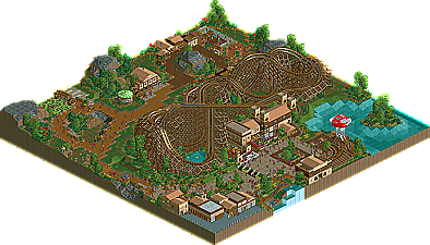
I've loved most of the design, but I regret how messy were the land types you have used in the water. Although, the supporting work was fantastically well done and the details in each building...
Congratz!
-JDP
Wicksteed Offline
Airtime Offline
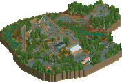
The foliage looked amazing! The landscape was lovely as well as the few surrounding rides.
The artitecture looked real good. The station was lovely and the row of shops in the bottom near the water fall looked aweomse.
However I'm assuming the coaster was supposed to be GCI? Whilst the layout wasn't bad, the ending wasn't too good, but it didn't seem very convincing to be honest. Maybe you wasn't going for something true GCI, I dunno, but maybe that's why teh socre wasn't as good as it should have been?
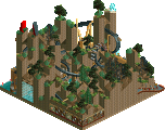
The other thing that was a little off was the mushroom? It looks way to forced and unnatural compared to everything else in the design. The colours also sticked out. Although it was very creative, it just didn't fit.
Amazing stuff! I really enjoyed this. Looking forward to some more NCSO greatness from you!
As usual the NE Folk get the link to the video a bit earlier. I´ll make the video "puplic" at 6pm UK-time tomorrow.