Park / Solaris
-
 18-November 05
- Views 8,686
- Downloads 2,014
- Fans 2
- Comments 16
-

-
 74.38%(required: none)
 Design

Austin55 85% posix 85% Xeccah 80% 5dave 75% alex 75% Liampie 75% MCI 70% ][ntamin22 70% inthemanual 65% Cocoa 50% 74.38% -
2 fans
 Fans of this park
-
 Full-Size Map
-
 Download Park
2,014
-
 Objects
138
-
 Tags
Tags
Corkscrewed Offline
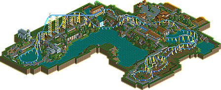
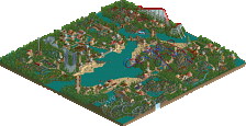
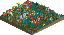
Our little IAAPA journey continues with another pair of similar designs. This time, the common theme is beauty in simplicity. Both slob's Solaris and Turtle's Merlinwood Express have elegantly composed exciting thrill coasters in a setting of beautiful serenity. You don't always have to jam 58 scenery pieces onto one building. Indeed, these entries show off what great results you can get if you build almost negatively... carving out spaces rather than cramming objects in.
And if these are the last works from Jem and Matt, well, they're certainly great ways to go out in style. So congratulations, you two!
Commence drooling.
Corkscrewed Offline
Also, Adix, I honestly liked the original skin of the front page news posts better. It was simple but very nicely in contrast to the rest of the site. Plus it's easier to read the titles on flat gray than on a gradient that fades to black.
and i'm out...
I suppose what gets me is that the description paragraph seemingly tries to squeeze every last drop of juice out of the design in order to justify its being here. Mainly the point that it is a good example of the rationale behind minimalistic building, and that the general lack of quantity and the rushed-looking spots in places are justified because it somehow proves that minimalism is cool. Whereas, allow me, the use of plain grass in Dioxide, which is a ten times better example of minimalism that works, is ignored.
Oh well. I don't mean to offend Turtle with any of this. I have immense admiration for the guy and I just view this as a bit of a lapse in quality. As indeed he might, as you theorized.
Edited by Panic, 18 November 2005 - 09:26 PM.
-Parkmaker-
Solaris - The coaster colors were worse then anything I could ever dream up, the layout was great in parts, bad in others, a pretty choppy design, not as good as your H2H3 work. The best part imo was the Q line, amazing line, I loved that.
Really nice work guys, that was our map too, now Genus:Carcharodon, Solaris, and Merlinwood are all designs, nice that we came the nearest to finishing
This was a project and this is how they're released, there's no passing with flying colors involved whatsoever.
Anyways, i didn't like turtle's diagonal bit on the coaster, the rest was ok. The flowers seemed a bit off but it's all good..
Slob, yours was beautiful. The coaster flowed, the theming was spot on with the coaster! One of the more memorable times i watched a coaster go through its circuit. Lovely throughout!
Candidate for best NE design i think, whilst there was no obvious theme, the coaster layout was fantastic. Everything about it was ultra-realistic, the storage units, maintenance paths, all of it- just awesome. The thing i liked most about this apart from the layout, was the coaster colours. Those shades of blue and yellow really compliment each other- you seem to have a nack for colour schemes, and perfection. I am beginning to see why Posix thinks so highly of you now- its because of the thought you put into your work- everything has a purpose for being there. Congrats, sad to see you go.
Merlinwood
4 hours? Nice work lol. It was very pleasant, the pacing and overall layout was sculpted very well, you can imagine this being a popular coaster to ride if it were real, the little bunny hops towards the end, swooping around the lake and of course, the ferocious drops at the start- the coaster had everything that makes a wooden coaster good. It would be nice if it were a bit more finished, however.
-X-
i mean honestly, slob (metalface) was easily the best rct player of the modern age.
i had wanted at least one solo from him before he left
really, i'm sad.
but solaris' pacing had it's problems you know
jem, what a fantastic coaster layout. i'm a huge fan of it.
the style and park design though, compared to solaris, was rather wannabe.
Kumba, i thought you blacked out?
I personally believe that what I made was good for four hours. I personally don't believe it should have been made a design, indeed, I voiced this to Cork, but the response I got was this was how they were going to do this. I think the layout is one of my best ever, and I really hope that I can return to RCT someday and continue playing. Probably not, though.
The one comment I will address is Phatage's, because I think he has hit the nail on the head. When it becomes "work", something has gone wrong.
Solaris- Suprising I didn't like the coaster as much as I expected and I loved the theming a lot more than I thought I would. The coaster simply wasn't fast enough towards the end of be a convincing Intamin Mega coaster since all of those haul major ass into the brakes. Another 15-20 feet in the lift would've done it. Add 10 feet to some of the major hills towards the beginning to keep it in scale and BAM! There it is. But no... That would be a speed crazy like me who'd do that.
Merlinwood Express- Of course I'm going to say that the layout was a bit slow towards the end, but I say this for good reason, all (great) coasters really seem to fly right at the end, where even though much speed is lost the tightness of the elements makes up for it, I didn't see that here (of course it's hard with only a few turn sizes). Very nice layout and custom support job, really made the ride count. The station and Q area showed the frantic pace though, since they seem thrown it because their nessisary, rather than because of "love".
Good luck to both of you in whatever the future holds.
ride6