Park / Adelaar
-
 25-December 11
- Views 13,095
- Downloads 918
- Fans 4
- Comments 15
-

-
 76.92%(required: 65%)
 Design

posix 95% Kumba 90% SSSammy 90% geewhzz 85% Liampie 85% Maverix 80% Milo 80% robbie92 80% Wicksteed 80% nin 75% Loopy 70% RMM 70% BelgianGuy 65% Airtime 50% Louis! 45% 76.92% -
4 fans
 Fans of this park
-
 Full-Size Map
-
 Download Park
918
-
 Tags
Tags
![park_2420 [H2H6] R4 - Reservoir Dogs - Atlantis Resort](https://www.nedesigns.com/uploads/parks/2420/aerialt2160.png)
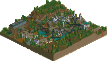

Wicksteed Offline
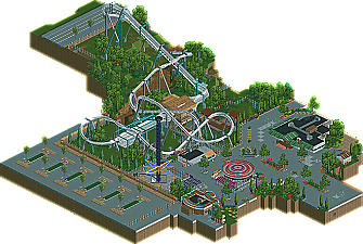
I thought this was absolutely brilliant. Pierrot, you've found dozens of clever new ways of combining the objects available in LL to create amazing effects that no one has ever done. The supports, the top of the drop tower, the dolphin statue, the bag lockers or the ground lines are just some of the examples that really really impressed me. Thank you for this submission.
Wicksteed Offline
I agree that the release should count, but when I look at a released park I can not disconnect it from what I saw on the forum before that. The things I saw on the forum before were jawdropping indeed and built up great expectations, but I didn't get that feeling again when I saw them the second time, because I had already seen them and because this seemed to be almost exclusively about these technical innovations. So in this case the way the design was advertised was not beneficial to how I perceived the release.
Now I sound way to negative. I still found this great. So keep it up - I'm looking forward to further innovations in this game!
Congrats Pierrot, I really love what you did here
Airtime Offline
Overall, the ideas were there but there wasn't any focus on atmoshpere and aesthetics, just pure ideas, which is why for me, I didn't enjoy the overall picture.
You may be thinking why on earth I voted so low, but I can say the same thing, why on earth did people vote so high?
But it's all a matter of opinion, and this is mine.
There were some nice features though, it just didn't fully come together for me.
(Oh and I really like the logo
Airtime Offline
The layout wasn't amazing at all. It was below average and below design score and with that the whole design gets brought down. It was too short for how big it is, if it had been a bit longer I think it would have helped a great deal. The pacing was pretty awful if I'm honest, it flew round there. The sloped turns were in awful places and looked awful as well, for example before the pretzel loop and before the zero-g. Also because everything else is ultrarealistic I was expecting to see 2 trains and 8 cars per train and not launched out of the station
The new supporting system didn't pay off in my eyes either I think sticking with just the one type of support used such as B&M twister/invert track would have worked wonders. The supports in one or two areas went into the track badly and were totally on the wrong side for example the turn after the pretzel loop. The supports on the transfer as well didn't touch each other which looked messy.
The station wasn't too bad for architecture. I was really pleased to see you fixed the brown and white building with the teal. I really liked this. The burger resturant was quite nice. Maybe a bit over hacked but it worked and looked nice. The two buildings by the coaster exit weren't too good I'm afraid, a bit flat and boxy. The toliet building was ncie but I feel like I've seen it before...
The swinger that was broken down, I wasn't a fan of one bit. Sorry but what was that supposed to be? The roof looked a bit messy and too much. The generate was also too much and reality unless it was a fair ground wouldn't be there but rather in a back stage area with large generates for the whole park. Same with the star flyer? The star flyer itself was brillaint executed. Maybe could of done with a foot path underneath instead of just the land texture.
The foliage wasn't too bad actually and I really enjoyed bits of it, quite shocked to be honest. However I think more sparodic bushs could have been placed on the grass making things a little less open and a little more dense. Land textures under and around the foliage clusters such as mud and muddy grass would have helped a lot. But that foliage in general especially around the coasters lift was some of the best I've seen for a long time!
The foliage and general things such as planters and fences around the plaza were awesome as well!
The car park, road and the coasters queue line roofing were real nice!
Don't get me wrong I liked it but IMO it wasn't design worthy, sorry. The best things about it was the foliage, car park and road. Which I adored but that wasn't enough, sorry.
Congrats non the less though! Some amazing technical creations and new ways of doing things in here that's not been done before but that didn't make the design.
Next time maybe take a step back from the little details, hacks and realism and look at the bigger picture like the aesthetics. Maybe sacrifice some of the realism and things will look a lot better and also come togehter nicer. I think you'll create some truely phenomenal stuff.
Congrats though
(I feel like Kong with the long post I made you