Park / Canyoneer
-
 28-November 11
- Views 14,610
- Downloads 1,196
- Fans 12
- Comments 30
-

-
 73.08%(required: 65%)
 Design

robbie92 90% BelgianGuy 85% Liampie 85% 5dave 80% Dimi 75% That Guy 75% CedarPoint6 70% JDP 70% SSSammy 70% tyandor 70% wheres_walto 70% Wicksteed 70% Airtime 65% Maverix 65% turbin3 60% 73.08% -
12 fans
 Fans of this park
-
 Full-Size Map
-
 Download Park
1,196
-
 Objects
254
-
 Tags
Tags
![park_2810 [PT4 R1] Los Sueños Gardens](https://www.nedesigns.com/uploads/parks/2810/aerialt2474.png)
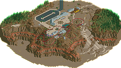
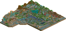
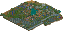
I thought the coaster was solid. The pacing kept up a little too much for it to be that long imo though. I think it would have been cool to make some Great Bear-esque supports for the final helix so that footings wouldn't have to exist over the red dirt land rock layer, implying that there is some sort of construction limitations in this National-Park-type-area. Either that or I would've just said "to hell with it" but as a double entendre; have the final helix of the coaster surprise riders by going all the way down to the canyon floor before heading back up to the station. Right now you have Hydra when I would prefer Hercules.
For the terraforming, the size of the map lets you get away without using quartertiles to refine the landscape. I still would've liked to have seen a mixture of quartertiles used with monorail track to create those rich colors that canyons are known for as well as give it a more organic look. Actually you know what, I still do want to see this done like that, it's great as it is now but if you still have inspiration to work on this (it seems like you've already "used" a lot of it up to begin with) I would love to see what modern RCT2 terraforming methods could make this into.
If I had to quantify my feelings on this, I would say 80%. Great job!
Hope to see more front page hits on both websites! ;D
@Phatage, thanks for the detailed feedback! I actually tried experimenting with different landscaping methods to try to get the appearance of different coloured rock strata, but the colour palette in rct was just too vibrant and it ended up looking ridiculous with bright orange and pink layers. It would be amazing if someone made some new land blocks with different coloured edges that are more natural-coloured, or at least more subtle.
@Liampe, I'll send you the file across when I get a minute and you can have a look.
I'm sorry I just don't understand. I mean it's nice...but best in a while? fantastic design? I guess we just have COMPLETELY different views.
I need to get RCT2 reinstalled; as if that wasn't already true that landscape looks truly incredible. The little platforms along the trails, the colors, and the way the foliage is arranged reminds me more of Bryce Canyon than the Grand, but either way it's beautiful.
Ride6
disneylhand Offline
-disneylhand