Park / Kraken
-
 10-November 11
- Views 2,612
- Downloads 766
- Fans 1
- Comments 8
-
 53.08%(required: 65%)
 Design Submission

Kumba 80% CedarPoint6 70% 5dave 65% turbin3 60% wheres_walto 60% Liampie 55% Maverix 55% robbie92 55% SSSammy 55% That Guy 50% Wicksteed 50% JDP 40% prodigy 40% K0NG 35% Levis 30% 53.08% -
1 fan
 Fans of this park
-
 Download Park
766
-
 Objects
268
-
 Tags
Tags
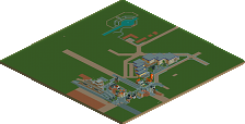
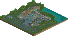
The fucked thing is...this could have been a very good design...maybe even deserving of the 80 that Kumba gave this (which, BTW, was the same score he gave Vulture...dude, don't ever complain about anyone else's scoring like...forever) had he just thought everything through just a little bit. I just can't believe that you could watch this as you're calling it "finished" and think that it's all good.
Uhhh.....WHAT?????
Maybe I'll try a rec of this...I've already got the sign for it
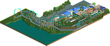
The problem with this coaster is that there's a lot of subtleties with the layout that make it difficult to replicate in RCT-- the lift crosses the brake run, the corkscrew is much larger than can be done in RCT and it's spread out and angled in such a way that there really isn't a good way to represent that correctly in RCT... or at least aesthetically. Then if you look at the supports, a lot of them are very awkward due to the service road underneath. Even still, the service road gets awfully narrow in some places.
To me, this design attempt came close in some regards, but missed on others. First, let me know that I'm looking at this purely from a realistic recreation standpoint. The coaster is probably the most important part of a recreation and for the reasons outlined above, I think you gave it a good shot at trying to include all the parts of the layout in their general relation to each other, but unfortunately the in between is just too far stretched to really get something that looks good on the whole. To the theming, this part was actually not that bad. You can tell you looked at google earth and a lot of pictures. The back areas were relatively decent in terms of egress stairs and stuff- though you forgot a couple of doors on there. The cave out front is pretty rough, but I can see what you were going for with it. The queue buildings from the entrance/locker area up through the photo building to the station is pretty decent though a little plain. Overall, that section is layed out the best and probably contributed to my score the most. While pretty rough all around it was nice to see a recreation attempted as those are tough.