Park / Cape Congo
-
 25-March 06
- Views 8,468
- Downloads 2,051
- Fans 0
- Comments 29
-

-
 71.88%(required: none)
 Design

Cocoa 80% alex 75% MCI 75% Poke 75% csw 70% inthemanual 70% Liampie 70% posix 70% Sulakke 70% 5dave 60% 71.88% -
 No fans of this park
-
 Download Park
2,051
-
 Objects
211
-
 Tags
Tags
![park_6122 [NEDC6] Farewell, For Worse Until Someday - 2025](https://www.nedesigns.com/uploads/parks/6122/aerialt6377.png)
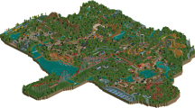
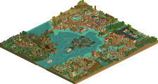
The coaster layout was great; and I really liked it. The atmoshpere was so/so for me, but was pleasant nonetheless. The only thing that annoyed me, was the music. I think all the rides were playing the same song and when I would look around the park, it sounded as if the music was skipping.
Congrats on the win!
I'm picking the shit out of this because you have massive potential, and I want to see more from you.
You all will definatly see more from me though.
Thanks for the comments.
Edited by J K, 27 March 2006 - 10:01 AM.
Great work man, you should be fantastic here.
Also, the logo is awesome, so if you made that cork good fucking job my man.
Corkscrewed Offline
It was pretty nice, nothing too out of the ordinary and not really memorable but nice enough. Good color selection, what was there of archy was great. I wish there was some more though by the first half of the ride (loop and immelman have no buildings in site, that was a negative). However, the ending was really cool IMO with the corkscrews over the flume. Great placement on those, I'm a sucker for ride interactions w/ coasters. The last turn was kind of a "squeeze" if you will and kind of hurt the smoothness that you had going through the rest of the layout. I donno what you could've done with that space though. Oh, and the brake run was really nice too, btw.
Hope to see some more work from you man, you're definitely very talented.
Nice design. Nothing mind-blowing, but definitely nice. The coaster had some nice elements in the usual places. The thing I liked the most about this though was how complete it was, with all the supporting rides an such; Very nice. Wish I had more to say, but I don't because I found it very conservative on almost all levels of parkmaking. Eitherway, congrats on your NE debut JK.
oh, corky - LOL @ "the non-epileptic one"