Park / Cape Congo
-
 25-March 06
- Views 7,966
- Downloads 1,947
- Fans 0
- Comments 29
-

-
 71.88%(required: none)
 Design

Cocoa 80% alex 75% MCI 75% Poke 75% csw 70% inthemanual 70% Liampie 70% posix 70% Sulakke 70% 5dave 60% 71.88% -
 No fans of this park
-
 Download Park
1,947
-
 Objects
211
-
 Tags
Tags
![park_2614 [NEDC2 #1] Winter is Coming](https://www.nedesigns.com/uploads/parks/2614/aerialt2316.png)
Corkscrewed Offline
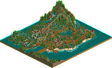
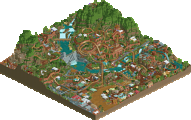
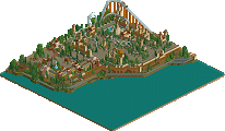
Well, with the Pro Tour over (although more comments are always appreciated), I guess it's time to get back to the regular routine of the site. Our first non-PT2 update in over a month features an up-and-coming parkmaker who seems to have some nice enthusiasm for the game. JK presents Cape Congo, a B&M looping machine set in a Edenesque locale. Although Congo is more associated with dense jungle then tropical paradise, the design itself is pretty nice and shows a good mastery of solid theming, coaster making, and architecture. Sure, there's nothing groundbreaking, but not everything has to be super original. I really liked this for its tranquil atmosphere and different twist on the B&M looper models that we usually get.
So congrats to JK, and hopefully, we can see even better work in the future!
It was just beautyful with its surroundings and all.
The layout of the coaster is great i think, even if it's a little short though...
egg
Edited by egg_head, 25 March 2006 - 04:50 AM.
egg: ...
nice to see a new design.
i thought the architecture around the big wheel was really impressive.
you should have heard of him
not only the well known parkmaker can create a design, posix, there still are underdogs you did not tought
How much you have improved over the past few months is staggering, and this is a major step up from your last piece of work. The coasters layout was perfect, i loved how it interacted with the pond in the middle, and the lettering for the station was fantastic. I also enjoyed the big wheel's theming, very well organised design this one. Look forward to seeing more from you in the future!
-X-
Great writeup cork and the logo is unbelievable, seriously i could'nt like it more.
Egghead-Thanks alot glad you had faith in me.
Thirteen- The next round in Fury knockout will be very good to see who produces what.
Posix- Thanks i really did like that part of the archy aswell, Probebly my favourite bit.
X250- Thanks X i feel that i stepped up from moon mountain. Im really glad that my coaster has gone down well because they always used to be really weak.
Edited by J K, 25 March 2006 - 06:30 AM.
Anyway, congratulations. With this, Asteroids and some other stuff NE hasn't seen yet, I think we have a good start to the competition!
Edited by ekimmel, 25 March 2006 - 11:29 AM.
Postit 2 weeks is a hard thing to acomplish but im glad ive done it as it proves i can work fast if i want.
Ofcourse the design would have alot more details that i'd want it to have but my time in the week did'nt permit that.
I still can't believe it got a design though so thanks alot.
Corkscrewed Offline
Wow, Brent! Way to notice the little things!
HEAD CHOPPA!!!! </this guy>
anyway, it was a nice enough design, i thought the layout was pretty cool. i also really liked how you took the time to include flat rides and even a log flume with it, making it seem more like a minipark than a design. shows you care more than to just theme a design.
Silver Star @ Europa Park and I think Goliath @ SFOG and the other one being built up in Montreol (Goliath) are also like that.
Congrats on the NE Design, I hope to see more work from you.