Park / Phoenix
-
 16-April 06
- Views 3,791
- Downloads 715
- Fans 0
- Comments 10
-
 72.50%(required: none)
 Design

Cocoa 85% Liampie 85% MCI 85% csw 75% geewhzz 70% inthemanual 70% 5dave 65% posix 65% ][ntamin22 65% alex 60% 72.50% -
 No fans of this park
-
 Full-Size Map
-
 Download Park
715
-
 Tags
Tags
Corkscrewed Offline
NE is proud to present a Design that probably seven people will download... because it's in LL!!!!
Just kidding.
Hopefully.
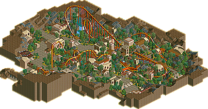
But Loopy's come out with a really nice Design in the form of Phoenix, a B&M inverted roller coaster that dives its way through six harrowing inversions. This is the type of Design that takes you back to the "good ol' days." Meaning it's very posix-friendly.
edit: my 1234th post.
-X-
The layout looks fresh, which is nice, though. Theming can't really be faulted, either.
I loved the sweeping drop into the loop, although the train hit the loop and a few other parts of the coaster too fast. The speed thing wasn't too big of an issue. I also wish you would have put fences around the queue so people wouldn't wander off into the mysterious mountains around them. The foliage on the path, again, wasn't really necessary. But all in all, very nice.
Edited by postit, 16 April 2006 - 01:38 PM.
Im pleased with how this turned out, i used it as a break from my IOA park and is one of a few designs i have planned which i hope to have finished sometime in the near future.
Thanks again everyone
solid design, overall, however it felt a little lacking. looking at the overview on the design page, it seems wonderful. but as i was looking at it ingame, i felt like there was something missing. i'm not sure what, everything was very well executed (great sculpture, by the way), it just didn't really seem to excite me very much. i think it may have been the closeness of it, meaning the paths felt kind of cramped.
anyway, great, quality design loopy, and i'm looking forward to your park.