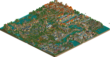
Park / [NEDC] Duke Alva - #7/9
-
 21-October 11
- Views 3,324
- Downloads 733
- Fans 1
- Comments 8
-
 46.92%(required: 65%)
 Design Submission

SSSammy 70% Liampie 60% Maverix 60% Kumba 55% BelgianGuy 50% Dimi 50% JDP 50% Wicksteed 50% robbie92 45% wheres_walto 45% nin 40% Roomie 40% turbin3 35% RMM 30% CedarPoint6 25% 46.92% -
1 fan
 Fans of this park
-
 Full-Size Map
-
 Download Park
733
-
 Objects
197
-
 Tags
Tags
![Park_2094 [NEDC] Duke Alva - #7/9](https://www.nedesigns.com/uploads/parks/2094/aerialm1880.png)

![park_2097 [NEDC] Schwarzwald - #2/9](https://www.nedesigns.com/uploads/parks/2097/aerialt1887.png)

![park_3185 [MM2014 R2] Sands of Time](https://www.nedesigns.com/uploads/parks/3185/aerialt2821.png)
![park_2095 [NEDC] Archimedes - #1/9 (Winner)](https://www.nedesigns.com/uploads/parks/2095/aerialt1885.png)

Congratulations on finishing something anyway.
Other than that I really liked this, the archi was great but kinda what Liampie said.
The coaster wasn't the centerpoint of attention.
Oh, also build the concrete blocks under water, they are floating now.
Congrats on finishing
And the foliage was really weak, as others said.
"MFG"