Park / [NEDC] Shock 2 - #4/9

15 Comments

  • Comment System%s's Photo
  • nin%s's Photo
    Ah yes, this was definitely one of my favorite entries. Fantastic job Levis, I am now excited to see any future releases from you.
  • Coaster Cow%s's Photo
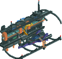
    Loooovved the crane. Can't wait to see this in-game!
  • Levis%s's Photo
    I hoped this would get above 80% but still not bad imo. Wanted to do more with it but just didn't had any time left to do it. For example I wanted to do more with the supports and wanted to add more to the black areas (like crumbeling rock) etc, but still I think it turned out pretty nice. At least I'm quit pleased with the result.
  • Brent%s's Photo
    I personally have never liked this style of parkmaking... it's just too out there for me to enjoy.
  • inVersed%s's Photo

    I personally have never liked this style of parkmaking... it's just too out there for me to enjoy.


    I agree with this, City by the Sea is so much better in my opinion... this is very solid though
  • ivo%s's Photo
    I liked this so much! one of the best things to come out this year. Although I can understand why people do not like this. The colours aren't aestheticly pleasing and sometimes it is hard to see the dimensions in the buildings. But this design got so many other features...

    Great job Levis!
  • Flap%s's Photo
    The best thing i've seen in years here!
  • 5dave%s's Photo
    Not really my cup of tea but it always impresses me how you managed to keep your unique style over the years and come up with something new every time. For the steampunk theme, it was a bit too much electricity in this for my liking, but as steampunk being a fantasy theme it's no big deal really. I loved the pipes as paths and the crane for sure. I just wished it had more crazy architecture and less plants on the ground but I suppose the deadline was cause for that.

    All in all this design really shows your skill, although it missed the crazy unique Levis hack every release of you seems to have.

    You seemed to miss the cog wheels in the bench as much as I did ;)

    "MFG"
  • AvanineCommuter%s's Photo
    I love the ideas here, and like most of your work, I love how creative you can get! The thing that I'm not loving so much is the architecture; while it is unique and cohesive, I don't really get a 'wow' factor from them as fantasy architecture. The buildings seem a bit small and repetitive without anything especially engaging for me. I guess I am a bit more critical because I was actually trying to go for a steampunk theme in the beginning, then I changed the idea because there was a lack of glass objects that I wanted to use. Maybe I had envisioned steampunk differently?

    Anyway, the crane, waterwheel, and small details were amazing though, and I LOVE the unique color choices for the foliage. All in all I really enjoyed your entry!
  • JDP%s's Photo
    yeah guys i dont like this style of parkmaking as well but i know great rct work when i see it... and this had a lot of it
    -JDP
  • Turtle%s's Photo
    Probably my favourite thing you've ever built, really nicely done. I can't help thinking if you could just change your colour choices it would make things far more harmonious...
  • posix%s's Photo
    The thing is that I don't think his goal are aesthetics at all, so colour choices are out of the picture.

    I found this very impressive, as others have said - for its scale, its gigantism, its spectacularity. But fantasy style still doesn't speak to me very much because - and this was very true in this case - I find it confusing and overloaded with stuff catering to a highly abstract and non-RCT-related concept, too far "off" to stand a chance at making sense. It still sometimes worked, as in I understood you wanted to simulate machines powered by steam, and the ways in which you realised this looked interesting, but it never went further than that I'm afraid.
  • Levis%s's Photo
    thanks for the replies guys. Indeed this park is missing a wow factor. Normally I add it to the main ride but the rules stated it wasn't allowed to change the lay-out so I first was thinking about making a shoestring and then use the same lay-out but I figured that alone would take me a week or so and I wouldn't have enough time to finish the rest. thats why it doesn't have any crazy hacks.
    The archytecture is pretty simpel also. this is due to the same reason.
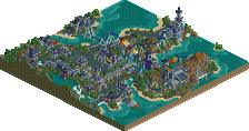
    About the colours. I try to set a certain feeling and atmosphere and the colors normally work with me to create this. also the foilage I pick are chosen to give a certain feeling. And I think this park really gives a kind of dark industrial feeling which I wanted it to have.

    and dave indeed I missed those, and more water objects.
  • chorkiel%s's Photo
    great logo, great write-up, great design !

    Levis, congratulations on the design! I loved the themeing of this ! :D
  • Levis%s's Photo
    Thanks chrokiel, I also love the logo :D.