Park / [NEDC] City by the sea - #5/9
-
 22-October 11
- Views 6,153
- Downloads 829
- Fans 1
- Comments 6
-
![Park_2080_[NEDC] City by the sea - #5/9](https://www.nedesigns.com/uploads/parks/2080/logot.png)
-
 78.08%(required: 65%)
 Design

Kumba 85% Maverix 85% Roomie 85% turbin3 85% Liampie 80% robbie92 80% SSSammy 80% BelgianGuy 75% CedarPoint6 75% Dimi 75% JDP 75% wheres_walto 75% Wicksteed 75% nin 70% RMM 70% 78.08% -
1 fan
 Fans of this park
-
 Full-Size Map
-
 Download Park
829
-
 Objects
220
-
 Tags
Tags
![Park_2080 [NEDC] City by the sea - #5/9](https://www.nedesigns.com/uploads/parks/2080/aerialm1879.png)
![park_2095 [NEDC] Archimedes - #1/9 (Winner)](https://www.nedesigns.com/uploads/parks/2095/aerialt1885.png)
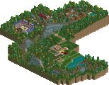
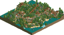
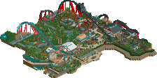
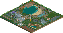
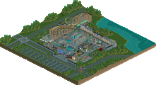
the original concept was for a size of 2 or 3 times as big as this, but i hadn't enough time. atm i'm in the final weeks at university, just 2 of 4 oral exams are out (both in the next 12 days), all the other normal exams and diploma thesis are already done, and when the deadline of the contest ended it was one day before the first of that oral finishing exams. i did a 90% in that exam, so i'm just happy i could submit something design-worthy in-time... maybe the next contest will be when i have more time.
I really loved the look of it, it shows your skill pretty well. Too bad you didn't have more time to pursue the whole ride a bit more, but what is there is very solid nontheless.
The archy was top quality and the log flume too, but the hacking was a bit strange IMO.
What bothered me were little things like the odd park layout and the missing ride interaction
"MFG"
Prodigy, this is a well deserved design. I just love your attention of detail, a lot!