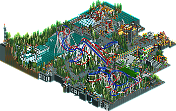
Park / Out of Space, Planet of the Battles
-
 10-October 11
- Views 5,932
- Downloads 699
- Fans 1
- Comments 63
-
 43.46%(required: 65%)
 Design Submission

Levis 80% turbin3 70% Dimi 60% Kumba 60% CedarPoint6 55% prodigy 50% 5dave 45% Maverix 40% SSSammy 40% wheres_walto 40% robbie92 35% Phatage 30% Liampie 20% nin 20% RMM 20% 43.46% -
1 fan
 Fans of this park
-
 Download Park
699
-
 Objects
275
-
 Tags
Tags
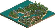
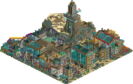
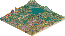
But the other 3 parts are never going to be released cause i don't fucking build the concept arts i've made earlier in my head anymore.
- I didn't like the coasters. They weren't awful, but I just didn't like the layouts and the pacing and stuff. Also I think they didn't duel well and the colours were ugly and random. It totally didn't fit in its surroundings, there weren't any cool interactions at all. No thought went into them.
- Foliage was ugly and filler.
- Architecture was ugly and random.
- Everything was really ugly. The colours were random and looked bad together. Yellow and orange represent radioactive materials? Makes perfect sense. It could as well represent child abuse in eastern Peru or extra fluffy Mickey Mouse boots. The composition was unbalanced and again it seems no thought went into this, or you just have no sense of aesthetics. I presume it's a combination of both.
- Nothing made sense. What is it I'm looking at? Is it a space station? With trees? Is it a 'space planet'? A 'space planet', yet out of space? Where are the battles? Why are there trees on a space station? The naming was besides the incorrect grammar stuff totally random too: Sound Control of Noise, The Virus of Orange Evil, Saw of the Technical Arts, The Office of Futured Madness, X-MayDay Falls, Enterprise Of the Zero G-Force and don't forget the main rides in the park/design/space planet/out of space station, Looping Faithless and Unlooping Faithless. What the fuck? I tried to understand your work but I remain clueless.
It's not because you're 'so different and special' that you got a low score. The (lack of?) ideas and the execution are just really poor.
Spot on.
Levis, I don't think that's how a panelist should vote. Now you're voting higher to make your own vote weigh more.
The coaster supports and layout were pretty decent, but really, just take a step back and look at the rest of the park, it was awful.
Sorry to be so blunt about it, but when people start moaning and crying corruption, it pisses me off.
And i also don't believe anymore in the pannelist after seeing what they vote this days on some submissions. even if there is a politics for the pannels...
Not saying mine was that good, but as i see some from others and what designs get a whin and which not i give up my trusts in the pannel, i'm sorry.
@Louis or a other administrator, Still don't want any points for my submissions from now. just forget it, i play for the fun
I mean come on! I've been panelist for over a year and I have 4accolades, I did get some near misses, some closer than others but I never blamed it on the panel I mean, you're sending it in to be judged by people who WILL have an opnion and you'll have to live with the fact some people have other opinions about your work, some will think it's worth of design, some won't, that's the system you submitted it to so don't come bitxhing about it afterwards because it didn't win...
And to be quite honest the red/blue with white supports doesn't look appealing to me at all, the colors of the whole design clash quite bad.
It's a good start and if you actually listen to what people are saying you need to improve on, you will get an accolade.
This is serious business.
But seriously. I vote what I think is fitting for a park and it worked out 325 times before without anyone complaining.
"MFG"
For those of you who don't know why this didn't make design, have a look at past designs and compare the quality of them. If you still think it's the same as something like Tomahawk, you need to take a step back and really examine the two.
But i can deal with it guy's come on, there is voted and i enjoyed it to create it
Where? And who are you? I rarely have fights.