Park / Firebird
-
 08-February 07
- Views 4,745
- Downloads 707
- Fans 1
- Comments 27
-

-
 72.50%(required: none)
 Design

5dave 80% Liampie 80% MCI 80% Cocoa 75% Ling 75% inthemanual 70% Sulakke 70% Fisch 65% Stoksy 65% geewhzz 60% 72.50% -
1 fan
 Fans of this park
-
 Download Park
707
-
 Objects
248
-
 Tags
Tags

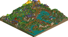
In the past couple of years Turtle has taken NE by storm winning an amazing 2 NE Spotlights. Now it's time to give the name what he's got coming, his NE Parkmaker Page. On it you will find many of his parks and designs, even 2 designs being released today, one which I will talk more about below and Glenrunner, Turtle's first LL release in like 5 years
Now not only do we have a brand spanking new NE Parkmaker page for Mr. Camble, but Jem has also been kind enough to send in an NE Design and needless to say he got the nod with...
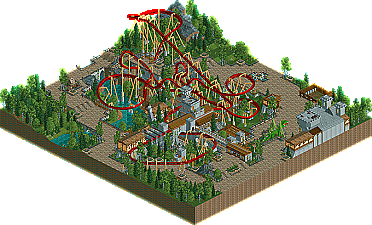
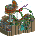
Good things can come in small packages, but it really does help if that small thing is packaged by someone with the skill of Turtle. Jem "Turtle" Camble lands his second NE Design with a mid-evil little design he calls Firebird!
Enjoy the new Parkmaker page and Design. The 2006 NE Awards are now on deck...
RMM Offline
Congrats Turtle!
Edited by RCFanB&M, 08 February 2007 - 11:05 PM.
The page looks nice (checking it out now).
I wasn't that keen on the coaster layout, as while I see that you were going for a really cool semi-realistic design and it has unexpected elements and stuff to give it a cool edge, I think in some cases the train is travelling too fast (ie. the zero-g roll, the final inversion) and in some cases too slow (the loop).
But the atmosphere was perfect. That architecture was expertly done, without being over detailed, it gave a really nice feel. That transfer track was absolutely awesome, and the building it transfers into was equally awesome. The queue line was magnificent. That archway that the track goes into the station under, the queue goes along, and the actual coaster goes under, was actually amazing. Perfectly excecuted.
The custom dragon was sweet. I've never been very good at sculptures like that, so a lot of respect to you there.
And the foliage was simply top notch, you are one of, if not the best concerning that.
Great work Jem!
As for the design. I was amazed at the support work you did for it. I can only imagine how difficult it was to get all that to fit in the center without making the supports looking fake.
I liked the actual layout with the exception of the vert loop near the end as it did look a bit slow, however I really liked the last inversion sequence right before the station. Nice touch!
One thing that will always impress me is the various sculptures people can create. Your dragon was a nice touch and the scale was perfect. In some instances, the sculpture seem to large however yours was spot on and fit the area perfectly.
As for the foliage, I have never been a big fan of placing tree’s on grass however, yours was very well done and you added enough detail to them to make it look natural. Well done.
Although I don’t think this is your best work, it was still very good and most deserving of the design. Now, do we get to see a solo form you in the near future? One can only hope!
Congrats again Jem!
James - rctnw
I'd just like to point out to everyone that might not have noticed, all credit regarding the custom sculpture must go to Xcoaster. It was based from his one in Shadowlands, and needless to say mine doesn't even come close. Thankyou man.
And Cork, that Firebird logo is amazing. Probably my favorite logo ever. I can see you struggled with the Turtle one though, I wondered what on earth you were going to pick up on there...
Congrats on the parkmaker thingy + design!
-X-
+ Landscaping was beautifu and the tree selection was perfect imo.
+ Architecture was amazingly detailed on a second viewing and i see you used the info kiosk technique from kukuana
+ The layout as Metro said was amazing apart from one or two pacing problems, which i think might have been corrected if you switched the direction of track around between the double corkscrews and loop, with the loop being the first element after the helix instead, if that makes sense.
love the parkmaker page too, thanks for a great right up on kukuana.
RFan
Corkscrewed Offline
Thanks for the logo comments. Firebird is actually nowhere near my favorite logos, but if everyone else likes it, then I'm pleased as well. Turtle's logo... well, yeah... short of actually drawing a cool mean looking turtle (I don't get paid for this; I'm not gonna actually take the time), what are you going to do for a logo of a "Turtle?"
Overall though turtle you're one of my favorite parkmakers and you know how to create an atmosphere, which is something few can achieve. i wish you'd be more confident to try new things and step out of your "comfort zone," if you know what i mean. i hope you can finish another park in the future.