Park / Tomahawk
-
 02-October 11
- Views 6,206
- Downloads 740
- Fans 2
- Comments 25
-

-
 66.92%(required: 65%)
 Design

nin 95% geewhzz 85% wheres_walto 85% robbie92 80% K0NG 70% Liampie 70% Maverix 70% Levis 65% 5dave 60% JDP 60% tyandor 60% BelgianGuy 55% prodigy 55% turbin3 55% Wicksteed 50% 66.92% -
2 fans
 Fans of this park
-
 Full-Size Map
-
 Download Park
740
-
 Objects
162
-
 Tags
Tags
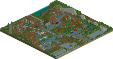
![park_3325 [H2H7 R1] Tenochtitlan](https://www.nedesigns.com/uploads/parks/3325/aerialt2925.png)


Airtime Offline
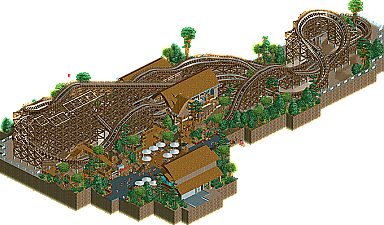
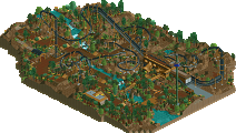
The entrnace plaza and architecture was awesome! It had a good atmostphere around the entrance to the ride as well. Such a great area. The layout was good and station was awesome as well.
The landscape colours and foliage surrounding the turnaround wasn't that good. There was a little too much of the sand texture or whatever it is around there and the tree selection in the foliage could have been better I'm afraid.
Love your work so can't wait to see more!
One of the most underrated designs ever, in my opinion. Funny to see people vote low on stuff whenever the expectation for a design is now a whole part of a park.
I'd say the vote % is fair. The layout is beautiful - one of the best I've ever seen I'd say. But the surrounding area is mediocre. He could have added even a small supporting ride or another building or even more foliage around the coaster.
But that's the thing- a design is meant to be a coaster and just a little context around it. Coaster+station+queue+path interactions+building=design.
I agree with Shogo. A design shouldn't always have to be a section of a whole park, they were originally meant to be layout showcases.