Park / Joker's Revenge
-
 23-September 11
- Views 9,951
- Downloads 995
- Fans 0
- Comments 28
-

-
 73.08%(required: 65%)
 Design

Louis! 90% robbie92 90% CedarPoint6 85% inVersed 85% nin 80% JDP 75% Maverix 75% Liampie 70% prodigy 70% BelgianGuy 65% posix 65% tyandor 65% wheres_walto 65% Levis 60% RMM 30% 73.08% -
 No fans of this park
-
 Full-Size Map
-
 Download Park
995
-
 Objects
330
-
 Tags
Tags
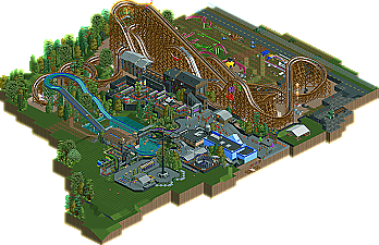
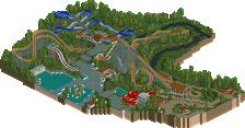
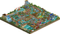
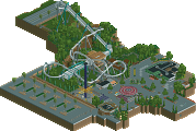
I just thought it all looked ugly. I wasn't a big fan of the coaster it's self; whilst being realistic, it stuck out like a sore thumb, didn't really seem to interact with the theme that much. I thought the architecture was quite boxy, basic and just generally ugly, which it's all fine and dandy saying it's meant to be like that because it creates a Six Flags feel, but I just judge things purely on aesthetics, so if it looks ugly I'm not going to like it. Plus, I liked SFSF, which is a Six Flags park. I also didn't like the dismantled rides as it just seemed like a cheap cop out instead of actually building something there and expanding the theme around the coaster. I also HATED the wall around the queue, just looking at it made me feel claustrophobic, never mind actually standing in it. I imagine standing in a crowded place such as that surrounded by such high walls would make a fair few people freak out.
I did like the foliage though, and it wasn't as though everything else was bad, just not design worthy in my opinion.
You're contradicting yourself. If SFSF were real, it would be ugly (No offense to you, Robbie. Love that park.
Maybe simply put, I think what makes realistic parks look good is the composure, not the aesthetics.
...or I just don't know what the fuck I'm talking about, either or.
Because I didn't vote on either Leviathan or Kumba (as far as I can remember), so I can't directly compare my scores.
But I gave this 90% because when I opened it I had an instant attraction. I personally felt that this is one of the best designs the site has seen. For me, it hit every box. Yes Kumba was incredibly accurate and technically brilliant, but I felt it lacked charm and atmosphere, Joker's Revenge may not be technically outstanding, but it had incredible charm, beauty and atmosphere.
I know it sounds weird, but I'm happy to see such a diversity of reactions regarding this design. When Sam and I were planning/building it, we kind of had the idea that it would end up being hit or miss for a lot of people. It seems that was the case. The whole idea behind this was to build a really gimmicky, gaudily themed Six Flags coaster. So, yeah, it's not exactly pretty haha. Or at least it was never meant to be. But in the end, we were happy with the layout, the surrounding rides, and the little bit of atmosphere we were able to cram into a little map that was never initially intended to be submitted as a design.
@Flap: Thanks man!
@xtreme97: Thanks! Glad you liked the "gravestones," although they were intended more to be story-boards profiling the origins of various batman villains. The Superman Ultimate Flight coasters used to have these (except with Superman villains, of course).
@Insanity: Thanks! I know a lot of people have praised the unique take on a Gotham City area. I'm not sure I fully understand, as I personally don't find it to be anything too special haha. We just wanted something a bit different than the typical Batman the Ride as a headline Gotham attraction, which definitely gave a different vibe to the area.
@Posix: Thanks a lot man. I'm glad you enjoyed it for the most part. As far as charm and atmosphere, I think I've always struggled a little bit in both areas. Sam is a self-proclaimed realistic details guy, so I'm sure he falls into the same category. It could also be due in part to the fact that there is very little on the map. With a larger Gotham area, I think we could have done more.
@Cocoa: Thanks man! Definitely glad you liked the media day stuff. That was a last minute idea I threw together that Sam and I agreed added a bit more to the "story" behind the ride. Glad you enjoyed it.
@That Guy: Thanks! Really glad you liked the graffiti and spray paint. We had a lot of fun with that aspect of the ride. As for RRP's layout, I can honestly say that I had never seen his before building this, but I can see the similarities. I don't think his was intended to be an Intamin, though.
I'm going to stop there for the moment, as I'm pressed for time. More replies to come!
@RCTMASTA: Thanks man!
@Chorkiel: Thanks for the kind words! And I definitely agree with you about spreading things out a bit more. When I decided to turn this into a design, I had to keep time limitations in mind, as I knew I would have little time to play RCT once I left for school. So, in other words, this was sort of a summer project for Sam and I. With more time, we would have tried to do more with this. There's a whole bunch of ideas we wanted to include that we just didn't have time for.
@inVersed: Thanks man! Had a feeling you'd like it.
@Nitrous Oxide: Glad you liked it man! Sam deserves all praise for the Crime Wave. That was all him. When it comes to technical details like that, he's second to none. As for the train size, that was something Sam and I discussed on a few occasions. Sam actually said exactly what you said. I was the one who decided to stick with the four-car train, though. I just liked the pacing and flow of the ride with that particular train size.
@Brent: Thanks!
@Luigi: Thank you for the kind words! Sorry you didn't like the bone yard. It may not be too aesthetically pleasing, but there's a good amount of cool stuff Sam put in there.
@TheEmperorZurg: Welcome to the site and thanks for your comments! A woody wouldn't have been my first choice either, but something about theming a woody in such a gaudy, flamboyant way just screamed Six Flags to me haha.
@nin: Hahah. In a way, I'm kind of glad you felt this way about the design, as I share some of your concerns. But anyway, thanks for the kind words and sorry if it was a let down in any way!
@RMM: I don't know man. I understand that you value aesthetics in this game, but maybe you need to be a bit more open-minded. Just because a design "looks" ugly to you doesn't mean that you should simply overlook all the positives. There was a lot of neat stuff to look at on this map, in my opinion.
@robbie: Thanks again for the write-up and all the kind words, man. Your work was a big inspiration for this, so it's a great feeling to know that you enjoyed it.
@J K: Thanks man!
@Trav: Thanks for your comment. All I can say is that, despite your argument, I still feel that being more familiar with Six Flags would have helped you enjoy this more.Boxy architecture is a staple of the "Gotham City" areas in most Six Flags parks. Even SFSF had similarly boxy architecture around Batman: The Ride and the rest of the Gotham City attractions.The wall around the queue is pretty standard, also. Ride a B:TR clone. The queue for the one at Great Adventure had me in a panic because of how claustrophobic it was.
@RRP: Thanks man! We thought so, too.
@Fizzix: Thanks man! That was my favorite part of the ride, as well. The double-rise out of the turn would be some crazy air-time.
@Louis: Thanks so much man! Pumped that you enjoyed it this much.
Thanks again everyone for the comments. I'm sure Sam will make his way to this thread to respond sometime soon.
Much more could have been done with this if the coaster had been built further back from the map edge. Working with the limited space made it difficult to fit in the rides we wanted without the park feeling cramped. There were several rides (at least that I wanted) which never made it to the park because doing so would result in the layout being too awkwardly forced to access them, and neither of our hacking abilities were at the level to accomplish the rides in mind. A Two-Face themed flat was one of these rides planned. Supporting rides can really affect the outcome of a design by showing overall effort put into them. That's why we went with the "Batwing" Chance-Morgan Aviator ride since instead of another one of the game's default rides which was there at first.
The boneyard seemed to be a real hit or miss here. It started with just the remains of the Togo being cleared away (yes Cocoa, that ride is being scrapped, as made evident by the chopped up mangled pieces being hauled away), but we decided to add some more junk like a real Six Flags park that just keeps rides on site instead of spending extra money to move them off site to be scrapped or whatever. Sounds like the main complaint is that the boneyard looks ugly, which was the intent. At some parks, they are absolutely packed with no extra room, so this one came out clean looking by comparison. Since there would be no easy way to access back there from the park for an attraction, this is an area in real life that would probably be the boneyard location because of easy access to the service road. And with the old Togo track being removed, who's to say the rest of that area isn't being cleaned out too?
RCT Six Flags park are misunderstood by many here on NE, and others think they are straight up ugly (I'll admit it's often true in real life); the mixed reactions were expected. But yeah, it's really great to have another project completed here as my other projects have slowed significantly in recent months.
And lol at the Batman queue comment Burns, because holy shit, I get claustrophobic as all hell in the one at Magic Mountain too.