Park / The Hunchback of Notre Dame
-
 09-June 07
- Views 21,275
- Downloads 725
- Fans 0
- Comments 64
-
 61.88%(required: none)
 Design

5dave 70% geewhzz 70% MCI 70% Cocoa 65% Stoksy 65% Fisch 60% csw 55% inthemanual 55% Liampie 55% nin 55% 61.88% -
 No fans of this park
-
 Full-Size Map
-
 Download Park
725
-
 Objects
311
-
 Tags
Tags
god dammit take that fucking spell check off your name.
Edited by tracidEdge, 10 June 2007 - 02:21 PM.
Will comment on the others tomorrow, when I had a look - but congrats you too for getting into the PT3
For what it's worth, you're obviously trying your best to act in the site's best interests so you have my respect for that.
Ok, ok... I was kinda out of line. I just get annoyed by you saying you hate stuff I think is really good and seeing like 30 posts from you each day does get under my skin a little.
On topic:
I did think disneylhand did use to many inversions, it was like a combo Vert/Floorless, but the theming carried it.
I don't see why Jazz' coaster needed a big drop, it had some good ones, but the layout was pretty much terrain based...
Boring surrounding oh Egg's? In the rapids round yeah, but here they looked great, his tiny buildings are way better then most peoples whole ones.
So yeah im still waiting for the day everyone agrees with me
Next, I'd like to thank Kumba for granting this as an NE Design, as well as hpg for making the awesome logo.
I'm not going to go on a rant about every single post made about this whole controversy, but I would like to adress a few of you who I think need to be spoken to.
Six Frags: No, I didn't make this design purely for getting into the PT3 ... infact I let Kumba know that I may not even have enough time for it. Also, about the whole "omg designs shouldn't grant PT3 access" that is absolute crap. If anything, NE Designs are far beyond prelim quality, because several more factors have to be considered.
For example, with the inverted round, all of the entries were terribly unfinished. If you sent an extremely unfinished design from the winner of that round (Geoff, even though that coaster was pretty good) it simply wouldn't win this award. Prelims are based on a different judgement system. Prelim winners win not only on the quality of the entry itself, but also in comparison to the other entries in that round. Then you pick the best entry. For NE Design, there's already a certain standard that must be fulfilled in which you either pass it or you don't. A prelim winner doesn't necessarily have to be amazing to win, but it does have to be the most amazing of all of the other entries involved within that round.
I'm also satisfied with your actual post regarding my park. I respect your opinion, and for once you posted your thoughts in a proper way without any heated bias or hatred.
eman: I find this post even worse than any arguements I've had with Six Frags ... I mean, the layout "abysmal?" I understand it's your opinion, but if my coaster was as "abysmal" as you describe it then I'm sure it wouldn't get NE Design.
To be quite frank, my coaster was "miles beyond" your wooden coaster that failed to achieve NE Design. Kumba would support me on this, I'm sure.
Normally I wouldn't mind your post that much but it's been quite evident recently that you have an undenying hatred for my work. I would appreciate it if you would at least explain your thoughts more thoroughly and respectfully, or at least like Six Frags did in this topic (suprisingly). I just wanted to inform you of my opinion on this matter.
JJ: Your post is even more annoying to me. You explained your opinions even less.
"However I hated Jazz's it didn't deserve design IMO, was a bit sloppy." - JJ
If you hate my entry so much, than please explain yourself. Not to mention I do find you quite annoying, in which this park is far beyond anything you've done, as Kumba previously stated. Next time learn how to make a coherent post with actual meaning, because your previous 1,012 posts have yet to contain any.
I fully support Kumba with his previous posts. It wasn't the fact that your opinion bothers me (infact, Six Frags and eman hated my entry just as much as you, I'm sure) but in the manner you posted it that is particularlly irittating.
Lay off Kumba because he is right on this matter ...
Thanks again for all of the comments, and any more feedback is certainly welcome.
Edited by Jazz, 10 June 2007 - 05:58 PM.
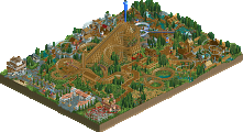
I loved egg's. Of course. Love this guy's stuff. I really liked the coaster layout. The supports looked really sexy, and were so well done. A lot of yor stuff is so inspiring. From your landscaping, to your color choices, to your foliage. Great, great work.
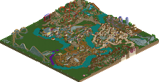
I was underwhelmed with Quest. The write up made it seem as if it was "one of the best wooden coasters RCT2 has ever seen." Don't get me wrong, the layout was a lot of fun and fluid... but I don't think one of the best I've ever seen. There were some real nice touches, like the little bridges, and ornaments in the pagodas that made it charming, but overall it didn't seem cohesive. Jazz, if your work was a little more refined, I think you could be one of the greats.
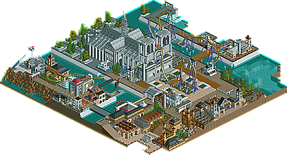
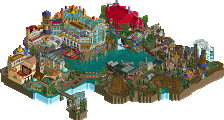
I'm going to need to look at Hunchback some more. I looked at it, the cathedral is nice... but it's going to take me a while to look at all the little details and really appreciate what was done.
Congrats to all three of you. PT3 is going to be nuts.
FK+Coastermind
Yeah pretty much my thinking. An NE Design is as good and usually better then a prelim entry. Also if you got the skill to win NE Design with these higher standards then IMO your PT finals worthy. Prelim is still a good way to go as a winner is always needed and you can sneak in like Geoff, Ling and Vekoma9 did.
Jazz that's some good feedback, but please add comments to your follow winners while your at it next time.
FK+Coastermind
The layout was abysmal. Thats my opinion. The fact that you need to TRY and attack my recent design is testament to why you are quite pathetic and a lot of us dislike you. If you're work is so good, you shouldn't need to attack others' work to try and make a point. Your work should be good enough to speak for itself. And anyways, as far as quality, I feel that my woodie was ahead of yours, and I know many who would tend to agree with me. Your design was merely a much larger scale creation. But the quality of my design is irrelevant...
Also, I find it funny how you say I have an undenying hatred for your work...Ive made 3 posts about your work, and one was positive too....just because Im willing to acknowledge that your "design" was a poor layout with bland repetitive archy and all-around mediocre work doesnt mean I hate you or your work.
Edited by eman, 10 June 2007 - 11:08 PM.
FK+Coastermind
And I also find it really funny how you cried foul at Six Frags in his topic when he dug up your old member problems at rct2.com and yet you do the exact same thing with eman here with his coaster by using it against him lol.
From what I've seen of this the one thing I'll say is that you need to grow some balls and take some risks. Throughout your time here I haven't seen you stray away from your style of work much at all no matter what the theme is. It's almost like you set rigid rules for yourself whenever you build. I think you really need to experiment more on colors and textures, architecture styles, and landscaping. You're not necessarily bad at those things but you just haven't really advanced in them either. You should open up rct and start using colors and objects that you've never used before to get out of your comfort zone [/blitzquote] =P.
Comments on the other two when I look at them... but from the screens both look nice.
i've never understood this argument, because, shocking i know, opinions are in no way indicative of talent.
I apologize for my fury; it was the heat of the moment and I got ahead of myself. Opinions are opinions, and there's nothing I could do to change that. All I was trying to ask for was for a couple people to at least support them.
Anyways ...
Egg head, your design was simply awesome with magnificent pacing and flow. The supports were spot - on and the archy and theming was good (especially the go - karts).
Disneylhand, your design was also nice with some nice church - esque theming and a strong vertical - drop layout (especially the beginning).
As I already said before, congrats and nice job on these designs, perhaps, if I have the time, it will be fun to compete with you guys in the PT3.
Let me be the first to end this controversy and return to this normal state, so we can properly comment on these excellent NE Designs.
Amen to that because I judge parks all the time and never make any
but anyhoo...I liked all three designs, I think all three deserved to get design, and I think making designs to get into the pro tour is just as hard as making a prelim entry...maybe harder...so thats my opinion
Congrats to all three of you!
Edited by Buckeye Becky, 11 June 2007 - 04:42 PM.
^ Good and clear post, took the words out of my mouth, fully agree
Emergo
Jazz, you compared it to a weak week. Prelims have strict deadlines, and particular coasters to build. With all these designs coming in to gain PT3 access, your 'point' will be proven more and more. Because otherwise these entries would be sent in (to the bonusround, if necessary). Then, no matter how you tell it, they would have to compete. Even if there are weaker rounds where in each and every one of these designs would win hands down, there will also be much stronger rounds if people didn't work on designs instead of prelim entries. I think this whole designs thing is hurting the prelim quality, badly.
Though when Kumba is letting two per week through, is willing to give 4 other people there a chance on the pro tour, AND is giving all these designs prelim access.. I have no idea why we didn't just do a Hi Rollers in the first place. He even wants to start right away (because otherwise fatha' will run away). How about we throw all this bullshit away, and let everyone enter, if anyone that even wants to is going to be granted access now anyways?