Park / Caiman
-
 22-August 11
- Views 9,331
- Downloads 1,084
- Fans 1
- Comments 29
-

-
 67.69%(required: 65%)
 Design

SSSammy 85% wheres_walto 80% BelgianGuy 70% Casimir 70% Liampie 70% Louis! 70% Maverix 70% turbin3 70% tyandor 70% geewhzz 65% Wicksteed 65% posix 60% prodigy 60% RMM 60% JDP 50% 67.69% -
1 fan
 Fans of this park
-
 Full-Size Map
-
 Download Park
1,084
-
 Objects
199
-
 Tags
Tags
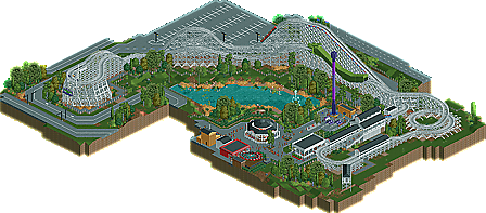


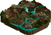
Otherwise, I thought this was a completely believable layout with some great architecture and nice supporting rides. Oh, and the logo looks sick, btw. Congrats man!
Honestly I'm really sad I didn't have the time to vote on this one. I probably would've went with Walto's vote because I think this is absolutely fantastic. Love the classic themepark feel and atmosphere, the southern theme really strikes me as well. I think this would be a cool theme for a whole park, get on it!
The Wild One trim at the end of the ride barely kisses the train, such that the train could navigate the end helix without the trim while not causing too much discomfort/track wear, but it makes sense for a trim to be there just in case the train's speed is too high to prevent those things from happening. Take the trims off Caiman and you have like 35 mph through the turnaround and 42 mph thorough the helix. That's to say that didn't happen here.
Xcoaster Offline
The layout was nice, with the right pacing. Also nice to see something different with the unbanked turns. In my opinion this worked well. The last helix was very enjoyable. The colors were also nice. The caiman tunnel was a nice touch, executed very good.
The surroundings were OK. Nothing mindblowing here. The architecture was minimal, but it gave off a real classy vibe, combined with the coaster's color. The other attractions were decent ass well, but nothing really kept my attention here. The foliage was really nice though.
Overall I can say this was really nice. It shows some quality but it misses the 'wow'factor in my opinion.
Airtime Offline
One thing with all your work is the great foliage. You really make the foliage look so natural and "free growing." However I thought the planted foliage outside of the woodie's station and in the car park used to much jungle bushes. Just a little niggle though nothing to take away from the awesome foliage. Also the use of the land textures are second to none, they really compliment the foliage and landscape perfectly. That's another thing I love about your work.
The layout was pretty good, like I said ages ago. Well I think it's the same one you showed me?
The drop tower fits in lovely so do the other supporting rides. The carousel building was real nice as well, fitting in perfectly with the woodie's architecture.
The rest of the buildings are nice but I know you can do better but they fit in perfectly still and antything more I'm not sure would have fitted.
Overally very nice design! Hope you finish more!