Park / Caiman
-
 22-August 11
- Views 8,860
- Downloads 988
- Fans 1
- Comments 29
-

-
 67.69%(required: 65%)
 Design

SSSammy 85% wheres_walto 80% BelgianGuy 70% Casimir 70% Liampie 70% Louis! 70% Maverix 70% turbin3 70% tyandor 70% geewhzz 65% Wicksteed 65% posix 60% prodigy 60% RMM 60% JDP 50% 67.69% -
1 fan
 Fans of this park
-
 Full-Size Map
-
 Download Park
988
-
 Objects
199
-
 Tags
Tags
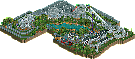
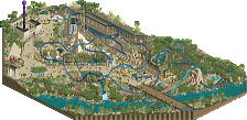
I want to thank the prep team for this, and verti for the fantastic logo!
and
* Caiman - nin
you added a lot of creativity to the bareness, this style of themepark brings but that's still not my favorite type of theme park.
gotta love 'gatorland' though ;p
-The Chains in the track.
-The Unbanked helix
Things i really Really liked about it:
-The Dragon Tunnel,
-Parking Lot
-Coaster Station
-Color
-Foliage
-Caroucel
Really Great Design!
tdub96 Offline
^obviously you havent ridden a PTC woodie if you dont get the "chains in the track," or the unbanked helix for that matter.
Well done nin, well deserved.
The rest of the design was nice but nothing special. The architecture was worthless though, you can do so much better.
Congrats on winning and even more on finishing!
P.S:
I... I think it's supposed to represent a Caiman.
I did think that the last helix would bring up a bit of a debate, but in this instance I went with form over function as the unbanked turn looked much better here, plus the train wasn't moving fast enough to have a banked turn be the only option. it's funny how I was 'daring' with this, as I actually had to go back to see if every turn was unbanked; I had forgotten that I did that!
this will probably mark the end of my "classic" amusement park days, as while a bit of old-school is fun, it's rather boring to make an entire park out of it.
Here's the link btw, sorry I was such a dick back then but I still agree with the points I was trying to say:
http://www.nedesigns...nostalgia-vale/
If it weren't for the brakes before the turnaround in Caiman, then the lats would have been way too high for comfort and maintenance issues would have caused a park to either retrack the turn to make it banked or remove the ride altogether. However, those brakes just seem so awkward; maybe they're intended to be a modification by the park for the reason I just stated but 1) they are a kill joy in a Mean Streak/Hercules sort of way and 2) a coaster from the first half of the 20th century wouldn't be built where the train was entering a turn like that at that speed. It doesn't seem feasible that they were included in the coaster's early years because they would have had to be skid brakes rather than pneumatic compression, the former requiring much more space to take effect. As for the rest of the layout, I found it very short and lacking in nuance and charm save the last helix. Even traveling through the serpent body doesn't set this coaster as a unique ACE coaster classic. And while the helix was cool and the supports look nice, we have the scenery in RCT to make much more realistic wooden support structures and the slanted walls in cardinal directions are frankly obsolete.
I think I saw in the dump place (?) that this was something old that you stopped and then started up again. If your aim was just to have fun with this, I think you've met that goal. It was a fun entry to look at, easy on the eyes and yet very detailed/refined and very tasteful. It's just that you've released/showed screens of stuff that's of much higher caliber than this and with your reputation, I would have liked to see you released this non-competitively. I know that may sound silly but on this site where Designs aren't tiered, maybe we should raise our standards yet again. I'm not saying a ride of this type isn't fit for a Designation, but I found this ride to be mostly uninspired and unrealistic yet set in a very nice setting.
Can't wait to see your bigger projects. Hopefully this hints on (but doesn't go as far as revealing) what's in store.
I love this ride, and I love the surroundings. The Wild One inspiration, from the helix to the offset transfer track, is obvious and you pulled it off very well. You're so terribly good at this game!
inVersed Offline
I really like this design.