Park / Yggdrasil
-
 10-July 07
- Views 17,637
- Downloads 617
- Fans 0
- Comments 37
-

-
 60.00%(required: none)
 Design

MCI 75% csw 65% Fisch 65% Liampie 65% Poke 65% Cocoa 60% inthemanual 55% Stoksy 55% 5dave 50% geewhzz 45% 60.00% -
 No fans of this park
-
 Full-Size Map
-
 Download Park
617
-
 Objects
262
-
 Tags
Tags
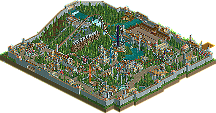
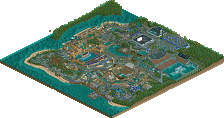
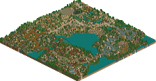
![park_4114 [H2H8 R3] Forum Caeleste](https://www.nedesigns.com/uploads/parks/4114/aerialt3853.png)
Salga:
Pros-
Excellent layout... I really like how it came out.
Great landscaping... the setting worked out very well. Nice mountainous stuff.
The architecture, as little as there was looked excellent.
Supports are very well done, I think.
Clever hack with the 2 trains.
Cons-
I think I might have to agree in that the brighter supports leave it looking kind of cluttered.
I've never been a fan of using wooden track as the catwalks.
This theme, while a bit different, feels a lot like Kindred, a few buildings and mainly landscaping. I'd like to see some other stuff one of these times. Not a big deal, though.
Overall, this is one of the best things I've seen from you and the best design today. Hope to see a PT entry from you.
Buccaneer:
Pros-
The architecture is some of the best I've seen with no custom scenery. It's really impressive.
I like the layout, especially that part where it circles round the drop tower.
Supports, along with the with the architecture, are really creative for no custom scenery.
Cons-
Really the major one is just a personal preference, but I'm not a fan of the non-custom parks. It's cool, just wouldn't be a choice for a park.
Overall, this is quite good, congrats on the PT spot. Hope to something finished.
Yggdrasil:
Pros-
The dragon was cool.
Custom bumper car area looks great.
Cons-
The layout seemed to be trying to do a standard formula B&M layout, but missed out on a lot of things. It seemed to drag in a couple of spots and didn't really flow at all.
The supports were overdone in some areas and underdone in a few areas. If it's supposed to be a B&M, I wouldn't do crossbeams either.
A lot of the areas seemed to be rather unplanned, especially that part where the loop spills over onto the path.
Sorry to be a little harsh on this one, but I didn't feel like this deserved a design. I do think, though, with a little more time, that you could come up some stuff that's pretty good.
I'm d/l'ing now. Fisch's I've already seen and loved.
salga- Great lay-out and support work.. It flowed really well, and had no real awkward turns or drops.. Good landscape and path interaction in places.. Good colour schemes, which gives it a fresh look.. Nice little innovative things like the diagonal queue line bit and diagonal brake at the end.. Terraforming was ok, foliaging could be better as it was a bit bare in places.. Nice waterfalls and supporting rides & architecture... Theming could've been better, but the general atmosphere made up for it.. Great design!
Buccaneer- Why lower yourself in options?! That's one of the worst things to do, and only could be pulled off when the design is one-of-a-kind (see Posix' Canonball), which isn't the case here imo.. The layout itself was just a standard one-in-a-dozen B&M invert which I've seen too many times already, and done much better.. The architecture wasn't inspiring either, which I thought was your strong point when seeing your screens in the ad. district.. Supports didn't work, but what brought it down to me most was the lack of atmosphere.. It felt really bland and uninspiring.. Hope to see more of the ad. district-Fisch in the pro-tour..
Yggdrasil- No offence, but why did this even get design? I understand you could doubt with Buccaneer, but this just lost in all aspects of what appeals to me.. The layout was very awkward with no flow.. It's going really slowly over the tops of the hills, stops a couple of seconds at the block brake section and just didn't excite me really.. The colour schemes were very bland with only browns and greys, and the architecture looked cluttered with all those different textures and variations going on.. I appreciate the effort, and understand it can't be all top of the bill, but if a coaster gets design it should be of great quality, which this imo unfortunately isn't...
SF
_____________________
Also thanks to everyone who answered!
@JJ: Thanks and nice to hear that you liked it.
@Vekoma9: Same as JJ. Thanks and great that you liked the supports!
@disneylhand: You're right. I really could have made those buildings look better but I think even if there were no csutom scenery objects that it looked good.
Also I don't think that to build with the normal scenery is that bad and I don't even know how I could make a real pirate theme with custom scenery.
But as you said it's a matter of opinions. Thanks for the comment and good luck for the finals!
@Egg_Head: I really have to thank you for the logo! It looks great!!
Also thanks for the comment and it's great to hear that you like my style etc. !
Even if I can't understand that mine is your favourite design of these three.
Good luck for the finals!
@Magnus: It truely would be awesome if this makes rct-history but I don't think so.
Thank you and nice to hear that you like it.
Also good luck for the finals!
@CP6: I hope so, too. I'd be very disappointed if I couldn't finnish my park for the finals.
But we'll see.
Also nice to hear that you like it!
Hope to see you in the finals, too!
@Gwazi: Thx and yeah we RCT-Majesty guys now everything!
@SF: I haven't seen that many of those B&M inverters with a innovative layout yet. Sry for that but next time I'll try to make a more innovative layout.
Also the architecture wasn't as good as it is in my solo - I know that but I think it's a bit harder to make a fantasy coaster than to make a realistic solo.
Also I had no CSOs but as you said it was my own choice to build without CSOs.
I've already a plan for my finals park and it will have much more the atmosphere that my solo has.
Don't know if I'll be able to build the park exactly like it is on my plan.
Fisch
What the hell are you talking about? Super runner-up? Where?
Salga looks pretty fantastic and has for a long time but I hope geewhzzzz isn't falling into a rut of constantly building in a similiar style? I'll take a look soon.
Yggdrasil... well from the screens I have to agree that it doesn't quite make it as Design but a closer look will probably reveal more.
Remember the park that you worked on when you left the club.
Fisch, excellent idea to do a NCS park. Sometimes its fun to "get back to basics" and play this game the way we did when it first came out, only now with the additional parkmaking skills you have learned over the years, its just that much more fun. And its also fun to challenge yourself to come up with new uses for old scenery pieces, like you did with the custom supports. Great work!
DelLagos, I enjoyed your choice of theme (And coaster name), and I thought your archy was very good, but your layout was not too strong IMO. Obvisouly this was the 3rd best of the group but still good so congrats!
queue
Geewizz's design was good, but not great imo. The supports were topnotch, and the layout looked (and ran) pretty nicely. It lacked any sort of unity though, mainly because of theming issues and/or I couldn't sense a general idea pervading throughout the design. It still deserved the design mark, which is a great achievement. Congrats.
I'm gonna be a little bit harsher on buccaneer than most people. there's a difference between using no custom scenery efficiently and not. posix' cannonball was done efficiently. he was able to create a convincing theme along with an outstanding coaster layout. your architecture was somewhat original but ugly in places, and you need to learn how to use "blank" space in between buildings so as not to stuff every square with dense scenery. the supports, while different, were just plain ugly. the layout itself was alright, but nothing better than that. like SF said, we've seen average layouts like these many times. your pacing also needs to be improved greatly. as levis mentioned, the cobra roll was way too fast, for example. with some practice you'll get better im sure, but this definitely did not deserve a design mark.
the final design was stronger than buccaneer i felt, but still same old, same old. boring colors, bland, standard B&M layout, and no real pacing made this coaster slightly below average on my list. i appreciate your effort on some of the surrounding rides though. good luck in the PT3, i hope to see your improve soon, you do have some marks of potential.
it's on-par with el encierro imo, even when it's less surroundings than what that had.
let's get gee to that parkmaker spot, shall we?
Holy fuck... this is up to Louis to decide but this is one of the few coasters I've seen that I find truly deserving of the coveted #datflow tag.
This is art.
Your reply had me confused because Salga shares the comment thread with Buccaneer and Yggdrasil. I thought you were talking about Yggdrasil. On par with El Encierro, WHAT? Yggdrasil is quite poor, El Encierro is a milestone.
Voted 85% for Salga. The station area doesn't do much for me, but the layout and landscaping is fucking fantastic. The valley, wow! Wasn't this also the first proper pretzel loop in RCT?
Buccaneer is also pretty good, by the way. I like the custom supports.
Salga is still one of my favorite things on here. really atmospheric and cool looking. simply a coaster which has inverted parts made out of steel and probably done by B&M done right
85%
Salga has an orgasmic layout...ugh.
I can't help wishing for slightly more architecture though. Landscaping was awesome, as were the coaster colours but I just feel that a couple more buildings would helped retain an interest for that bit longer to bring this up to El Encierro standards in my opinion.