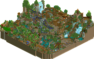
Park / Nature's Fury

38 Comments

  • hulkpower25%s's Photo
    were not talking about me being illiterate,were talking about the mistake of your ride being a design. if you want to take that way by saying i am illiterate good for you if it makes you feel better. yes and i am very illiterate, yeah illiterate.
  • dr dirt%s's Photo
    Don't make Hulk angry
  • That Guy%s's Photo
    Hulkpower, I hope you realize it's a pretty dickish move to say that he doesn't deserve it, etc. I've never won an accolade but I'm sure that's the last thing I would want in my replies.
    I'm not your enemy, so you don't need to come back at me with a plate full of insults. Just have some empathy.

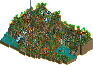
    As for, you know, the design, I liked it a lot. There were a ton of areas that just had outstanding beauty and atmosphere, and a design like this hasn't been pulled off in a long time, so congratulations. The great thing about this is that it's very memorable.

    edit: I award you 10 points, Mr. Dirt.
  • geewhzz%s's Photo

    were not talking about me being illiterate,were talking about the mistake of your ride being a design. if you want to take that way by saying i am illiterate good for you if it makes you feel better. yes and i am very illiterate, yeah illiterate.


    You know, I rarely have problems with anyone on this site, but you're starting to get there. How about we talk about your two parks that aren't accolade worthy?

    Anyone care to chime in? Maybe I'll take this over to your park's pages and shit all over you?
  • hulkpower25%s's Photo
    well geewwhzz i dont but, i hate went something like this happen, and if saying what i think to somebodies' "illiterate" comment in trouble then count me in........yeah and i could be really nice or either else.
    consider an answer to your comment and dont take personaly.
  • K0NG%s's Photo
    ^ Literacy at it's apex.
  • posix%s's Photo
    Disagreeing with a close accolade decision is one thing, proclaiming one's opinion as the one and only valid account that disrespectfully denies the worthiness of a fellow member's abilities is another. It's being an asshole. You need to fix that. Enjoy a 3 day account suspension.
  • SSSammy%s's Photo
    with some peoples opinions, i can see and understand what they mean.

    however, looking at the amazing landscape and palpable atmosphere in natures fury, it's really hard to understand why someone would not want this to be an accolade while thinking maverix should (love you maverix, don't hate me!) purely because we've seen it from maverix before and rewarded him accordingly. just because one song was great doesn't mean you should keep making it again.

    what i'm trying to say is, i really, really like this design.
  • Cole%s's Photo
    I like this a lot more now than when I first looked at it. It's just...fun
  • Maverix%s's Photo
    I'm going to end this, hulk, I think this deserved a design more than Kraken did. Do I think that Kraken deserved a design? At the time it was finished yeah, that's why I submitted it, but looking back, I can see that it did not, at least not as much as this did.
  • BelgianGuy%s's Photo
    I actually agree with JDP's vote, nothing here did it for me and foliage while being a good filler for aesthetic values didn't work as a theme for me tbh, it didn't work for me and the fact that you so posted in your thread you didn't want to do the effort to parkdat objects to get custom supports while a lo of people said they'd help, including me if I recall is a little lazy to me, this looks as if you had no idea what to fill the map with and just started putting down more trees to get it "finished"...
  • rct2isboss%s's Photo
    I really liked this when I first got to test it. The only thing that bothered me was the foilage, which actually turned out great in the final version. Besides no custom supports, there were only minor flaws. The waterfall and landscaping is fantastic. Also, the lookout area was very interesting.
  • pierrot%s's Photo
    yeah JDP is right.

    i liked this design but it was nothing special.

    some waterfall...structure...and trees..end. nothing special. like he said.
  • Nitrous Oxide%s's Photo
    I'm not trying to be rude, but really? Is NE that desperate for submissions? This was the worst accolade I have seen. Note: I have not seen all.. So there is still a possibility. But it seriously looks like no time went into this at all.

    It is not the worst thing I have seen in RCT2.. but you really should have spent more time on this.
  • Cole%s's Photo

    I'm not trying to be rude


    well, it looks like you failed miserably at that
  • Loopy%s's Photo
    I thought this was really beautiful. Fantastic landscaping and the foliage works well. I also really liked the architecture, especially around the little area with the S&S tower.

    As mentioned previously, the layout was good but could have done with a better ending. Always nice to see something other than a 'cookie cutter' B&M layout. I think the choice to not use custom supports was the right one as they may have impacted on the natural beauty of the design which I'm sure was to be the main focus.

    Congratulations on the design and I look forward to seeing more from you in the future.
  • Nitrous Oxide%s's Photo

    well, it looks like you failed miserably at that


    Yea, I thought so myself :lol:
  • hulkpower25%s's Photo
    Sorry for everything and the stupid comments, what i think dies not mean you dont deserve something.
  • Louis!%s's Photo
    This is beautiful. Such a nice break from the usual designs we see here now. I loved how the layout was flowing and had a very natural feel to it, even if it wasn't conventional realism.

    I think the surroundings backed this layout up beautifully, the flowing landscape, fantastic foliage, even the architecture was top-notch, something you have clearly improved on.

    It's brilliant to have you grab an acolade Comet, I really hope we see more from you :)