Park / Nature's Fury
-
 29-July 11
- Views 9,526
- Downloads 1,056
- Fans 1
- Comments 38
-

-
 69.23%(required: 65%)
 Design

Kumba 80% Liampie 80% Wicksteed 80% CedarPoint6 70% Loopy 70% Maverix 70% nin 70% prodigy 70% robbie92 70% turbin3 70% Casimir 65% tyandor 65% Roomie 60% wheres_walto 60% JDP 45% 69.23% -
1 fan
 Fans of this park
-
 Full-Size Map
-
 Download Park
1,056
-
 Objects
232
-
 Tags
Tags
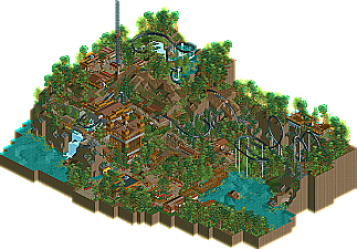
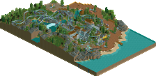
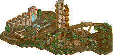
Anyway it's nice to see this released and thanks a lot to the prep team. Looking at the votes I imagine the lack of custom supports really hurt, but I'm interested to hear everyone's opinion
On topic, great design and I was happy to be the one who finally got the write-up done
Comet, I've always liked how you play this game. You always seem to have a clear idea of what you want to make, and don't release it until it fulfills your expectations.
That being said, I thought this was a really fun layout that felt really old-school without the custom supports. I know it can be said for many designs, but this one especially felt that it would have been better suited in a full park. Kind of reminded me of what would have been an "E Ticket Attraction" in one of the old spotlight parks.
My only real complaint would be to get your parks out of the woods. You always have everything so shrouded in foliage that it's hard to appreciate all the excellent touches you add to your work.
Anyway, congrats on the design man! Well deserved.
RMM Offline
Congrats Comet, were you inspired by a H2H5 minutemen park Turtle was working on? I see a lot of similarities.
That is why this release is so great to me. Even without it not being the best on a technical level, it shows the value of fun this game's worth to you as you consistently come back to show us whatever projects you come up with, and how little you cane care about the trends we set here. It shows you can have great work without falling victim to cliches such as ultra realistic layouts in realistic settings, custom supports, among other things.
This is a good step up for you, dude, and the fact that you're already showing you're latest and greatest in the dump place is a good sign that you'll be here for a bit longer.While you're not at the top yet, I see you as a true rising star.
im sure im the only person on the panel who is strict with coasters... which mixes things up (look at my vote for Steel). i liked this design but it was nothing special. it had points where it felt uninspired along with it being rushed and no custom supports didnt help.
but its cool "Cena" with the CMPunk avatar. you can hate on me all you want, wont get ya far though
-JDP
this looks so very sexy. best design for a while me thinks.
What I would like to suggest for you to consider in future projects: Don't overmusic things. One jungle drums playing somewhere is more than enough in my opinion. And, be careful to properly expose the features of your park. Building entrances, facades, ride and shop entrances, path + ride interactions, make them clearly visible and pronounce them with details. You often had them hidden by overpowering greenery, which I felt was a waste the park's potential.
Comet; I love the setting. It might break a few unwritten design rules, but I don't really care much about that; it looks like a fun ride, and like you had fun building it. That's what matters when you open a park, I believe.
anyway, it was a pretty good design. overall the atmosphere was very relaxing and cozy, and your layout was good. It was definitely hurt by the lack of custom supports though, and all of the architecture seemed too repetetive and unrealistic (in terms of what style it is based on- it didn't really feel "real"). some highlights for me were the brake structure and the eating patio at the bottom.
Fuck that I'd take comet's design anyday over maverix's both are great but Comet's just appealed to me WAY better than maverix's
I Agree with Hulkpower,
I think i miss something that makes this perfect, also the layout doesn't get me either,
it just need something that make it special i think, which it isn't now.
I agree with Zburns though; the foliage was a bit too dense and blocked views in some places.
Congrats.
To everyone else thanks for the comments I'll answer some of the questions and criticism a little later