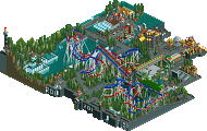
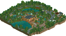
Park / The Lion

Park_2001 The Lion

16 Comments

  • Comment System%s's Photo
  • turbin3%s's Photo
    Kumba? WTF?
  • SSSammy%s's Photo
    no, turbin3. maybe it was an act of encouragement. don't take it away.
  • posix%s's Photo
    why was this not rejected?
  • mardy%s's Photo
    What is the lion here?
  • Metropole%s's Photo
    I think I saw something saying this was a recreation somewhere. Any ideas?
  • chorkiel%s's Photo

    no, turbin3. maybe it was an act of encouragement. don't take it away.

    and the 5 zeros aren't discouraging at all.
  • Flap%s's Photo
    Recreation??

    Well i should give it a 5% cause he had take the time to make it...

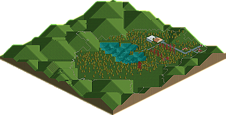
    Layout is a bit bad,
    It's kinda empty,
    Your paths is a bit simple and uninspired.

    Your parklayout needs to be fixed a lot!
    Just put some things down and send it in as a design!!
    Just put a lot of time in it!

    I never get a design, but i definitly put a lot time in my things to make it look vieuwable, which this wasn't
  • K0NG%s's Photo

    Well i should give it a 5% cause he had take the time to make it...

    Absolutely not. You give it a 0% to discourage him from submitting anything similar because it's a waste of admin's and the panel's time.
  • inVersed%s's Photo
    This might be one of the worst design submissions of all time.
  • Jaguar%s's Photo
    11th October, Year 2. That was the date it was saved on and chances are it wasn't hacked. Put more effort into parks, because it takes more than an hour to make something half-decent. Keep trying, but please don't submit parks like this, especially for an accolade.
  • Flap%s's Photo

    Absolutely not. You give it a 0% to discourage him from submitting anything similar because it's a waste of admin's and the panel's time.


    I'm not that hard as you Kong,

    I'm a person, not a beast.
  • Metropole%s's Photo

    I'm not that hard as you Kong,

    I'm a person, not a beast.


    Hahaha. That tickled me.
  • FullMetal%s's Photo
    ^ I think we're thinking the same thing. XD Language barriers can be so much fun.

    Innuendos aside, I would have given this a 0% as well. Not for the purpose of discouragement, but because it lacks anything that could merit any kind of score at all. There are only two types of trees and they are contained within the confines of those god-awful border fences, the layout is mediocre at best, the only buildings are blocky and unimaginative, and the rest is just....no.

    My advice to you here is this: If you only spent an hour's worth of your time building something, it's probably not good enough to be submitted. Try spending 20, 30, or even 50 hours on a coaster before you submit it.
  • tdub96%s's Photo
    I'm going to quote Turtle on this one....


    Why. The. Fuck. Is. This. On. The. Internet?!
  • Midnight Aurora%s's Photo

    I think I saw something saying this was a recreation somewhere. Any ideas?

    It's actually a metaphorical retreat into the human psyche, the financial marketplace, and the world at large. When considered in that light, the masterpiece presented here is one of the best submissions to have made its way to our insignificant website and this should have been reflected in its score. But, alas, great art is never appreciated in its own time. You would think the fine people of NE would understand that, but it's obvious that such higher thinking is lost on the proletariat masses. Go back to your Jersey Shore reruns and leave the finer things to the rest of us.
  • chorkiel%s's Photo
    ^That made my day.