Park / The Curse
-
 23-January 09
- Views 5,095
- Downloads 797
- Fans 0
- Comments 12
-

-
 68.46%(required: 65%)
 Design

Steve 85% chapelz 80% FullMetal 75% Milo 75% Xcoaster 75% zodiac 75% geewhzz 70% nin 70% posix 70% CedarPoint6 65% Fr3ak 65% Magnus 65% 5dave 55% RCTFAN 50% Evil WME 40% 68.46% -
 No fans of this park
-
 Full-Size Map
-
 Download Park
797
-
 Objects
101
-
 Tags
Tags
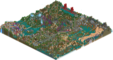
![park_2095 [NEDC] Archimedes - #1/9 (Winner)](https://www.nedesigns.com/uploads/parks/2095/aerialt1885.png)
(click logo to go to page)
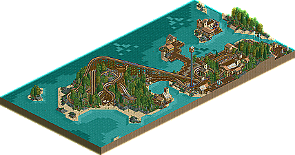
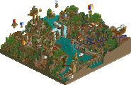
With our latest New Element Design, Cocoa puts a curse upon the site. Finally, his persistance pays off as he nabs his first accolade. Formerly known as RaPiPo, Cocoa has shown a lot of work in a short time and has made lots of progress. Several attempts at solos in both games and a couple design attempts showed his unique, detailed, style and bold color choices. As he developed his game further, he made two nice showings at the PT3 Preliminaries with Ravager in the Bonus Round and Sierra in the Wildcard Round. His Micro Madness entry, Metalworks, wasn't enough to take Kumba down in the first round but showed even further progression of his skill. Now with The Curse he not only shows that he can be successful in breaking away from his preferred style but also joins that small group of players who can build well with no custom scenery objects in RCT2. Read On ...
But in my eyes, it's not a design, because of some reasons:
- I think that the theming was good, but not enough
- you missed some details like plants under water
- I don't like the blue at the coaster
But there some positive things, too:
- nice theming (but not enough)
- good foliage
- awesome landscaping
Go on!
super awesome! i cant find anything wrong really.
It's about the coaster.. If that's alright, then all other aspects of parkmaking don't really matter imo.. In this case the theming, architecture, landscaping and all other things except the design of the coaster are not at design level, but the design itself is.. Nice flow, speed, diagonal track and air time.. I didn't really like the color scheme though..
All in all a nice coaster design! Oh, and kudo's for the peepfriendlyness,
SF
Congrats on winning the design accolade. It was close but the layout of the coaster is very well worth the accolade.
The coaster itself is fantastic, and the whole park exudes a sort of nostalgic charm. I fail to find any serious flaws in the architecture, foliage, etc. the park layout isn't the greatest, and i'm not sure why the path is at water level, but gosh darn if this isn't simply beautiful. the Curse makes me think of the Beast on an island the way guests just catch a few glimpses, and the layout is fantastic. i love the bridge segment, and the way the whole ride is hidden in the wild overgrowth looks fantastic. the little covers over all of the tunnel entrance/exits are a nice touch.
For everyone else that didn't like it, I respect your opinions but urge you to take a look at some of the older designs (Blue Thunder comes to mind)
Oh, and MFZ72, there are underground paths.
-Cocoa
Edited by Cocoa, 24 January 2009 - 02:53 PM.
this is the type of shit that makes design now, and its sad.
hurry up an give ole his props so i can calm down from seeing this bs get an accolade.
Edited by rK_, 24 January 2009 - 05:28 PM.
honestly I really liked this... I thought the atmosphere was really well done and while the architecture isn't all that amazing I thought it was some of the better ncso stuff I've seen. And major kudos for creating a refined look with the lack of options, most ncso stuff looks kinda random to me usually. Guess it's the LL player in me that really found that to make this a nice Design. The coaster was also very nice and I loved how it dominated an entire island and how it used the landscaping.
I thought this was a cool little design, and definitely worthy of the spot. At the end of the day, if it's a good ride design, it's worth the accolade. And the Curse certainly is. It's a nice, twisted and surprising layout... I particularly like how the bulk of the ride is on its own island. You used the same idea with the Top Spin; I think it works well. This general presentation is spot on - someone used the word 'tasteful' - and that somehow seems to fit this design perfectly. In a way, the non custom-scenery might add to this, but either way, the overall foliage/archy is all excellent.
One or two slight gripes: I didn't think the purple handrails looked that good on the coaster, and (this is minor) you had the ride running in Continuous Circuit Mode, when you could have easily implemented the block brakes. The other issue - and I think this is the reason why a couple of people have been negative about the design - is that it just didn't hold my attention for that long. What is there is really nice, but once you've viewed the coaster and had a look at the other rides, there's not much there. But this in no way downgrades the design-worthiness of the ride; as I say, what is there is really good, and at the end of the day, you've submitted a map with a really nice coaster design on it, so it definitely deserves the spot.