Park / Walt's Disneyland Utopia

30 Comments

  • Corkscrewed%s's Photo
    Posted Image

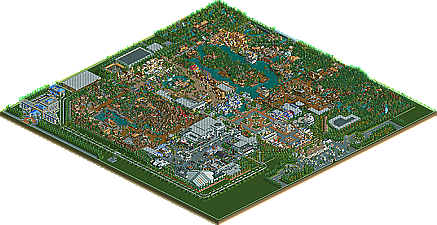
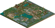
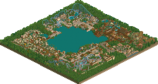
    The original Disney Mafia Godfather is back with his latest Disney installment, Walt Disney's Utopia, an excellent traditional Magic Kingdom park that mirrors the traditional hub layout but doesn't damper the quality at all...

    Discuss the park here. I'm sure Aero would love to hear your comments as well. ;)
  • chapelz%s's Photo
    Well deserved spotlight if you ask me Aero deserves one after the his last Disney park got "jewed" out of its spotlight and I feel once again its happened I feel for you aero I have always loved your Disney work.

    p.s. its 2:38 so shh corky
  • Corkscrewed%s's Photo
    Nice Kumba-style run-on. :p

    To be honest, I really struggled between deciding whether or not this should be Spot or not. A year ago, I would have said definitely. But of course, the bar is always being raised, so now I really can't say. I'd like to say that the Super Runner Up is now being elevated to "just a bar below Spotlight."

    But this is a really unbelievable park if you ask me. I adore the atmosphere, and viewing it makes all the difference. I can't emphasize that enough. Aero is just a Disney genius. He knows what to do. And I wouldn't be surprised to see this elevated to Spotlight at the next NE awards, assuming we do the whole "best runner up becomes a Spotlight" thing again. It'd be two in a row. ;)
  • Panic%s's Photo
    Hey, thanks for posting the park Cork.

    Now speaking of which^, I was wondering a while ago: whatever happened to DMA getting a Spotlight page and all?

    (I'm just an ungrateful snob :p )
  • Evil WME%s's Photo
    The upper left corner (with the dig and fire mountain) was quite possibly the best aero area yet imo. The theming was unique, and it evoked a nice atmosphere for me. The rest seemed below par though, imo. A nice park to look at once, and possibly worth of a (super) runner up, but I agree with Corky on not handing this a spotlight.
  • Micool%s's Photo
    I'm sorry I can't really comment as I can't view the parks. But aero, I think posix put it best. You really do love making parks. I have to hand it to you.
  • jon%s's Photo
    I'm not a huge fan of Disney parks but I still enjoyed looking the many details throughout. My favourite part of the park was definetly Tomorrowland. It had the most detailed architecture in the park and the Transport 2K4 was great. I liked Fire Mountain but it wouldv'e been nice to see the more traditional Splash and Thunder Mountains. Good job though. A truly deserved super runner-up.
  • Tech Artist%s's Photo
    This deserved spotlight IMO. This park had such a great atmosphere and the themeing was amazing.
    My favorite part was Fire Mountain. I really liked how the coaster ran around the mountain among pieces of burned out track, or just track that was out in general, that actully looked like they were part of the ride.
    Overall it was an awsome park and I hope it gets spotlight at the next NE awards.

    Great job Aero! :D
  • posix%s's Photo
    very nice logo, but no park overview image. also the arrangement of screens and text somehow doesn't work. i think it would be better if you invented a certain presentation layout for runner ups, super runner ups and spotlights. like, they could generally be the same but still you have to be able to see what the park won at one look. "super runner up" was merely mentioned as a small word in the text. i didn't like that.

    about the park; why didn't you get rid of the green ring? that really struck me as bad right when i opened the park. also, why not make it peep-accessable? during building you can keep it closed, but i had liked it if i could have led people in now that i'm viewing the park.
    what i've always liked about your parkmaking is that it's obvious how you build for yourself, and also, that it demonstrates how there are still people who know their job. this is what i would call a true disney park. except meretrix, no one can do them as well. at least now i can't recall anyone. so the high authentic level of your parks is something i find very impressive and admirable.
    what's important to me as well though is harmony. basically in colour schemes. i don't think your parks have much of an atmosphere and if it does, it generally feels cold. that's why i've never been sucked into your work.
    my personal highlight of the park was definitely the drooling skull. very cool and very disney.

    i hope we won't have to miss your parkmaking any time soon, aero.
  • CoasterForce%s's Photo
    First off, congrats on the Super Runner Up. As for presentation, it was good, but it would be nice to have full size screens in there (you don't need as much then, and it's also good for details), but either way, we got to see the park, so it's good. Maybe do something also, to distinguish the Super Runner Ups from the other Runner Ups?

    I'm not going to lie; I've never liked Aero's work. I appreciate it, but the style is just too messy looking. The buildings he makes have never really seemed to come together in all of the parks I've seen by him, except maybe a little bit in some parts in Wormwood.

    Anyways, on to the park. I didn't really like it too much. I've never been a big fan of Disney parks in RCT2 either, so maybe I'm biased or something. It had a few nice parts though--I liked Space Mountain and the Jungle Cruise the best. Space Mountain's building was great, and Jungle Cruise was executed perfectly. I also liked some of Fire Mountain; it had some good parts, and the burnt idea was cool.

    Besides that though, the park didn't do much for me. There were a lot of rides that screamed more of "Busch Gardens" then Disney to me, like the water coaster. A lot of the buildings were too complex, or perhaps too messy, for my liking...I donno, it's hard to explain.

    I did enjoy some parts of it though, and congrats.
  • hesaid%s's Photo
    Really liked this, it had one of my favourite Space Mountain's yet. Loved the area with The Dig and Fire Mountain, especially around the vertical drop. Just seemed very atmospheric to me, with the gates etc. Only down point, was that I thought the entrance was slightly lacking, can't really put my finger on why though!

    Nice park, and congrats!
  • Ride6%s's Photo
    Personally I couldn't get completely into any area of the park. All of it looked so excellent yet something just kept me from jumping in and feeling it. I'll need to give it a few more good looks before I can post my true opinion, however I agree with it being a Super Runner up rather than a spotlight. It's amazing to be sure, and I was shocked to see that it didn't make spotlight. Then I looked it over and somehow it struck me as not being too terribly awasome.

    I just need to give it a bit more time though, let it sink in a bit.

    ride6
  • tyandor%s's Photo

    Personally I couldn't get completely into any area of the park.  All of it looked so excellent yet something just kept me from jumping in and feeling it.  I'll need to give it a few more good looks before I can post my true opinion, however I agree with it being a Super Runner up rather than a spotlight.  It's amazing to be sure, and I was shocked to see that it didn't make spotlight.  Then I looked it over and somehow it struck me as not being too terribly awasome.

    I just need to give it a bit more time though, let it sink in a bit.

    ride6

    I have to agree with you on this and I think I know why. Aero has a certain buildingstyle. I like that style and I loved his other two rct2 park. Now he built a Disneypark and a Disneypark has a style of it's own. The two styles are in conflict. That's the reason why the park doesn't come out as it could have been. It's a good park, but not everything works together.
  • Kumba%s's Photo
    The park was pretty good. I liked main street, fire mountain, and tommarowland the best. I think the thing is that your style comes off as messy, but alot of times id think that, look closer and see it was realistic, not just messy, but in a few areas it just seemed to be a mess, or clutterd. As for spotlight or super runner-up if I had to pick id give you spotlight coz its a great park, and I think after all your hard work you probabply should have won, but this new type of super runner-up is pretty good, gota admit that.
  • aero21%s's Photo
    Thanks for all the comments! This park has been a long time comming, with a lot of "life" happening for me in the mean time. I am glad to say though, that my life is now back on track and I plan to increase my "building time". Glad to see some of you liked the park, as well as those who didn't. My building style has always had that effect on people all the way back to my first parks, i feel it is what has made me unlike anyone else in the RCT community. I would say my favorite area of the park is Main Street by the Haunted Mansion. I just loved how early concepts for the original Disneyland ride were based off Main Street, so I took that concept and ran with it. You will also find various tributes to many of the concepts and attractions for Disneyland that either came and left or might be in the future. Anyways enjoy, and I will see you at the release of Eurocinescape.
  • Corkscrewed%s's Photo
    Only 14 replies? 8@

    C'mon. This park is better than that. ;) Maybe I should disqualify it for breaking an anonymity rule. Maybe there'd be more comments then. :p


    Aero, I liked that Main Street mansion touch. Although the original had it at the end of Main Street. Understandably, that wouldn't work these days!
  • Dark-Daxter%s's Photo
    It looks great. The only disney ive been was in France, so I dont know how this is in real, but it looks fantastic. This is the best Disney Park ive seen with RCT till now.
  • natelox%s's Photo
    Corkscrewed! What did you do! This park is amazing, definetly worthy of the Spotlight title. There were only two noticable flaws; over treeing on that mountain and it looks too much like Disney's Mid America. Outside of that, the park has incredible detail, awsome composition (The hardest part of RCT, or atleast, for me) and some creativity (The train yard). The park was true to Disney in every aspect! Great job Aero, you were robbed.
  • Coaster Ed%s's Photo
    I don't know. I'm in the minority here, but this park didn't really do much for me. It's all very well done, but I still have the feeling that I've seen it before. That's not a knock on the parkmaking, it's characteristically excellent, and certainly I give you credit for being so prolific to have established such a continuous style. It's just that another Disney park with a somewhat different assortment of themes does't excite me anymore. I could never have made this park anymore, I would have gotten bored and given up half way through. So I want to be clear that I'm not critisizing the park in anyway, I think it's well done, I just don't see you stretching yourself in any way. And yeah, there's nothing saying you have to stretch yourself. I guess it goes back to all of that discussion in Posix' nspheres park topic. If you're just making the same parks over and over again, I have a tough time calling you an artist and it's only the art of RCT that gets my attention anymore.

    PS - Nice quote in your sig Nate. I wonder, do you want to be an architect? You talk about architecture more than just about anyone else here. Even Cork and he's an Architecture major.
  • Steve%s's Photo
    aero, I'm probably one of the only sole existing members who still loves Wormwood, but sadly, I cannot say the same for this park. Don't get me wrong, this park is definately worthy of what it's recieved as it's title, but I just can't bring myself to want it to be promoted to Spotlight like others have said. Who knows, though. You might just get that super-runner up promoted one more time. :D

    Great work aero. Here's to hoping your next solo venture is just as good as this one, and Wormwood, too (I don't care what you all say, I love it).