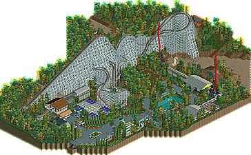
Park / Tornadus
-
 29-June 11
- Views 4,250
- Downloads 838
- Fans 0
- Comments 11
-
 45.77%(required: 65%)
 Design Submission

K0NG 65% Kumba 65% Liampie 65% posix 50% robbie92 50% That Guy 50% Loopy 45% Metropole 45% Maverix 40% prodigy 40% RMM 40% tyandor 40% JDP 35% turbin3 30% BelgianGuy 20% 45.77% -
 No fans of this park
-
 Download Park
838
-
 Objects
137
-
 Tags
Tags
![park_2848 [PT4 R5] #DATCREEKYBRIDGE](https://www.nedesigns.com/uploads/parks/2848/aerialt2501.png)
![park_4121 [H2H8 R4] North Fork Mountain Park](https://www.nedesigns.com/uploads/parks/4121/aerialt3862.png)
Keep up the good work.
Looks pretty good, but there isn't any angle where a viewer can read the eruption sign.
Rhynos Offline
Wow, you even know the number! Even though I can't catch him in my version I simply liked the name because to me, as someone who lives in the northern part of tornado alley, the name symbolizes the destruction a tornado can bring. Plus I thought it sounded cool.
To everyone else, thank you for taking the time to view, judge, and give thoughtful and helpful criticism on this. I really do appreciate all of it.
Unfortunately I have been in a building slump since just before finishing this, but I do have some things in mind to look out for.
Here's hoping you get Frontpage soon.