Park / Disneyland Park
-
 09-March 05
- Views 21,023
- Downloads 8,723
- Fans 7
- Comments 34
-
-
 76.25%(required: none)
 Gold
Gold

5dave 85% Cocoa 85% MCI 85% G Force 80% inthemanual 80% alex 75% Liampie 75% posix 70% trav 60% Dimi 0% 76.25% -
7 fans
 Fans of this park
-
 Download Park
8,723
-
 Objects
602
-
 Tags
Tags
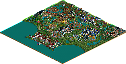
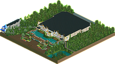
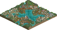
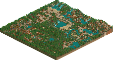
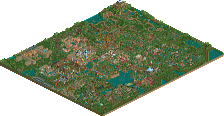
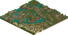
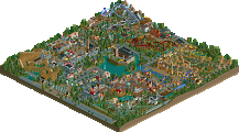
Entrance: Looked fantastic, although I don't know about the green glass canopies.
Main Street: Amazing attention to detail. Some really ncie buildings, and the right atmosphere.
Hub: Worst part of the part. The connections between all the lands are really bare, and there's nothing there. I'd have liked to have seen something more like DLP's hills, with the square trees.. On the other hand, the castle was superd - had exactly the right look.
Discoveryland: Feels really big, dead, and empty.. I do like the colours and DLP "Jules Verne" style you've used, and parts of it are amongst the nicest in the whole park. For example, Space Mountain looks really nice, and I love the really big building near Autopia. The way you used the frame supports scenery was really inspired.. The building looked very futuristic, in an old kind of way, just like DLP's tomorrowland.. It looked like an old, futuristic expo kind of building
Fantasyland: Again, really nice atmosphere. I really liked what you did with the facades for the buildings, especially Alice's. However, like someone said, Small World wasn't exactly great, although what was there was really, really great. I wasn't hugely keen on Dumbo or the Teacups in their locations, but I did like the little Alice maze.
Shadowlands: I really didn't like Bald Mountain - I thought it looked too "obscured," - maybe some turns around the outside of the building in the upper levels (eg - Splash Mountain, Dudley DoRight's..). You had some nice touches here, and it's one of the best "dark disney" styles around, but I think in general they usually don't quite work in a park.
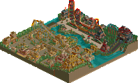
Frontierland: I'm not sure about Big Thunder.. In some ways it looks quite garish, but then again, it does kind of work... Kind of. The best that could be done, given those big orange WW blocks, I guess. Great work around the station as well.
Adventureland: Nice to see an "Agrabah," style area that isn't over-themed like many turn out. It fits in nicely to the park. The treehouse area is really nice, and everything does look great here, although the area is realy big, and lacks rides. I think an "Indiana Jones Et Le Temple Du Peril" (DLP) or "Raging Spirits" (TDS) style little minetrain coaster would look really good here.
So... I think some parts look *amazing*. Great detail, fantastic architecture, and nice atmosphere, but some parts are just too vast and empty (Discoverland, and around the hub suffer especially from this).
However, given that the game had reached its scenery limit, it's hard to see how you could have improved any of the bare areas without significantly affecting the good areas. While the good areas are really brilliant, the others do suffer due to the constraints of the game.
Well done on getting SRU - it's a really brilliant park, that deserved it
Shame not many people have WW.
(It's very easy and quick to find - especially on Gnutella).
***downloading***
We'll start where every visitor starts, at the Disneyland Hotel. Realism simply oozes from the area. I felt soaked up in the atmosphere you've set up. Every wall, every tree just seemed to belong perfectly and complimented the area in a perfect fashion. Job well done! 5/5!
Next up is Main Street. We start off totaly wrong! You chose my least favorite Station design!! :-P (done beautifuly tho). Oh well, getting over that I enter Main Street.The atmopshere is lovely, and you've put all the right details in the right places. The number of flags is not overdone (like in my park lol) and the facades do not get repetitive. This place has me totally soaked up in the Disney experience. Wonderful accomplishment. 4.5/5 (only because of the station)
From here I turned to Adventureland. I have mixed feelings on this place. On the one hand the arabian / spanish section looks to be almost perfect, yet there's something I don't like about the African area and the Jungle Cruise just feels bland. Can't quite point out what... Either way tho, the place continues to keep a realistic feel that makes this park so unique. 3.5/5
Continuing foward we arrive at Frontierland. There's something about this place (in reality aswell) that just isn't appealing to me. Maybe it's all the brown and wood, but I just don't like it. Anyhow,the buildings here look very realistic yet maintain an original feel and look. Big Thunder's station is done perfectly! I couldn't have imagined it better myself. The accuaracy with the theming is quite impressive. Job well done on the water feature, it's one of my favorite details in the park! 4/5
On we go, and we arrive at Fantasyland, my favorite area both here and in reality! I swear it feels like Disney characters walk on the paths of this game! The place is exploding with realism and the atmosphere feels veru Fantasyish. I especially love the whole Alice in Wonderland area. My only pet peeve is the "it's a small world" facade. I know you were on the verge of hitting the limit of data but I felt a bit more detail could have been placed here. This isn't enough to spoil the atmosphere in the perfect score I give this area! 5/5
Now, the Shadowlands. How disappointing. Yes it's dark, it's intimidating, it holds a whopper Mansion but it just doesn't feel good. I guess it just seems too dark (or small) for me to actually treat this as something Disney would create in real life, taking away points off realism. I was also praying you'd theme the inside of Night on Bald Mountain (why didn't you?). Strong bits are the imaginative facades and the way it's cleverly placed outside of the main hub. I admire you for trying, but it just isn't my cup of tea. 3/5
Last, but definetly not least is Discoveryland. The touches of detail here are incredibly beautiful and satisfying. By far my favourite attraction here is the least important, The Orbitron. The way you've placed it as a land icon just makes it stand out and makes it seem more than a carousel! Awesom job, one of my favourite pieces of detail in the park. Other strong areas are the whole Autopia area and the Space Mountain station. Although lacking in the attraction department this land is my second favourite area of the park. You did Disocveryland justice! Well done. 5/5
I've had the privilage of viewing the park already a few weeks ago. I was impressed then and I'm still impressed now, about a month later. This, in my opinion, is a masterpiece. This should've won spotlight. Anyway, no matter what title this park has over it, it's by far my favourite RCT2 park I've ever viewed. Scott, you're a talented lad, and I eagerly anticipate more work from you! Don't disappoint me!
Disney Freak.
Corkscrewed Offline
The ReadMe actually addresses both of these issues. They're like that for a reason.
Regarding the very large Hub:
See if ya'll can guess what I picked from Disneyland Paris and Disneyland in California.
http://forums.rct2.c...topic=15309&hl=
The park looks gorgeous ice, wonderful atmosphere..
SF
Disneyland Hotel/Entrance Area: This is one of the most realistic hotels I have ever seen in RCT. The atmosphere is incredible and has the feeling of welcoming you to a different world. The lake is greatly shaped and adds to the creativity making it the shape of Mickey's head. The color sheme is brilliant and I also like the way the guests have to take a boat to the park like the Magic Kingdom. It really makes it feel as if you are in a different world. 10/10
Main Street: First off all, the entrance to Main Street is amazingly done. The station and City Hall bring out enormous amounts of detail. Along the actual Main Street area, all of the shops all magnificently done. My only complaint (and its a small one) was that where the Walt Disney Story is, and on the other side as well, I thought that area was too skinny and I couldn't quite take in all the detail. Besides that though, I don't have one complant. Excellent Job! 9/10
Adventureland: Moving clockwise around the hub we come to Adventureland. I exceptionally like the Agrabah Bazzare. It really looks Arabian and almost like the market place from Aladdin (I wish you would have put an Aladdin ride [besides the hub and spoke] in but I know you are saving that for DisneySea).
Now we come to the African Marketplace. It feels like the entrance area at Disney's Animal Kingdom. Very detailed. Brilliant except for one thing. The waterfall located by Sunshine Tree Terrace is too bare for my liking. I think some palm shrubs or something like that would do it though. Moving along to the Jungle Cruise/Adventure Isle area, and I have to agree, that is the best fake tree I have ever seen in RCT. It just looks like it is one scenery piece. Now the Jungle Cruise I thought, could use a lot of more detailed. It seems that there is a lakc of detail compared to the rest of Adventureland. Pirates of the Carribean was good but it doesn't really scream pirate attraction too me. I know that is the way Magic Kingdom is but Pirates does involve water so maybe some water there would help. Since Adventureland was so big I graded it in sections:
-Agrabah Bazzar: 5/5
-African Marketplace: 4/5 (because of the waterfall)
-Jungle Cruise/Adventure Isle: 5/5 (even though I'm not completely feeling the Jungle Cruise, the Treehouse changes everything)
-Pirates: 5/5 (even if it doesn't look the way I want it to, it still is very detailed and looks very realistic)
Overall: 19/20
Frontierland: First off. love the watch towers in the entrance. Very original and well created. Now feel of Frontierland is amazing with all of the buildings and everything but as we move deeper into Frontierland, the atmosphere sort of fades. I was however dissapointed with Big Thunder Mountain. I thought it lacked detail and creativity. Now the Big Thunder Entrance. That is a whole nother story. That entrance is just how I would have pictured it. Amazing is all I can say. Overall good job. 7/10
Fantasyland: Here we are. The land that makes your dreams come true. Starting off with the castle. Words can't describe the maginficence and amount of detail that make this castle seem so real. This is by far the best castle in RCT. The atmosphere of Fantsyland is incredible also. I like the originality with some of the rdies like Robin Hood and Cinderella (I love those tents at the entrance to Robin Hood). However, I don't like the fact that Fantasyland is on t he very edge of the map. Also, I don't really like the design of Fantasyland. It just seems so skinny, if you know what I mean. Those two things aren't that big of a deal so I am still going to give you a 10/10 since this is still the best section in the park. 10/10
Shadowlands: A lot of people dislike this area but I love it. It has a great atmospere, like a medievil feel. The detail in the buildings are nice two. The Bald Mountain facsade is great but it could use some of the track going out side it as well. I like the originality. It could be a bit bigger though. A couple more attractions would help. On a side note, I love your Phantom Manor (it looks just like the real thing) and the little square where Moon River Tavern and The Posion Apple are. 9/10
Discoveryland: Discoverland was good but not great. Probably the thing setting on a good rating is the lack of shops on the side of the pathway and in the middle of pathways. Besides that, I absolutley love the building with the Orbitron on it at the entrace. Very good. Also Space Mountian blew me away. I like the signs in Autopia too and the Visionarium Theatre is great. Very realistic. 8/10
Now I will grade the E-Ticket rides:
-Big Thunder Mountain Railroad: 3/5 - I'm sorry but I just don't feel the atmosphere and detail in this ride as the rest of the park. The entrance however, is brilliant.
-Night on Bald Mountain: 4/5 - The fascade was awesome but I think the ride should have been themed on the inside too. Also, the drop should have been conected to the actual ride.
-Space Mountain: 5/5 - In my opinion, the best ride in the park. The fascade is great, the atmospere is great and the launch is great too.
-Jungle Cruise: 3/5 - It's decent but it should have more animals in it. Too many trees. Also maybe add some strcutures like a camp or something.
-Sleeping Beauty Castle: 5/5 - I know its not a ride but I still have to comment on it. How can I put this? AMAZING!!! I know I already said it but I'll say it again. The bloody bes castle in all of RCT. Period. End of disgustion. It has so much detail and thought and creativity put into it. Brilliant, just brilliant.
-Peter Pan/Robin Hood: 5/5 - Catches the feeling great. The fascades are great. Just great. I love the Fastpass Tents as well. Those make all the difference IMO.
-Swiss Family Robinson Treehouse: 5/5 - The best treehouse ever made in RCt (yes even better that Kumba's)! I love the walkway too. Very nice.
Overall you get a 102/115! I thought this was a great park and very furtunate I have WW and am able to view this masterpiece. Can't wait for your next park and good luck!
IOAFreak
I know it may be a big file for a read-me, but it will be worth your while because it addresses many issues mentioned above and details how I built about building the park (kind of). Plus I spent about 2 days typing it so it would be worth your while.
Thanks for the comments/suggestions and keep them coming. I'm always looking for ways to harness the Disney atmosphere even better.
danwxm88 Offline
I don't know if i am being stupid, why are people not coming into the park?