Park / Disneyland Park
-
 09-March 05
- Views 22,516
- Downloads 8,965
- Fans 8
- Comments 34
-

-
 76.25%(required: none)
 Gold
Gold

5dave 85% Cocoa 85% MCI 85% G Force 80% inthemanual 80% alex 75% Liampie 75% posix 70% trav 60% Dimi 0% 76.25% -
8 fans
 Fans of this park
-
 Download Park
8,965
-
 Objects
602
-
 Tags
Tags
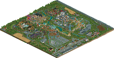
![park_3185 [MM2014 R2] Sands of Time](https://www.nedesigns.com/uploads/parks/3185/aerialt2821.png)
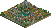
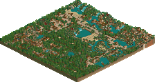
Corkscrewed Offline
Those of you who actually have WW can post your comments. And those who don't can beg Iceman for a personal tour.
Congratulations, Scott. Knew it would win something!
Damn WW.
From the screens it does look cool, but i dont have WW so i cant veiw it.
But well done anyway.
it was quite a nice park. nothing i will remember but not bad. i liked the own style that showed and the high realism level. it was also a convincing disney park. well done on that.
i missed the indiana jones coaster and thought there was too much water and too many paths. also, why no entrance? i take it people are supposed to arrive by ship?
Anyway. Congrats on the park Ice. I felt priviledged to be one of the testers for such a highly anticipated park. Disney-wise, the park is extremely well-done; near flawless. But there's something about it that just didn't hold my attention for very long. I think it had to do with lack of detail & what I can only describe as "over-tranquility" in some areas. There wasn't one standout area for me either, but if I had to choose, it would be Adventureland. I think Super-Runner Up suits this park well. Spotlight, despite the many deserving qualities, would have sparked a lot of controversy IMO. The fact that the park requires WW is a big let down for me, but understandable based on how old it is. A masterpiece in the Disney world, but just shy of a NE masterpiece (aka Spotlight).
On a side note.....I am confused (for sooooo many reasons)....is this park not a Spotlight?
Maybe I read wrong...I thought it DID get Spotlight.
Maybe I should pay attention to the title page, hmm?
edit: doh! There it is in plain english....march super runner up.
Congrats man.
So pristine, clean, and executed very well. Congrats, dude.
I'm working on that as I type this. Expect the full walkthrough up by this weekend.
Regarding Indiana Jones, I decided to leave Indy for DisneySea instead since I felt that he would fit in better there. The Magic Kingdom doesn't seem right for Star Tours or Indy IMO. So I axed that ride. I didn't have enough room anyway.
Originally, there was supposed to be a monorail passing in front of the hotel and going across the lake. I hit the map data limit while constructing its track so that couldn't be completed either. The monorail station is the structure attached to the front of the Disneyland Hotel's bottom left wing. And there's a ferry, too.
My sig should indicate what I intend to do next.
Thanks. You know, if you ever get back into RCT2, I'll be hangin' around.
I just wanted to point out that Corkscrewed was right about Discoveryland being the worst area. I rushed it, and with the Disneyland 50th Edition, I will fix it by turning it into Tomorrowland. And for the love of God why did you put a screen of my hideous Astronomers Club on the page?
PBJ Offline
but drom the screens it looks nice! so great job!
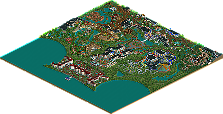
Lake Mickey: Awsome. I really like how you got it to look like the Mickey's ears. On the map, it looks so smooth with no jagged edges. Great job.
Main Street: I really liked the life like realism to this. The buildings were well constructed as well. Great job.
Discoveryland: While the buildings were nice, most of this area just seemed empty to me and there was way to much path. I think there could have been more buildings and instead of using those tan walls, you should have put some steel walls instead. Space Mountain as very nice though.
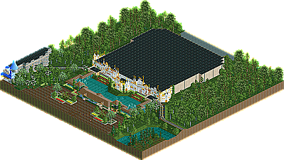
Sleeping Beauty's Castle: Awsome! I really like how this was constructed. Great job!
Fantasyland: Most of the buildings here were nice but Small World was just not that good. Small World looked so small and plain. I think you could have added more detail to this attraction. Other than that, great work on the rest of Fantasyland.
The Shadowlands: Well, you can't get more dark disney than this, sept for Phantasia. Night On Bald Mountain was pretty cool. This area reminded me of Meretrix's.
FrontierLand: You pulled this area of very well. Some of the buildings were a bit plain but those were only a few.
Big Thunder Mountain looked really small, it didn't really look like a mountain at all. I think when you redo this you should maybe add and/or rearrange some of the rocks here.
Adventureland: This was my favorite area. You really pulled the theme off well. The Arabain Marketplace awsome, POTC was looked really good and actully look like a pirate theme, and the whole jungle area was awsome as well. Great job!
Overall this park was awsome. You really gave a Disney feeling throughout the park. I think what stopped this park from becoming spotlight was some of the areas were a little small and parts of areas like Discovery needed more work. Great job on finally getting this finished.
I got a WW disk but lost it somewhere... so untill I find it I can't look, but if I do i'll be sure to give you some feedback.
Also Cork can you please post a spotlight? shit if are parks aint up to par, post AoE or DMA.
Corkscrewed Offline
I was going by what Iris told me. Since I don't have WW, all my info had to come from him.
Also, it WAS Sleeping Beauty's Castle, right?
That said, Iris and I had a LOOOOOOOONNNNNNG discussion on whether this should be Spotlight or SRU. Ultimately, based on what I observed and what Iris noted, the main reasons were as follows:
- Treeing got pretty bad at places. Especially where there was not much architecture to really hide it, the vegetation could be somewhat hideious
- The rides seemed under par. BTMRR was pretty bizarre and didn't suit my tastes at all, and I think that a lot of the other rides were either a bit lackluster or not even implemented, right?
- There were places that didn't completely draw me in. And a Spotlight should pretty much be consistent. Discoveryland was one example, and there were spots of other parts.
- Basically, when you got away from the architecture, the park lagged a little bit. I didn't see much to indicate the same strength in other areas.
Now, these are rather nitpicky reasons, but remember that we're elevating the Spotlight like crazy. And admittedly, had I had WW and seen it in-game, I might have judged a bit differently, but SRU is ultimately what we decided upon. And personally, I think that's pretty good, because nowadays, even our SRU's are like 10 or 50 times better than other sites' "best parks."