Park / Blood Gulch
-
 20-June 11
- Views 2,414
- Downloads 569
- Fans 0
- Comments 12
-
 5.77%(required: 65%)
 Design Submission

That Guy 25% Loopy 20% 5dave 10% K0NG 10% Kumba 10% BelgianGuy 5% Metropole 5% turbin3 5% tyandor 5% wheres_walto 5% geewhzz 0% JDP 0% Maverix 0% prodigy 0% RMM 0% 5.77% -
 No fans of this park
-
 Download Park
569
-
 Objects
67
-
 Tags
Tags
more detailed , be creative.
Anyway...take some time and refine your skills. You have a long way to go before you should even consider submitting another park for accolade.
Why would you submit this?
Post some topics in the AD, practice before you submit, use custom scenery, take some inspiration RCDB, SFSF, SFC, MRR, Kumba (design, not parkmaker), etc. (for realism) or Kumba/Levis. (for fantasy)
Also, just in case you didn't already know, don't use TT or WW. They're just bad.
Instead of the only 'you suck, practice more!', that are usually given.
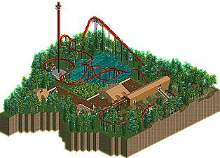
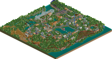
The buildings:
Underdetailed! Cs will improve it a lot, I think.
Your walls have no windows or anything. That entrance building is way too skinny.
That small building near the merry-go-round, is actually a better start but it lacks attention.
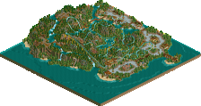
The foliage:
The lake looks really weird, there isn't any level of land lowering on the side of it.
It seems rather random and forced because a lot of parks have a lake.
The trees around it seem like a filler. Which hadn't been bad but these just lack ground texture, try placing bushes underneath it and differ theg round types.
The observation tower:
It's underthemed !
The entrance (queue):
An entrance (queue) should be clear to the peepz! Everyone needs to know how to enter that goddarn coaster they wanna ride so friggin bad !
You placed it to the exit as if those peeps first had to discover how to get out of it before going in. Your queue had fitted better was it placed near your park square.
That hospital building thing doesn't fit an exit either. It makes it look as if everyone became sick of that ride.
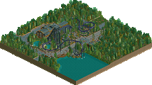
The layout:
It wasn't all bad, but most of it seemed forced! That curve around the observation tower which made the way near the exit consist of mostly just long lines of track which is even more boring since it's losing speed.
Hope your next submission will be better as this is just not good.
It's actually also a shame that this is way worse than 'The Lands' IMO.
The layout was pretty bad, architecture was too, foliage was just trees basically, and I havent downloaded this yet. Probably arent going to tho...
Anyways, GWL, none of us are trying to discourage you from playing the game as harsh as some of this may seem. We want you to get better and imporve so that youre miles ahead of stuff like this when you go to submit your next parks.
inVersed Offline
Same here. If it actually was, the name would have been perfect.
what would be the point of that?
how about if you spend 5 minutes on a park, don't submit it?
That would be pointless like Cole said. First of all, who would really want to download a park that had little effort. I mean, I'd rather view an accolade or atleast a park that has some effort put into it. Usually when I see a park with a really low score, chances are the person submitted it for points.
I'm so sick of seeing this: