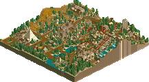
Park / Dimension X

Park_1965 Dimension X

13 Comments

  • Comment System%s's Photo
  • musicman%s's Photo
    Your layouts are definitely improving, but the colors and architecture are really quite painful to look at
  • rct2isboss%s's Photo
    ^ik one this one it sucked a lot but i think it deserved a ten percent
  • wildroller%s's Photo
    You know your goal should be 65%. if your goal is a 10% coaster you can probably save the accolade members time by not submitting it as a competitive park and making them download and rate this.
  • Liampie%s's Photo
    Spend more than a few minutes on a design... The ground textures show how rushed this was.
  • tdub96%s's Photo
    If your goal was ten percent, you should not have even considered submitting it...
  • SSSammy%s's Photo
    why the fuck did you submit this. seriously.
  • GigaG%s's Photo
    Don't make fun of the guy. He is improving compared to his previous submission. My suggestions-

    Keep your layouts somehow realistic (as in, they would be considered safe in real life).

    Don't put so many ground textures in one area.

    Use more scenery.
  • Luketh%s's Photo
    At LEAST make it look finished by blacking out ground tiles... I thought somebody had submitted an unfinished design competitively and was about to slap-a-bitch until I saw you made it...

    And yeah, the key is TIME for finishing things with quality, sir.
  • Metropole%s's Photo
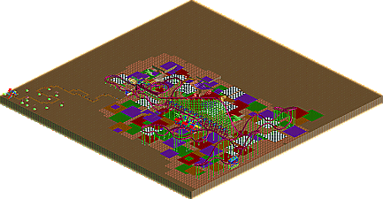
    This was awful...just awful. So this Dimension X...it seems like it's an alternate dimension that you have created, a world crafted deep from within your mind and portrayed artistically into rollercoaster tycoon 2. And in this world, the terrain is completely flat with weird land textures conveniently in the exact shape of the RCT land tile placer. A land where these multi-coloured grid tile floors randomly spurt out some kind of liquid. A land where green circles sprout up, serving no purpose whatsoever.

    The 5% was for the layout, which was at least passable.
  • GameWorldLeader%s's Photo
    woah, i knew i shouldn't have taking the lsd before playing rct2
  • highroll3r%s's Photo
    Another sorry sight. Im fed up of these types of releases so i cant immagine how the panelists feel. There should be a system where the uploader can only upload a good submission, like having to post screens to the panelists before its accepted to see the quality. If its shit then it should be rejected. Id say submissions of 40% and higher are accepted. It fucking does my nut seing effortless crap. This is NE for fuck sake, the best rct site ever so id say to people who upload weak, terrible and shit submission to release theire shit elsewhere! RctBoss im not targeting you, its just ive come to a point where im annoyed about all these lame submissions. I look on new posts and find a release, so i click it then i wish i didnt. I really cant understand why people think theire submissions are worthy of uploading when theres clearly no effort, quality and charm about them. Its not hard to see on the front page that releases like this just dont and cant compare to the standard of NE. Now let me give a little advice. Firstly rather than submit unworthy accolades just post screens in the dump for feedback to improve them. Thats what most members do! Secondly take your time, theres no rush. Ive been working on a solo park for a year now and i still dont intend to release it until im sure its worthy. Who cares about the rankings? I dont! I think people upload rushed parks and coasters just to climb the ladder of rankings. Lastly i recommend peoples goals to be as high as possible. A 10% aim is pointless. You shouldnt even consider releasing anything lower than 40% imo. Realistically people should aim for 65% with designs but 40% shows effort. I really cant see how people are going to improve by submitting garbage! The way to improve imo is to have released something thats just short of an accolade, so next time you would be sure to take on advice, crit and recommendations to ensure a better score next time. I didnt want to inforce such negative feedback but its the only way i feel to make people realise that these submissions arnt good enough, even to be uploaded.
  • wildroller%s's Photo
    The best option is to make people who score less than say 30-40% to wait 30 days before submitting something else. Make them have a reason to try to submit something worth the panelists time judging!
  • Flap%s's Photo
    Practise makes Result.

    Maybey you should practise a bit more on theming, Layout, and everyhting.
    If you keep trying you going to improve yourself automaticly.

    Sorry for my bad english.