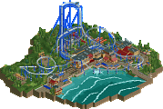
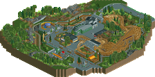
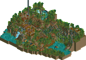
Park / The Lands

Park_1964 The Lands

8 Comments

  • Comment System%s's Photo
  • rct2isboss%s's Photo
    wow looks kind of wild... y did it only get 13.46 percent?
  • geewhzz%s's Photo
    because it's just a cut above Patriot Fields
  • rct2isboss%s's Photo
    ^ haha true
  • musicman%s's Photo
    ^ :???:

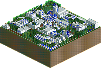
    The architecture was interesting, and I like the general concept and the element at the beginning of Sky Rider. Unfortunately, the layouts were way too short (generally min 2200 ft for anything other than a shuttle coaster or a kiddie coaster). You also need to use more than two colors (you can use 1-3 main colors, and others as accents), experiment more with terraforming and land textures, and include rides other than coasters.
  • That Guy%s's Photo
    I liked this quite a bit, it reminded me a lot of my old ncso work. However, there's so much more to a park than just buildings and a couple of coasters.
  • GigaG%s's Photo
    I kinda like the architecture, but you look like your coasters need some major work.
  • Metropole%s's Photo
    This needed a lot more depth. More than 2 colours would be a start...but just a start. Your architecture needs to serve purpose other than being a building that a coaster goes near/through, and there really shouldn't be grass inside a building. Your coasters, as mentioned, were too short and even their close proximity to the architecture couldn't redeem that fact that they weren't the designs were kinda weak. It is good to see you trying to add interest to your coasters with these near miss moments though. Better luck next time.
  • GameWorldLeader%s's Photo
    i know the coasters where mainly crap, i wanted to focus on the artitecture and work it that way. This was just a test to see how this would go. And I find it awesome that that guy voted a chunk above the rest :) your awesome wrath and your scenery style will never die!