Park / Son of Kumba
-
 07-July 11
- Views 22,577
- Downloads 1,563
- Fans 1
- Comments 50
-

-
 76.15%(required: 65%)
 Design

prodigy 90% RCTCA 90% robbie92 85% BelgianGuy 80% Casimir 80% geewhzz 80% Maverix 80% Roomie 80% Levis 75% Liampie 75% Loopy 70% Wicksteed 70% Metropole 65% RMM 60% JDP 40% 76.15% -
1 fan
 Fans of this park
-
 Full-Size Map
-
 Download Park
1,563
-
 Objects
411
-
 Tags
Tags
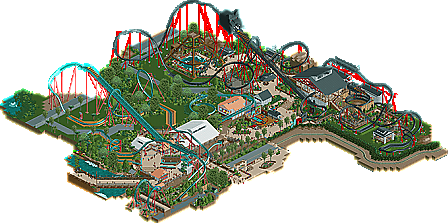
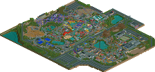
![park_4102 [H2H8 R3] Castles-n-Coasters](https://www.nedesigns.com/uploads/parks/4102/aerialt3848.png)
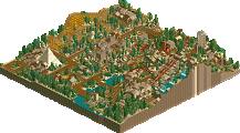
Kumba, from the start of construction I advised you to never lose sight of what made Kumba so great, that being the original vision/intention of it: to recreate a roller coaster at BGT. The entire 'sequel' idea was good, as sequels can be, yet you ignored the fact that Kumba was ultra-realistic as it was an actual coaster at an actual park with actual characteristics. You simply took what was good about the first one and blew it up to new proportions in the second.
Kumba, you are the Michael Bay of RCT.
The coaster itself blew any believability away as it didn't even fit the characteristics of a B&M stand-up. When you first started work on this, you and I spoke over AIM and (even if you don't recall this) I laid down some of the characteristics of a stand-up. I must have skipped over the launch bit as I didn't think even YOU would have though to include one.
That alone threw off the pacing of the ride, and then you covered it up with a fucking cat?! Strike number two! That alone just about blew this entire thing for me, as you have so much hard-core RCT building going on, and then a huge balloon of a cat face on the lift hill. Did you think that that looked good?
Other obnoxious bits of parkmaking appeared with the block that was the cave, one of the most useless bit of 'theming' in the design (seriously, do you even consider feedback?). The custom flat killed the realism, as even if it were based on a real ride concept it looked as if it were straight out of DRC. Maybe you could have saved it by include some bits of real-life operating equipment? Something needed to be there that this could in fact happen in real life.
The station was impressive, yet dominated that portion of the map when it didnt need to. Kumba's station was so nice as it fit into the area, it complimented it. SoK's stole the show, in a bad way. There's no need to include full sized switchback in a station, that's what the queue area is for.. which itself could have used work and shows that you have little idea what queue/ride interaction is. There was a moment where the ride does a helix right by the queue, allowing for an impressive view for the guests who are nearing the castl- err, station. Yet, you block it with a fence? Why? You could have at least given them some signage to read on such fence!
Kumba, when you first released your namesake I was very ecstatic to see what other jewels of realism you could bring to us. After what I see now, I don't want you to ever come back to the genre. Fantasy is where you belong.
Anyway, I've got to say that it's right up my street. The layout up to the loop round the lift is ridiculously cool - it gets a bit too windy and twisty for me after that by the looks of it from the overview but I can't open this in game right now as don't have an XP machine on the go right now.
I love how it's on the same map as the original as well - the slightly different style creates an interesting juxtaposition. Maybe you should build a grandchild of Kumba which is just your standard insane fantasy style right next to it haha!
I like the helix to finish of the course too, nice touch.
Hadn't it been that you attached Kumba to it.
Kumba did not fit with your design,
the simplicity elegance and flawless realism are pretty much disturbed by this overblowing son of him.
SoK is really nice but the style doesn't match with Kumba.
This one is overkilled with all those (needed) supports and that immense overpathing track.
There are tons of things that I love about this though,
The 3-point shootout is just amazing!
The cat-head near the entrance is really nice
I like that custom flat though I have no idea what it's supposed to be/resemble.
Congratulations on the design!
I'd like to see this one and Kumba seperated though, a map without kumba and just this one.
It just killed everything that Kumba acchieved for you...
The lay-out looked great from above, but looking at it kinda destroyed if for me. A stand-up coaster with a launch section could work, but not with Kumba next to it. The cat which covers this section was waaaay too simple. I just know you are capable of creating much better looking sculptures.
I felt that this launch section also destroyed the lay-out a bit. It went way too fast during the first half of the ride. I also was not really a fan of the ''cave?''. Again, I know you can do better and I felt it was a bit random here. However, I did really like the new object for supporting loops.
For the part after the midcourse brake I had mixed feelings as well. The lay-out was good here, as was the pacing, but I think this area was a bit too cramped. There were too many things to look at, while other areas felt a bit bare. The station was OK I guess, but I felt it was an adapted version of Kumba's station. The queue was nice, but I did not really like the fencing here.
The two other flat rides were nice, but again: not next to Kumba.
Overall I think this deserved a design, but it could have been a bit better. Next time, please just put it on a separate map. Congrats on another design.
Oh, forgot to mention: sick logo!
The layout had some really nice points, but a lot of it was ruined by the pacing; it just went way too fast through the layout. I think it was Blitz who said that a layout needs moments of tension and release, or bursts of excitement and breathers. A launched coaster like a rocket coaster is certainly an exception to that, but this type of layout should conform in some way, with the speedy parts being amplified by the inclusion of slower, drawn out parts, like Hulk's helix-type thing around its hill. That being said, I loved the post-MCBR layout itself, even if it was too fast.
That cat... well, yeah... Not really my cup of tea, and it really brought the design down tbh, in part to its size and the way it interacted w/ everything. You go to these great lengths for realism, creating new realistic objects and supports, and you blow it with the floating cat head. If it was smaller and shaped better, it may work, but atm, it's a detriment.
The surrounding details are all nice. I LOVE the 3-point challenge, especially it being operable. The foliage was meh in a sense that it's your general jungle bush bonanza. I understand that you like bush, but you gotta add some trees or grasses or something new! Kumba had great foliage, and considering SoK is right next to it, I'm surprised it wasn't carried over.
All I can say is that, yeah, I thought this was design worthy, for the details and the effort involved. However, I agree with nin that a lot of what was suggested to you over AIM or the forums was ignored. I can't say this is your best work, as I feel it's a cop-out to both realism and your DRC-style fantasy, and isn't as successful as either.
Deano, even the most experienced player should be able to consider advice, especially from the younger guns. I understand that Kumba could've chosen to ignore it, but it's also okay that, if he asks for advice, he really should consider it.
That is correct. With the issues with the pacing, the stupid cat, foliage etc mean, that upon another look, I would not have scored it as a design winner. In my first post I said the reason I did score this as a design was because of some of the skill required. I didn't say I still believed it to be design worthy.
There were a few things I liked though; the little basketball thing was good, and I liked the queueline and the SoK lettering. The netting was a nice touch too, and although truly awful in places, for the most part the foliage was good, just a little too sparse.
I really hope this isn't your new style anyway, I much much much prefer Bayfront and DRC to this kinda stuff.
this park is worth of the accolade. but, something missed from you..
And I could care less if this is one of the most experienced rct2 players or not. It is because he is one of the most experienced that he deserves what I, along with others, have been telling him. It's crap park making, and just shows Kumba milking what he thought made the original so great, but obviously he was very wrong.
inVersed Offline
Had I not been a lazy ass an actually voted for this design I would have given it a 80%
Edit- i just thought of something. It's been a while since I have been to BGT, so I am not sure if you did this, but it would have been cool if you would have expanded your recreation of the park and integrated the Son of Kumba coaster its real surroundings. Like play it as BGT added another coaster to the line up in this area of the park. It seems like you started with a blank pallet and built whatever you felt like instead of considering what is actually here in real life.
Its got that crammed full of brown and green feel in areas along with your better realistic style.A total style clash.
Remove the cat heads,ugly flat ride,random cave and trim down the jungle bushes and its much better