Park / Whiplash
-
 06-June 11
- Views 2,253
- Downloads 624
- Fans 0
- Comments 14
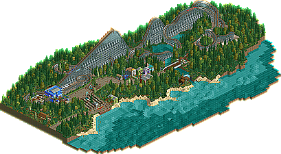
-
 42.31%(required: 65%)
 Design Submission

Roomie 65% geewhzz 50% Loopy 50% That Guy 50% Levis 45% Metropole 45% robbie92 45% BelgianGuy 40% JDP 40% Liampie 40% Maverix 40% prodigy 40% wheres_walto 40% 5dave 25% nin 20% 42.31% -
 No fans of this park
-
 Download Park
624
-
 Objects
133
-
 Tags
Tags
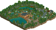
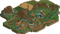
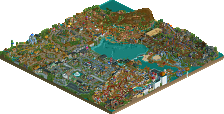
1. I don't like the location of the topspin, too much of a dead end. This was actually a small problem with the entire map.
2. The foliage may be slightly overdone, you don't nessessarily need a tree or shrub on every single square, especially right next to the coaster and on the beaches.
I love this coaster hope to seemore of you.
what where nin and dave5 thinking?
I dont care of what Dave and nin are thinking, because they wont justify there Votes.
Thanks to geewhz for beeing one of two voters to answer this one and thanks to metropole for being the only voter who gave me critic on this one.
thanks to musicman too
I enjoyed the layout, and looking back, I guess my vote was a notch or two low.
But that's it. That was the only thing going for it, the surroundings needed a bit more work to thoroughly impress me. NCSO doesn't have to be simple, colorfully cubed buildings and simple foliage schemes. Charm can only get you so far.
Well, by rctisboss you can expect everything, he recoloured my african torpic theme into a purple tropic african thematisation things with an themetisised GIB which has the Dejavu colours in African theme,
So i don't really take this reaction too weird from this user, but i do my best to tell him that.