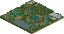
Park / Superior Shores Adventure Park

Park_1955 Superior Shores Adventure Park

4 Comments

  • Comment System%s's Photo
  • Metropole%s's Photo
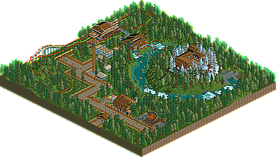
    Good effort CC9. I like that a certain amount of thought was put into this one (judging by the readme). I just don't think the excecution was there. The coasters did not race enough, and one of them had a really slow section at the end while the other sped ahead. The alpine looking hill idea was a good one, but it just didn't look natural. It seemed rather forced and a bit too even if you understand what I'm saying. I like the idea of having a chairlift going up there, but I think it would need to be a bit bigger/taller to warrant that, and the snow on top. Good job on hacking the rapids but it just needed a bit more to it than just going round in a circle to capture the viewer's (and rider's) interest.

    Keep going and you will improve.
  • Dotrobot%s's Photo
    And also I think it'll benefit you greatly if you got some diagonal path pieces. The 90 degree path turns seemed very blocky and unrealistic.

    The concept was very very nice and you're getting there with the skills
  • chorkiel%s's Photo
    I liked this thing! But it looked more as if it's a part of a widespread amusement park rather than being a park on it's own.
    Well job !
  • CoasterCreator9%s's Photo

    Good effort CC9. I like that a certain amount of thought was put into this one (judging by the readme). I just don't think the excecution was there. The coasters did not race enough, and one of them had a really slow section at the end while the other sped ahead. The alpine looking hill idea was a good one, but it just didn't look natural. It seemed rather forced and a bit too even if you understand what I'm saying. I like the idea of having a chairlift going up there, but I think it would need to be a bit bigger/taller to warrant that, and the snow on top. Good job on hacking the rapids but it just needed a bit more to it than just going round in a circle to capture the viewer's (and rider's) interest.

    Keep going and you will improve.


    Yeah, I perfectly understand all these issues, I just wish I had more room.. (I originally thought the map was BIGGER.)

    And also I think it'll benefit you greatly if you got some diagonal path pieces. The 90 degree path turns seemed very blocky and unrealistic.

    The concept was very very nice and you're getting there with the skills


    I liked this thing! But it looked more as if it's a part of a widespread amusement park rather than being a park on it's own.
    Well job !


    Well, I thought the map had been a bit bigger than I remembered, but I digress. :lol:

    Anyway, I'm pleasantly suprised by these comments, thanks guys. :)

    (By the way, you can expect a big park from me sometime this summer! It's already a WIP.)
  • 29.23%(required: 50%)  Spotlight Submission
    Percentage of vote: 29.23%
    Levis 45%
    K0NG 40%
    Milo 40%
    prodigy 35%
    Roomie 35%
    That Guy 35%
    CedarPoint6 30%
    Maverix 30%
    5dave 25%
    geewhzz 25%
    turbin3 25%
    BelgianGuy 20%
    inVersed 20%
    Metropole 20%
    tyandor 20%
    29.23%
  • No fans of this park
  • Download Park 387
  • Objects 135
  • Tags