Park / Tussaud's Boscastle Heights
-
 13-October 05
- Views 6,759
- Downloads 3,066
- Fans 2
- Comments 26
-

-
 77.50%(required: none)
 Gold
Gold

Cocoa 80% Fisch 80% Liampie 80% MCI 80% Stoksy 80% Sulakke 80% 5dave 75% posix 75% alex 70% inthemanual 65% 77.50% -
2 fans
 Fans of this park
-
 Full-Size Map
-
 Download Park
3,066
-
 Objects
474
-
 Tags
Tags
Richie Offline
Corkscrewed Offline
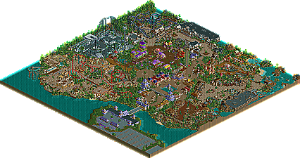
My opinions: this park was very closet to SRU for me, but half of the areas didn't really match up to what I would have liked. Entry area, the Kumba area, and the area around Nemesis wasn't really super astounding or unique in my eyes. It was definitely good, but not quite at the level. Lost Kingdom and the Land of the Dinosaur were my favorites. Those two exuded some great charm. Dimension X was also solid but not astounding. Kinda looked like something I've seen from an Aero park.
Coaster were solid, but you had all of like... four of them.
And really, the thing that almost cannot be described is how it kinda felt like that park just let up in areas, at least to me. I can't quite put my hand on it... but it was enough to knock it down the perch.
That's my opinion, of course, and I'm sure Iris can harp in once he gets back from his trip to Orlando for HHN. This was definitely close, but I did not think it had that SRU feel. Thanks for respecting my opinion, though, even if you don't agree.
Either that or a few months from now I'll secretly go in and change it to a SRU format.
Yay
X250: Thanks buddy. While I disagree that there are no flaws, I am very pleased with the outcome of the park. Also, thanks again for doing the guest spot.
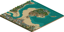
Trav: Credit should go to Richie for that entrance island. Really realistic and great work. The Nemesis area was probably my favourite too
Tyandor: Thanks ty. I never realistically thought it would get spotlight for the reason you stated, the size, but I wouldn't have thought that it contributed in holding it back from a SRU. Ah well.
Ride6: Wow, I'm pleasantly surprised considering you have never been a great fan of my work. I agree with you to an extent on that entrance area. There are a few changes I would have made given more time, and it did come off a little messy in places. I wouldn't rank my colour usage amongst those, yet I feel that it is one of my stronger points in parkmaking. Glad you enjoyed the park. Thanks
Richie: Hehe, thanks
Geoff: Thanks man. As I mentioned, I would increase the size if I were to build it again, but hey, what can you do?
Kumba: Another one I'm surprised at. I didn't think you would enjoy the park actually. Not sure why. The Ribena Ranch was always going to be a hit or miss area for people. I think those that know Tussaud's well would probably "get" this area more than those that don't. It's the first area I built, and I still enjoy it. I don't think I would really change anything if I had the oppertunity. Thanks alot Kumba, glad you enjoyed it
InVersed: Thanks.
cg?: Argh. Schoolboy error. Though I don't recall forgetting to restore clearances, it is most likely my fault. That's what you get when you're rushing to finish in the last week. Thanks
HandyAndy: o...k
Evil: I assume you're referring to the theming of the building insides. Having the 2 versions was the only way I could portray it really. Having just the inside one would give off a sense of incompleteness as if I couldn't finish the buildings. Originally, I was going to have the roofless version be with none of the buildings having rooves and all of them themed inside, but that was a little over ambitious.
JBruckner: Why?
Xenon: I disagree. The entrance island is awesome I think (Richie did the building and pathways). I think it's probably the most realistic aspect of the park. Perhaps I could have done a little more with the car park though. As for the treeing around it. I could have loaded it with dense foliage and covered in trees, but I wanted it more open and realistic. Anyway, glad you enjoyed the park.
Jkay: Yeah, purple rooving was always going to be controversial, but I like it. Regarding Cleopatra, although the layout may seem simple and dull, it's pretty much a recreation of Tidal Wave with different theming. I probably would have done more with it given some more space. Interesting to see how you enjoyed Dimension X most in the park. Thought X's guest spot was great and the dive machine was pretty nifty if I do say so myself. An Invert was a must in the park to be honest, and I'd probably say it is what I am most proud of. I'd say the landscaping does the theming for it really. Credit should go to Richie for the facade of Prof Burp's, though I am still fond of the idea of the ride. With skull cavern, there is a kinda cavern aspect of it (as it is built into the side of some land on the far right of the building) but I get you. As for the future, it's unlikely at the moment, but who knows. Thanks a load Jkay.
Murdock: I disagree on the too colourful comment. I really don't think it is too colourful to be realistic. Eg. http://www.towerstim...d_gallopers.jpg - Alton Towers. Thanks though.
Jacko: Thanks Jacko. I'm guessing size was the big factor when awarding this runner up. Regrets.
Corkscrewed Yes, I used probably 85% of the space. But let's reflect a second. The 85% I did use was totally crammed with rides, theming and architecture. I could have made a larger park and just seperated all the areas by water which you see in a lot of parks right now. In honesty, I find that less realistic, and in a way, the easy way out. I had my areas really close together with just a building or trees seperating them. I'd say that while my park only utilized about 85% of a reasonably small map, other parks fill even less as they are divided by water etc. on a larger map. But yeah, the park was pretty small, but if I were the judge, I wouldn't have stopped it being an SRU for that reason, though I probably would a spotlight. I diasgree with you calling Ribena Ranch the Kumba area. I find it completely different to Kumba's colouring work. But there we go
Metro