Park / Tussaud's Boscastle Heights
-
 13-October 05
- Views 6,333
- Downloads 2,983
- Fans 2
- Comments 26
-
-
 77.50%(required: none)
 Gold
Gold

Cocoa 80% Fisch 80% Liampie 80% MCI 80% Stoksy 80% Sulakke 80% 5dave 75% posix 75% alex 70% inthemanual 65% 77.50% -
2 fans
 Fans of this park
-
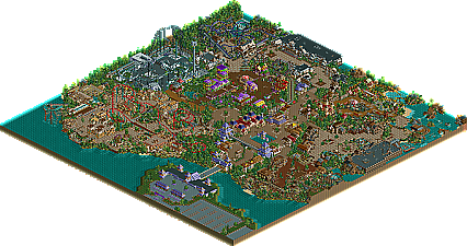
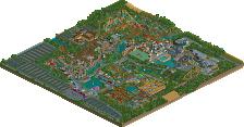
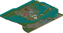
 Full-Size Map
-
 Download Park
2,983
-
 Objects
474
-
 Tags
Tags
Corkscrewed Offline
Tussaud's Boscastle Heights
Discuss this traditional but charming park here.
Absolutaly loved this Metro, it was great fun to look around (and build in), every little convenient detail- it must have taken you a long time. It really resembles a Tussauds park very well, i could not spot any flaws with this park whatsoever. Any in my opinion, this deserved higher than runner-up, maybe SRU? Spotlight at a push. Theres something about it i really like, it probably places in my top 10 fav rct2 parks.
Good job.
-X-
This park might not have had the best rct work ever, but it's very fun to look at and it's a very enjoyable park. I really loved it.
Good work Metro
*sigh*
ride6
Richie Offline
I enjoyed every bit of this park. Metro, I've already told you my thoughts on most of this, so I won't jabber too much.
he spooky area is just fantastic. I think the facades there are the best in the park. Nemesis Ethreal made my day, and probably my weekend. It has a lovely layout, and is perfectly set into the landscape. I can't get enough of it.
IMO the only thing that's holding down this park is it's size. Too small, even for me. The quality of the rides, architecture, and atmosphere are there, but everything just needs more space to flourish.
Well, congrats Metro. Superb work!
The Good:
- Prof Burp's Zombie Invasion, hell either of the indoor rides, both were awsome.
- The buildings in the Giga's area
- The Half loop on the B&M
- The B&M Invert
- The railroad path crossings
- X250's custom blast ride
The Bad
- That colorful area, now I know how people can hate my color use
- All those steap rooves, im not sure what Toon was on when he made them, they look like shit
Overall a really great park Metro, congreats
inVersed Offline
Edit-- Woohoo! 1000 post. lol.
Otherwise, it looks nice, but I think Runnerup is about right.
Then you obviously don't have any respect for the honor system. But of course theme parks are aware that there are people like that, they're not stupid. It's never that easy by the way.
you got into the park. You'd have to be a pretty good swimmer, but you could sneak around the long way far from the authorities and sneak onto land, go to the back of the park and then take out a hat out of the inside of your shirt. You flip the water out of your hat, sneak in when nobody's looking and throw your hat into the water, pretending that a friend of yours got mad, giving the public a big schpeel and then voila, you've gotten into the park without giving the company a dime.
Okay, I'm just kidding. It's technically possible, but highly unlikely. You're pretty much right.
First, I'll note that I had to restore clearances when I first opened the park. Don't know if that was a fluke with my system or what.
But, here's my review by ride and/or area:
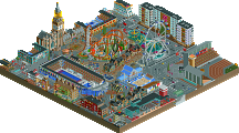
Entrance structure / main street - High quality stuff, although there's something that distracted me which was mainly the roofs and the pre-entrance building. I don't know what it is about those sloped shake roofs, but they just don't seem right to me and purple just didn't fit. However, I really enjoyed this more as I went further in and think it makes a good centerpiece of your park. Plenty of details to explore.
Ramses: King of Speed - A great coaster. I really like the color scheme. The surrounding architecture in this area was decent, albeit a bit lacking of color (but that's me talking). Definitely a very realistic area with a strong sense of traditional parkmaking.
Fall of Cleopatra - My least favorite ride in the park. The layout nor theming did much for me. Not terrible by any means, just not the highlight and quite unrefined.
Void - My favorite themed area in the park. This area offered a good tranistion in the park from more traditional themes to this futuristic approach. Top-notch vertical drop coaster. Great little guest spot from the X250 here too. No complaints guys, incredible stuff.
Nemesis Ethereal - Easily the best coaster in the park, but considering it is a Metro invert, thats no surprise to me. Probably the most impressive thing here was how you got so much coaster into such a small space without it being cluttered. Congrats on that. Another great queue line too. The theming was a pretty non-existant however, which may just the way its supposed to be.
Prof Burp's Zombie Invasion - Cool name. Definitely feeling the Richie influence here. Nicely intepreted indoor ride and I'm glad you provided the roofless version so I could check out the theming inside. Well done.
Archelon - A great kiddie ride with some spectacular theming. Some of the best theming the park had to offer.
Caveman Crawlers - Another nifty kiddie-type ride. Great use of space here. You really did a good job in engulfing each area with as much theming as possible without over-doing it
Ravenous Rapids - Probably the most realistic ride in the park. Steve at his best here. Not really my cup of tea, but I can respect it and did enjoy it for the most part. Loved the little boat bumpers; great touch.
Journey Through Skull Cavern - cool little ride. BEAUTIFUL queue line. I didn't understand the name behind the ride though. I mean it says it goes thru a cavern, but didn't see a cavern. *shrug* Still nice though.
Runaway Mine Train - another great coaster design. Compact, yet still action-packed. Not much I can say on the theming here. Some good flats to support the area, but a little dry for my taste
Berrycopters, Ribena Racers & Steamrailways - These are the other three supporting rides that caught my eye. Berrycopters had some great colors and kiddie appeal. The steam trains added to the atmosphere. Great addtions.
Overall, I say this should have got SRU, but I can side with cork's argument that this could have used somemore refinement. It seems like most of the ideas were there, but not executed to their full potential. Also, the aforementioned entrance building was lacking, as was the Cleopatra ride. Either way, I say this its SRU material due to its high level of realism and its great cumulative features that draw people to themeparks (i.e. kiddie, thrill, water, gentle, family). Hopefully we'll see something else from you in the future metro!
Nice park, good atmosphere, almost perfectly rides.
Only two things:
- A little too colorful for a realistic park
- the normal loop on the B&M Dive Machine looks strange compared to the Immelmann-Loop (which looks perfect
Good job.
I'm hoping for more Tussauds parks.
Anyways, I had an absolute blast making this park. Definately my most enjoyable RCT work. And also my best RCT work to date by a long shot (imo)
Thanks to everyone for the great comments, I see that I am not alone in my opinion.
Disapointed...but happy at the same time
Thanks
Metro what map size was it?