Park / Le Tonnerre
-
 19-September 09
- Views 6,168
- Downloads 331
- Fans 1
- Comments 25
-
1 fan
 Fans of this park
-
 Download Park
331
-
 Objects
199
-
 Tags
Tags
![park_2089 [NEDC] Shock 2 - #4/9](https://www.nedesigns.com/uploads/parks/2089/aerialt1883.png)
FullMetal Offline
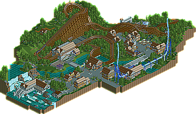
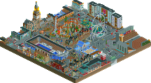
Anyway, without further ado, I present to you Le Tonnerre! It received a score of 12.54, and the required score is 13.00. So close, but yet so far away.
If you have any problems with the link, please let me know! I decided to use Kumba's little page to store the file, but I'm not entirely sure that will work.
Enjoy!
BTW, the zip includes a translation guide in case you don't speak French.
i'd say just keeping working to refine your style.
idk, good job though. i really liked the coaster.
1) all the trees were the same color
2) all the buildings were the same stile
Other then that i though it was great, you're really getting better.
FullMetal Offline
The buildings are all the same because I wanted to stick to a cohesive theme, but I suppose mixing them up a bit would be better in the long run.
I'm glad you all liked the coaster. I'm almost positive that the coaster was enough to win a design, but the theming held it back.
One thing I am happy about though is that not every half decent design gets design on this site. But I will say that your design seemed to be a lot better then a few of them that have made the front of NE lately. And no offense, even though you new name is Fullmetal, people still see you as Xin which could have dropped some of the voting points (sorry to sound harsh, but I am sure I am not the only one who thinks that).
Keep at it though bud.
-JDP
FullMetal Offline
-JDP
FullMetal Offline
disneylhand Offline
Another thing, I think you should try to remember that the reason the colorable trees are preferred currently is that they can offer some variation color-wise to landscapes. Take advantage of that!
-disneylhand
FullMetal Offline
Again, thanks for the comments, everyone!
I enjoyed it, nice work.
I can only see 1 thing that rubbed me the wrong way, the coaster stopping at the top of the lift. Other than that, this design was just great!
FullMetal Offline
Thanks, guys!
FullMetal Offline
Le Tonnerre v1.2
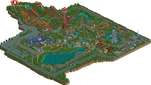
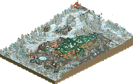
Here's an overview of the new Le Tonnerre addition.
This blank spot...
...is now occupied by Le Parapluie de Roi (The King's Umbrella).
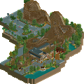
Le Tonnerre itself lacked an important feature...
...so we added on-ride photos. (Download the file and see if you can find the black camera! First person to post a picture of the camera gets a sneak peak at the stand-alone water ride!)
We had to splurge a little on land but...
...the new coaster turned out great!