Park / Paramount's Kings Adventures
-
 03-August 11
- Views 10,741
- Downloads 1,086
- Fans 3
- Comments 27
-
 52.00%(required: 50%)
 Bronze

posix 65% RCTCA 65% geewhzz 50% Liampie 50% Louis! 50% Metropole 45% inVersed 30% 52.00% -
3 fans
 Fans of this park
-
 Full-Size Map
-
 Download Park
1,086
-
 Objects
435
-
 Tags
Tags
![park_2080 [NEDC] City by the sea - #5/9](https://www.nedesigns.com/uploads/parks/2080/aerialt1879.png)
i would have made you a logo if only i was capable
really well done bro.
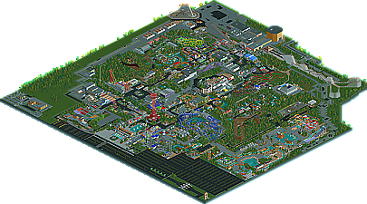
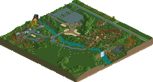
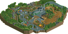
It shows some really nice things! First of all I really like the park lay-out and the foliage seems good too. Perhaps the left-side of the map and the area around the red B&M were a bit too empty compared to the rest of the park.
The lay-outs seem to be good too, but I don't no how they look ingame. All the lay-outs do feel a bit short though. Oh, and I didn't like the dual-woody, since they are not really dueling. Just one track of an out-and-back coaster would have been better here imo, or a nice dueler where there actually is a duel.
There were also some things I did not like. For example I think the object selection is really weak. Due to bad object selection the supports looked weird in some places. There were also some really ugly looking objects, like the blue umbrellas near the red lift and the cars around the park. There were some others as well.
I also felt that some big structures were too bare, like the entrance and the indoor(?)coaster at the top of the overview.
Congrats on a well-deserved bronze. But please, next time use a proper object selection.
EDIT: Oh, Fat-G, this looks wonderful from the overview. Italian Job looks pretty spot-on, and instantly brought me to the real versions. I just love how totally and completely Paramount this feels from the overview, and I hope you can keep presenting us with incredible work!
hulkpower25 Offline
inVersed Offline
*FACEPALM*
This park had a lot of good ideas, but none of them were refined enough for me to find this to be accolade worthy. Thats why I scored this so low.
I mean stuff like this:
There were some other examples as well.
Off course one can use TT, but the a lot of objects just don't fit the RCT-graphics and by not using it he will have more people viewing the park ingame.
Man, those cookies were supposed to have a calming effect...
Too bad this is TT...I would have loved to see it in-game and been able to vote on it.
Fat-g Offline
Fat-g
Honestly, I think it looks really nice from the overview. The supports you used for the steel coasters looked totally off, though. I don't know what your bench looked like, but there had to be a better object for connecting the supports to the track. The quarter tile blocks look very bulky. Kudos for Predator. It looks completely badass from the overview, and you totally made it fit the "Son of Beast" theme with the bio-hazard stuff going on. The Flight of Fear building back there looked really well done, also. Perhaps the best touch that I noticed, however, was the change in colors on the racer, from where it had been re-tracked and refurbished. Neat idea.
Overall, a definite bronze, I think. If you're gonna go back and mess around with it like you say, I would suggest making a TT-free version. It may take a bit of time, but I'm sure I speak for many people here when I say that we'd all appreciate a chance to see this park. Congrats on the accolade!
VanSchyndel Offline
Eh, maybe this realism stuff just isn't my cup of tea.