Park / Hood River Park
-
 25-May 11
- Views 1,870
- Downloads 548
- Fans 1
- Comments 9
-
 29.62%(required: 50%)
 Spotlight Submission

Milo 45% K0NG 40% 5dave 35% That Guy 35% Wicksteed 35% BelgianGuy 30% Levis 30% Liampie 30% Maverix 30% geewhzz 25% Metropole 25% prodigy 25% turbin3 25% JDP 20% Louis! 20% 29.62% -
1 fan
 Fans of this park
-
 Download Park
548
-
 Objects
292
-
 Tags
Tags

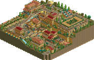
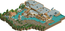
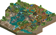
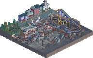
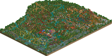
A few pros I noticed, personally I thought most of your stations were nice, and the layouts were fun to watch.
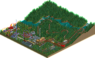
Cons, the foliage mainly consisted of lots of dark green pine trees. Lowlife is very nice in parks, but I can see what you went for in the mountain-forest esque landscape. The waterfalls looked rather unnatural, vertical with random outcroppings of water.
Can't wait to see what you build next!
I think a well executed park entrance sets the tone for the rest of the park.
Also I like some of the whacky stations you do, they're intriguing in a way.
quick note: in "ask the expert" forum I believe there's a tutorial on how to remove/make invisible exit/entry huts
Ride layouts get a D+, they're cool but too short and they just don't flow for me.
Metropole: The woodie was inspired by Boulder Dash which basically has the same type of layout and is plenty exciting without crossovers.
Maybe i missunderstood you, but it seemed like a harsh response to metro. If im wrong and/or im the only one who read it this way, I apologize.
And welcome to NE
I'm not particularly familiar with Boulder Dash, but I do get the resemblance here. Though I would certainly say that BD has a more interesting layout than just a circle, it's good to know that you had a direction to take this. I just didn't think it worked here. I think BD style coaster is extremely difficult to pull off well in RCT, props for trying, but I feel you fell short. Even just a forest needs to be made more interesting than you had here, with foliage under the trees for depth and variations in landscape other than the gentle incline of the hill. I believe that one can make even an average coaster look good with interesting landscaping/theming/interaction. Obviously, that shouldn't be an aim, but my point is, I think the lack of interest around the coaster highlighted the layout to me, which I felt wasn't strong enough.
Anyways, keep at it, you clearly have potential, and I look forward to what you have in store.