Park / windsweep

37 Comments

  • Comment System%s's Photo
  • tdub96%s's Photo
    Be back later for my thoughts. Grats sam!
  • RRP%s's Photo
    Congrats ssammy.Will add more once ive viewed it
  • rct2isboss%s's Photo
    Sick coaster SSSammy :mantis:
    btw u spelled plane wrong in the write up
  • SSSammy%s's Photo
    lol@bg cause we spotted that in the prep. thanks guysssssss. i'll give you a full response once you;ve replied fully.
  • EXeL}ErAT0R%s's Photo
    Nice.
  • musicman%s's Photo
    How do you open the write up? I actually have several questions, but I want to see if they are addressed in there first.
  • hulkpower25%s's Photo
    sorry, sammy . the coaster layout is good but everything else it suck
  • JDP%s's Photo
    eh, sammy give a big thanks to gee because he saved your ass.
    im with metro on this.
    -JDP
  • Roomie%s's Photo
    Wow i have no recollection of voting on this at all.... but then we have seen a lot of very similar GCI style designs recently. Just had another look though and I agree with my (possibly drunken) vote. Certainly the best of the 3 or 4 GCI's that I have voted on recently.

    Now Sam when are you going to nail a big sized park? :p u know u want to.
  • Cocoa%s's Photo
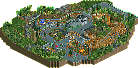
    This is a very technically perfect park. Nice layout (although I disagree about the MCBR), nice realistic detailing, foliage, etc. The only problem is I as bored... the sort of bland British-y architecture, concrete retaining walls, the general "nothingness" that I felt in this design. But that said it is still a great design.
  • Cole%s's Photo
    I liked the layout a lot
  • BelgianGuy%s's Photo
    gee didn't save his ass he had the high vote and that is nullified...
    I liked it for what it was and I agree with the overall score
  • Luketh%s's Photo
    That layout is GREAT, Sammy! I seriously watched it like.. 7 or 8 times 'cause I like the flow so much. It's a fun coaster to watch, I LOVE the way it interacts with itself, the queue and curves around and into the station. LOVE IT!

    That being said, the rest of the map was just... plain. Your foliage is great and all, but there was a real lack of buildings on the outside circle of the path which just looks... weird in my opinion. I also dislike how you used like 4 of the big rock scenery pieces and then just raised some rocky land around it. Go one or the other or a more balanced mix of rock scenery pieces and land tiles 'cause what you have here looks rather half-assed or unfinished, even.

    I like your incorporation of colors on the carousel and awnings, but those are the only places on the map with bright, vibrant colors. I think the design would have a better atmosphere with brighter colors on the buildings and even in the foliage itself; throwing a few bright flowers in the mix wouldn't have hurt the outer parts.

    Anyways, like I said, I LOVE the layout on this little coaster, I'd actually really like to ride it in real life. I think I agree with the panel on this one -- a design, but just barely. Grats, Sammy! Looking forward to more stuff from you! :)
  • rK_%s's Photo
    the layout is ok... the foliage, the massively wide paths, landscaping and architecture are all just blah. I don't see a design here, enjoy your gift SSSammy because someone definitely gave you this...
  • JDP%s's Photo

    gee didn't save his ass he had the high vote and that is nullified...
    I liked it for what it was and I agree with the overall score

    oh my fault

    sammy why was the lift hill so quick?
    -JDP
  • pierrot%s's Photo
    Posted Image
    how cute <3

    This is a very technically perfect park. Nice layout (although I disagree about the MCBR), nice realistic detailing, foliage, etc. The only problem is I as bored... the sort of bland British-y architecture, concrete retaining walls, the general "nothingness" that I felt in this design. But that said it is still a great design.

    I'm with cocoa, btw congrats design sammy :)
  • Dimi%s's Photo
    The layout was great, everything else seemed pretty uninspired and messy, but it still has that typical Sammy-atmosphere that makes it a great design anyways.
  • mardy%s's Photo
    nice coaster!
  • Luigi%s's Photo
    The score perfectly reflects what it deserves; A design but just with the minimum required. The coaster lay-out was very good. The interaction with the station and it's que was brilliant. Also the landscaping around the coaster was good, just like the foliage. The station itself wasn't very special, but it looked good though.

    The other half of the map was very dull. The foliage was great, I liked the carousel and the structure of the buildings were good as well. Only dislike is that it was lacking life for some reason. Probably due to the fact that everything was concrete/grey.

    As said; solid layout and some satisfactory surroundings, but it could have used some extra touches.

Similar Parks

Members Reading