Park / Oak Point Creek
-
 09-June 11
- Views 8,076
- Downloads 1,053
- Fans 1
- Comments 20
-
-
 61.92%(required: 60%)
 Silver

Metropole 75% 5dave 70% turbin3 70% BelgianGuy 65% Levis 65% Louis! 65% Wicksteed 65% Kumba 60% Liampie 60% Milo 60% wheres_walto 60% JDP 55% prodigy 55% Roomie 55% geewhzz 40% 61.92% -
1 fan
 Fans of this park
-
 Full-Size Map
-
 Download Park
1,053
-
 Objects
405
-
 Tags
Tags
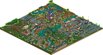
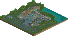
Entrance: This was cool, I liked the 2 large buildings between the ticket booths and the entry gates. The entrance area was nice and it was cool to see little stalls selling stuff to really bring life to the area.
Washout: Nice coaster giving of a cool boardwalk vibe. Cramped right between those buildings gave it a nice atmosphere. I liked the station for the ride, but I can’t work out why the peeps aren’t going on it? The flat rides in the area were well done. I didn’t like the seating area right at the edge of the park. There was nothing to look at in the area and seems like a place you shouldn’t be attracting guests to go to. If you wanted to put one there I would have put a cover over it so they can’t see the barren edge of the park. I also didn’t really like the Oak Point Boarwalk sign on the coaster. I can understand why you put it there, but it stood out a little too much and didn’t seem to fit with the architecture in the area or the coaster. Looked a little forced.
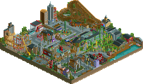
X-labs: I actually really liked X-raptor and the area it was in. I think you hit the nail on the head on how it would be implemented. The area it was in looked very purpose built for the coaster with the architecture all sticking to a strict and lifeless style (not a critism by the way) and pathways almost too clean representing it’s newness (if that’s a word). I understand why you did the station underground, though it’s not something I would have done myself, I can’t fault you for it. I would definitely, however, put some more of the queue line outside. Wingriders are a prime ride for path interaction, and I would have loved to see some here.
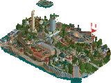
Oak Point Lookout: This was cool, and the contrast between old and new with this and the X-labs area was cool (a point I will bring up later). I really liked how you did that bench cover in the area by the way, just thought I’d point that out.
Oak Point Castle: This one was a bit of a miss for me. I think more could have been done to make it more castlely (I’m just making up words now). More colour was definitely need, and some cooler details would definitely added some much needed atmosphere to the building. I’m very fond of the idea of having the coaster and tour inside the building with the front being used for stuff such as the photo booth, etc. So good job in theory, I just think the execution could have been a touch better. Mousaqute was well executed, and did it’s job. I think this area though, was one of the weakest. All of the architecture became very monotonous with the brown brick everywhere and the buildings devoid of colour. Also, each building gave away no indication of it’s actual purpose. I would rather see a bit more identity amongst your architecture.
Oak Point Falls: This was cool enough. A nice take on a classic log flume. But I think you could have given it another name. As you move further into the park I think rides with “Oak Point” in them aren’t needed. I understand one or 2 nearer the entrance, but especially in a park with rides like X-raptor, even if this was a ride that Oak Point had named that in their older days, I reckon they would have renamed it to fit in with the area it was in. A small point I know. Also, I would have liked to see some of your own fences around the queue line.
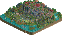
Thunder of Zeus: This was a nice woodie. I liked the entrance with the statues with “peeps” on top of them. Nice idea. The station was cool as well. I felt you could have done a little more with the actual coaster. There’s only so much a woodie set on some grass can do for me, though it was believable and did it’s job. The riverfront area and the architecture on the other side of those buildings was nice, but again suffered a little from lacking purpose. Also, the Oak Point naming comment comes in again.
Stunt Show: This was really really well executed. I liked the change of colour between the tiers of seating and the stage was really cool. I would have liked to see the front of the theatre be a little more representative of what was showing inside. I understand the park would probably change it between seasons, but even some temporary looking theming to show what was inside.
Oak Point Safari: This was probably my favourite area of the park. Sheikra (I mean Swara
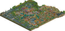
All in all, congratulations Mav. This was a very fun park to explore. As an overall feel, I felt the park lacked a little direction. Having the boardwalk area made me think this was going to be a very classic park, then having X-raptors and Swara in the 2 adjacent areas left me a little confused as to where you were going. I understand different areas having different themes, and I totally appreciate that, but this felt like the different areas were built by different companies, therefore making the park lack a bit of cohesion. It seemed like you were thinking “what do I want to make in this area?” rather than, “what would this park make in this area”, if that makes sense. Individually however, each area was really well done with solid coaster layouts, pretty much flawless support work and excellent realistic touches and attention to detail. In closing, I would work on ensuring all of your architecture serves a purpose, work on thinking a bit more behind the naming of your rides (to me, that’s very important) and making sure you have a distinct direction you are taking your next park/project in. Again well done, and look forward to seeing what you have for us next!