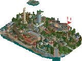
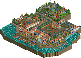
Park / Oak Point Creek

20 Comments

  • Comment System%s's Photo
  • Fizzix%s's Photo
    Nice! Glad to see you finish yet another project! All of the layouts were lovely, I really liked your version of Tonnere de Zeus. I still think the tan and white building right next door looks super awkward, too. All of the brown buildings were eerily similar, and i think it would be boring to walk around it as a peep. Overall a solid silver, and a fine effort!
  • rK_%s's Photo
    that Dive machine is beautiful, i wish i could open it up in RCT2 but i need to reinstall it keeps crashing on me =(.

    Congrats On The Silver Mav! Your landscaping and foliage and overall park layout is gorgeous, you and JDP need to collab on something, you 2 together on one map would be epic!
  • Roomie%s's Photo
    I had split opinions about this park. Some areas were really really nice. The Dive Machine is a shining example of this sort of coaster. The fishing village style area next to the X-Raptor Drop was nice too.

    However I really disliked the wing walker itself. Poor layout and execution in my opinion and it didn't really fit in with the rest of the park. The skyride was overly short and the air vents on the roof looked a bit repetitive.

    But don't let my negativity take away from what overall was a really nice accolade. Congrats.
  • GameWorldLeader%s's Photo
    i like the dock effect
    really cool
    btw what's the dimensions?
  • chorkiel%s's Photo
    The funny thing about this is, the more I saw of this park the more I recognised from your advertising topic. Which made it more interesting to see what it looked like in the full picture.

    I love this park a lot ! Easily one to look back at soon.
    It had some small flaws though.
    I didn't like that black/brown corner building, it was so empty on the inside.
    The red/black buildings near there were also a bit of a flaw, mostly because of the colors.

    Again, I love this park a lot! A well deserved silver (if not higher).
    Congratulations !

    Edit:
    Looking again at this, I wish you had been a bit more patient so that the guests could spread more through the park. There were guests everywhere but now they're all crammed at the entrance..
  • hulkpower25%s's Photo
    Amazing work on the B@M Dive,its the best i have seen since i been here in Nedesign.the park was overall exellent.
  • Phatage%s's Photo
    Some pretty good coasters here. The dive machine was a good example of B&M taking a general idea for a ride layout and modifying it to suit the park's layout/terrain. It was also situated in a nice setting where it could dominate over the park and the queue was interesting as well. However, I would prefer if the Thunder of Zeus either be a more accurate recreation or more original; because of wooden coaster supports, you tend to not see nearly as many 'near clones' even though you could have used many of the CCI elements and whatnot in a more custom layout. The boardwalk woodie was well executed, cool location and definitely captured a lot of what the real thing seems like, I just wanted it to be a bit longer! Really cool thing with the wing coaster's station underground, and with this part of the park being the most large-tree populated, it really created a sense of that there was a beast lurking in the woods. Would have been cool to see an inversion underground though ;)

    As others have said, there is a general feeling of dreariness in some sections, can't tell if it's the colors you used, the fact that peeps haven't populated the whole park, path choice, etc. but something definitely feels off preventing this park from being better received. One thing about the clumpscaping that seems to be so popular these days: I think you've (and many others as well) have crossed the line of what makes sense in terms of how and why plants and trees grow certain places. Maybe certain plants won't grow at certain elevations, maybe there was once a river there or a tornado carved out a path once upon a time, but aside from the rock ridge near the entrance (which was really cool btw) it didn't really make sense. I felt that the atmosphere suffered in a lot of places from a lack of larger trees, both of the natural and park-planted variety. Even the area with the wing coaster could have used more for a better effect that I was talking about above. Regardless, even if the area the park was set in was naturally devoid of large trees, the park should have offered more shaded areas for its guests.
  • zburns999%s's Photo
    Very mixed opinions on this, as well.

    First of all, I felt there was a major identity crisis here, in my opinion. You've got Sheikra, Tonnere de Zeus, Raptor, Turbine, and Twister (GG) all in one park. Ordinarily this would be okay, but you kind of brought the style and essence of each ride into the park along with the layout. For instance, the area around the dive machine felt like a Busch Gardens park. The area around the GG felt super tight and cramped sort of like Grona Lund,the area around the shuttle loop felt a lot like a Tussaud's park, and Thunder of Zeus was basically straight out of Parc Asterix haha. X Raptor didn't feel like too much of a ripoff, but the layout itself fell a bit flat with that whole underground bit at the end.

    The landscaping around the park was fantastic, but the foliage wasn't really up to the same level. Like, it definitely looked nice, but it just seemed so careless. Just the same bright green grass stalks all over the park to provide cohesion from one tree to another. Foliage is a weak point for me, as well, so I hate to critique others on it, but in this case, it was obvious to me that some simple variation in foliage from one area to the next would have sufficed.

    Architecture is probably the biggest problem in the park, though. It's kind of more of the same from your past releases. You've got sooo many buildings, but so few of them have any life. They're just kind of boxy and lack identity/personality. Just nothing really memorable.

    There was a lot of good stuff in the park, though! I did love the boardwalk area. I would have actually preferred to see a park by you where you stuck with that theme, as you were able to tackle it really well. I thought the GG woody was very well done, too. I also loved the building that the space shot ride came out of. It reminded me a lot of the building next to X Scream at Waldameer, which was neat. The rapids also showed a lot of talent/skill. A more interesting-looking temple building would have made this a top notch ride. The dive machine was also very very good, Sheikra similarities aside. Great layout and integration into the surrounding landscape. Nice work on that.

    Overall, I hate to come off sounding so negative. It's just that you clearly have the talent to turn out some great parks, but I think you get too stuck in the rut of repetitive foliage and boxy architecture, which takes away so much from your strengths. But after seeing the Sheikra ride and your Cheetaka design, it's obvious what you're capable of. I can only wonder when the full scale Busch Gardens Tampa recreation is on its way haha. Congrats on the silver, man. In my opinion, it was a perfect award for a park like this. A lot of flaws, for sure, but also a lot of content and great ideas! Congrats.
  • inVersed%s's Photo
    This was a fun little part! Very strong silver in my opinion. May have voted this a gold
  • Luigi%s's Photo
    First of all congrats on finishing another park and earning a silver award. You have also made yourself a nice logo! I only think the CR should have been closer to the eek part.

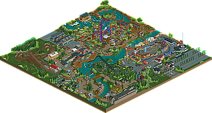
    Now to the actual park; the entrance was nice. Really busy though :p. The buildings itself were nice and all had a purpose. The area with the woody next to the entrance was one of the strongest in my opinion. The woody layout was nice and was fun to watch. Also the interaction with the buildings was good. The archtecture here was very nice as well.

    The area to the left was the weakest in my eyes. X Raptor had a really weird lay-out and the architecture was just pointless ''fill-up''. I also did not like the fact that the station and a big part of the ride were underground. The foliage was also really weak in this area. However, I did like the landscaping here.

    The area with the mouse coaster and the turbine-like coaster was a nice area as well. The mouse coaster was fun to watch for some reason. One of the best I have seen in a while. The building with the turbine and the haunted house attraction here fits in well. I also liked the fact it went through the looping. The building itself was nice as well. The foliage was the weakest part here too. Also two of the other buildings seemed really odd and just placed as ''fill-up''.

    The roto-drop/splash area was OK. The roto drop and the buildings around it were very nice. Also the foliage around the roto-drop really added something to the theme. The splash has a nice design. The interaction with the landscape and theming was great but it seemd a bit dull. Also the foliage just ruined this ride for me.

    The boardwalk area next to the splash has some nice building. I only do not like the roofs here; way too repetitive. The woody here was nice. Good lay-out and a nice pacing. The station was OK. The purpose of the older building next to the coaster was unclear to me. It was nice, but what is the purpose of it?!!?

    The show and kiddy coaster were OK. Nothing really mind blowing here, but nothing bad as well.

    The vertical srop coaster was just sick. This is in my opinion the strongest coaster in the park. Perfect lay-out, perfect pacing and perfect interaction with the surroundings. Buildings were nice as well, but again a few just seemed to be there without any purpose.

    The rapids was also a really strong ride. The layout was nice and the theming too. I really enjoyed the indoor part; realy clever with the spiral coaster. The only let down was the fact that this had a big part, including the station, underground as well. There also seemed to be a head-chopper here near the ending.

    Overall this was quite a nice park. It deserved silver. The landscaping was defenitely the strongest aspect of this park, as were rhe rapids and the B&M vertical drop coaster. The buildings without purpose and the foliage were without doubt the weakest parts.
  • tdub96%s's Photo
    I agree a lot with burnsy. This park did feel like it was divided into little areas of seperate parks, and it, all together, didn't fit well to me. Like Z said, you have the Thorpe/Tussauds type theming around the Turbine-esque ride, Busch Gardens for the ShieKra-esque ride, and then a Grona Lund Twister boardwalk area. That being said, all the coasters were executed very well. The Dive machine was one of the best I have ever seen when it comes to translating a realistic B&M diver into RCT. The X-Raptor layout was just ok, I was hoping for a bit more...the Twister-like ride was cool. You fit it in there nice and tight, thats what she said :p , just like Grona lund. Good call on the trains there too, making it look more like Timberliners.

    Overall, the coasters were gold-worthy, the architecture was silver worthy, but the foliage killed it for me. You way overused those tall grass objects, and it made the park feel overgrown. It seems foliage seems to be your weak point, as this, Black Mamba, and Cheetaka all have had mediocre (at best) foliage in my eyes. Also, like Phatage said, I cannot pinpoint what else it was, but this park really didnt have the atmosphere some of your previous work did.

    All things considered though, you did a nice job. Minus the foliage, this park certaintly deserves a high silver/low gold. But if I were on the panel, I'm saying 60% and a deserving silver. Conrats Mav, youre a great builder and I cant wait to see what you do next.
  • Dimi%s's Photo
    I had mixed feelings too. Congratulations on finishing, overall it's a nice park, but it had many flaws that made it all less interesting.

    - I really hated the foliage. You always follow the same pattern: large trees surrounded by normal trees surrounded by tall grass, leaving large spots empty or just filled with more grass. It's boring and it lacks originality, natural flow and aethetics. The tall grass is overused anyways. For example, the atmosphere of safari adventure is made purely out of tall grass in different colours.
    - Because the peeps weren't spread throughout the whole park, some beautiful areas like the stunt show had a very dead atmosphere.
    - Some architecture like the castle and Greek temples seemed very rushed and lacked atmosphere. Thunder of Zeus didn't shout 'Greek' at all to me.
    - I didn't like the fact that the stations of X-Raptor and Lost Temple were underground. Was this out of lazyness?

    + I really liked all layouts, including X-Raptor. I just didn't understand why the log flume only had small drops, but thats doesn't really matter.
    + In some places, your architecture definitely improved, for example near the two boardwalk areas and the stunt show.
    + I enjoyed watching it, which is the most important.

    I also have a message to BelgianGuy. No offense at all, I have great respect for you to write so much write-ups, but I don't like how you always end them with words like "this cute little park sets the tone for what we can expect in the future" and "but for now, [...] is NE's latest silver" or something like that. I know it's ment positively, but to me it sounds like the park is only interesting for this very moment, and it's all actually about the future. For the parkmaker, the park is possibly ment to be his magnum opus rather than a cute little park as if it was just a teaser for something much bigger. It might just be me though...
  • Nitrous Oxide%s's Photo
    I love it, one of my favorite releases of lately. @zburns999, I don't see the problem with having completely different themed sections in a park. The BM Dive is probably my favorite in RCT yet. Keep up the good work Mav.

    And if you ask me, I think this is better than some spotlights of the past.
  • Cole%s's Photo
    I liked it a lot. The best parts for me were the area around washout and the Dive Machine. It's nice to see a Wingrider, but it felt like it was just designed very poorly, and I'm not a fan of underground station.

    Very nice park Maverix. :)
  • Maverix%s's Photo

    Nice! Glad to see you finish yet another project! All of the layouts were lovely, I really liked your version of Tonnere de Zeus. I still think the tan and white building right next door looks super awkward, too. All of the brown buildings were eerily similar, and i think it would be boring to walk around it as a peep. Overall a solid silver, and a fine effort!

    Glad you like it Fizzix! I don't totally agree about the building being awkward but you can't please them all I guess ^^

    that Dive machine is beautiful, i wish i could open it up in RCT2 but i need to reinstall it keeps crashing on me =(.Congrats On The Silver Mav! Your landscaping and foliage and overall park layout is gorgeous, you and JDP need to collab on something, you 2 together on one map would be epic!

    Thanks rK, I'm very happy how the DM turned out and glad it's been getting some great reviews. It's one of my personal favorite designs today. Well if JDP is up for it and doesn't mind helping me out with archy then why not? :p

    I had split opinions about this park. Some areas were really really nice. The Dive Machine is a shining example of this sort of coaster. The fishing village style area next to the X-Raptor Drop was nice too.However I really disliked the wing walker itself. Poor layout and execution in my opinion and it didn't really fit in with the rest of the park. The skyride was overly short and the air vents on the roof looked a bit repetitive.But don't let my negativity take away from what overall was a really nice accolade. Congrats.

    First, thanks Rommie! Although I really don't see what was so bad about the Wing Walker, I really just tried to make a similar ride to Raptor but I guess Raptors layout isn't the greatest then ^^ Can't please them all I guess. Also, the skyride was just a way to get across the river or 'creek' and have a nice view of that area of the park and wasn't meant to be to long.

    i like the dock effectreally coolbtw what's the dimensions?

    Thanks GWL, and I believe the dimensions are 120x120 or around there.

    The funny thing about this is, the more I saw of this park the more I recognised from your advertising topic. Which made it more interesting to see what it looked like in the full picture.I love this park a lot ! Easily one to look back at soon.It had some small flaws though.I didn't like that black/brown corner building, it was so empty on the inside.The red/black buildings near there were also a bit of a flaw, mostly because of the colors.Again, I love this park a lot! A well deserved silver (if not higher).Congratulations !Edit:Looking again at this, I wish you had been a bit more patient so that the guests could spread more through the park. There were guests everywhere but now they're all crammed at the entrance..

    Haha that's one of my favorite things to do when looking at parks too :p And which buildings are you talking about? I believe there are more than one corner red and brown buildings. And I did try to let the guest spread out as much as possible, but both my patience itch to send it in got the best of me. :/

    Amazing work on the B@M Dive,its the best i have seen since i been here in Nedesign.the park was overall exellent.

    Thanks man glad you like it!

    Some pretty good coasters here. The dive machine was a good example of B&M taking a general idea for a ride layout and modifying it to suit the park's layout/terrain. It was also situated in a nice setting where it could dominate over the park and the queue was interesting as well. However, I would prefer if the Thunder of Zeus either be a more accurate recreation or more original; because of wooden coaster supports, you tend to not see nearly as many 'near clones' even though you could have used many of the CCI elements and whatnot in a more custom layout. The boardwalk woodie was well executed, cool location and definitely captured a lot of what the real thing seems like, I just wanted it to be a bit longer! Really cool thing with the wing coaster's station underground, and with this part of the park being the most large-tree populated, it really created a sense of that there was a beast lurking in the woods. Would have been cool to see an inversion underground though ;)As others have said, there is a general feeling of dreariness in some sections, can't tell if it's the colors you used, the fact that peeps haven't populated the whole park, path choice, etc. but something definitely feels off preventing this park from being better received. One thing about the clumpscaping that seems to be so popular these days: I think you've (and many others as well) have crossed the line of what makes sense in terms of how and why plants and trees grow certain places. Maybe certain plants won't grow at certain elevations, maybe there was once a river there or a tornado carved out a path once upon a time, but aside from the rock ridge near the entrance (which was really cool btw) it didn't really make sense. I felt that the atmosphere suffered in a lot of places from a lack of larger trees, both of the natural and park-planted variety. Even the area with the wing coaster could have used more for a better effect that I was talking about above. Regardless, even if the area the park was set in was naturally devoid of large trees, the park should have offered more shaded areas for its guests.

    Thanks Phatage! I do get what you mean about there not being as many near clones but I still don't see what it's not possible, unlikely perhaps, but by no means can it not be done. You hit the nail on the head with the wing walker as that was exactly what I was going for. The dreariness is something that I did try to avoid but it seems to always sneak into my work because I tend to stick to only a few colors and that's something I'm trying to get better at. This park helped me practice this a bit but I'm by no means a pro at it yet. I do see what you mean about the foliage though and that will be something that I address in future projects as it hasn't really been something I've thought about to much. Lastly, the shaded area's thing is something I always seem to leave out, but I am forcing myself to remember to add them in future projects.

    Very mixed opinions on this, as well.First of all, I felt there was a major identity crisis here, in my opinion. You've got Sheikra, Tonnere de Zeus, Raptor, Turbine, and Twister (GG) all in one park. Ordinarily this would be okay, but you kind of brought the style and essence of each ride into the park along with the layout. For instance, the area around the dive machine felt like a Busch Gardens park. The area around the GG felt super tight and cramped sort of like Grona Lund,the area around the shuttle loop felt a lot like a Tussaud's park, and Thunder of Zeus was basically straight out of Parc Asterix haha. X Raptor didn't feel like too much of a ripoff, but the layout itself fell a bit flat with that whole underground bit at the end.The landscaping around the park was fantastic, but the foliage wasn't really up to the same level. Like, it definitely looked nice, but it just seemed so careless. Just the same bright green grass stalks all over the park to provide cohesion from one tree to another. Foliage is a weak point for me, as well, so I hate to critique others on it, but in this case, it was obvious to me that some simple variation in foliage from one area to the next would have sufficed. Architecture is probably the biggest problem in the park, though. It's kind of more of the same from your past releases. You've got sooo many buildings, but so few of them have any life. They're just kind of boxy and lack identity/personality. Just nothing really memorable.There was a lot of good stuff in the park, though! I did love the boardwalk area. I would have actually preferred to see a park by you where you stuck with that theme, as you were able to tackle it really well. I thought the GG woody was very well done, too. I also loved the building that the space shot ride came out of. It reminded me a lot of the building next to X Scream at Waldameer, which was neat. The rapids also showed a lot of talent/skill. A more interesting-looking temple building would have made this a top notch ride. The dive machine was also very very good, Sheikra similarities aside. Great layout and integration into the surrounding landscape. Nice work on that.Overall, I hate to come off sounding so negative. It's just that you clearly have the talent to turn out some great parks, but I think you get too stuck in the rut of repetitive foliage and boxy architecture, which takes away so much from your strengths. But after seeing the Sheikra ride and your Cheetaka design, it's obvious what you're capable of. I can only wonder when the full scale Busch Gardens Tampa recreation is on its way haha. Congrats on the silver, man. In my opinion, it was a perfect award for a park like this. A lot of flaws, for sure, but also a lot of content and great ideas! Congrats.

    Well I suppose I should begin here with addressing the 'identity crisis' of the park. While I can see what you mean about area's of the park being very different, that was the point. I didn't what the park to feel like you'd be going from one area to the next with the same area just in different colors, I wanted some variety. Which I guess I did too well ^^ As I said to Phatage above, foliage will be something I think about more in the future but this was the best I could do with my skill at this time. Same with the architecture, it's just something I've got to practice and get better at the right now this is what I know to do to make it look as good as possible with my skills. It's by no means amazing, I know, but I'm just trying to get better. I'm glad you liked the Diver though as that is probably my personal favorite thing in the park. Though I think I'll leave the BGT re-cre to Kumba ^^

    This was a fun little part! Very strong silver in my opinion. May have voted this a gold

    Thanks inVersed glad you like it!

    First of all congrats on finishing another park and earning a silver award. You have also made yourself a nice logo! I only think the CR should have been closer to the eek part.Now to the actual park; the entrance was nice. Really busy though :p. The buildings itself were nice and all had a purpose. The area with the woody next to the entrance was one of the strongest in my opinion. The woody layout was nice and was fun to watch. Also the interaction with the buildings was good. The archtecture here was very nice as well.The area to the left was the weakest in my eyes. X Raptor had a really weird lay-out and the architecture was just pointless ''fill-up''. I also did not like the fact that the station and a big part of the ride were underground. The foliage was also really weak in this area. However, I did like the landscaping here.The area with the mouse coaster and the turbine-like coaster was a nice area as well. The mouse coaster was fun to watch for some reason. One of the best I have seen in a while. The building with the turbine and the haunted house attraction here fits in well. I also liked the fact it went through the looping. The building itself was nice as well. The foliage was the weakest part here too. Also two of the other buildings seemed really odd and just placed as ''fill-up''.The roto-drop/splash area was OK. The roto drop and the buildings around it were very nice. Also the foliage around the roto-drop really added something to the theme. The splash has a nice design. The interaction with the landscape and theming was great but it seemd a bit dull. Also the foliage just ruined this ride for me.The boardwalk area next to the splash has some nice building. I only do not like the roofs here; way too repetitive. The woody here was nice. Good lay-out and a nice pacing. The station was OK. The purpose of the older building next to the coaster was unclear to me. It was nice, but what is the purpose of it?!!?The show and kiddy coaster were OK. Nothing really mind blowing here, but nothing bad as well.The vertical srop coaster was just sick. This is in my opinion the strongest coaster in the park. Perfect lay-out, perfect pacing and perfect interaction with the surroundings. Buildings were nice as well, but again a few just seemed to be there without any purpose.The rapids was also a really strong ride. The layout was nice and the theming too. I really enjoyed the indoor part; realy clever with the spiral coaster. The only let down was the fact that this had a big part, including the station, underground as well. There also seemed to be a head-chopper here near the ending.Overall this was quite a nice park. It deserved silver. The landscaping was defenitely the strongest aspect of this park, as were rhe rapids and the B&M vertical drop coaster. The buildings without purpose and the foliage were without doubt the weakest parts.

    Thanks man! With the logo that was the text that kept those letter apart but oh well :p Throughout your review I noticed two main things: pointless building and foliage. As I stated before, both aspects of the game are a work in progress for me and I'm slowly getting better at them. As far as more specific issues go, X-Raptors layout was inspired by the real Raptors and I think both are strange but that's just how they are designed I guess. Also the building next to the woody in the back is a restaurant themed to the temple of Zeus.


    Thanks everyone for the reply's!!! Keep them coming!!! :)
  • Maverix%s's Photo

    I agree a lot with burnsy. This park did feel like it was divided into little areas of seperate parks, and it, all together, didn't fit well to me. Like Z said, you have the Thorpe/Tussauds type theming around the Turbine-esque ride, Busch Gardens for the ShieKra-esque ride, and then a Grona Lund Twister boardwalk area. That being said, all the coasters were executed very well. The Dive machine was one of the best I have ever seen when it comes to translating a realistic B&M diver into RCT. The X-Raptor layout was just ok, I was hoping for a bit more...the Twister-like ride was cool. You fit it in there nice and tight, thats what she said :p , just like Grona lund. Good call on the trains there too, making it look more like Timberliners. Overall, the coasters were gold-worthy, the architecture was silver worthy, but the foliage killed it for me. You way overused those tall grass objects, and it made the park feel overgrown. It seems foliage seems to be your weak point, as this, Black Mamba, and Cheetaka all have had mediocre (at best) foliage in my eyes. Also, like Phatage said, I cannot pinpoint what else it was, but this park really didnt have the atmosphere some of your previous work did.All things considered though, you did a nice job. Minus the foliage, this park certaintly deserves a high silver/low gold. But if I were on the panel, I'm saying 60% and a deserving silver. Conrats Mav, youre a great builder and I cant wait to see what you do next.

    Thanks man I'm glad you like it! As I've said numerous times now the foliage is a work in progress for me that I'm slowly getting better at. It's by no means great in this park but I felt it did it's job well. I'm glad you like the layout's though as those are definitely my strong point!

    I had mixed feelings too. Congratulations on finishing, overall it's a nice park, but it had many flaws that made it all less interesting.- I really hated the foliage. You always follow the same pattern: large trees surrounded by normal trees surrounded by tall grass, leaving large spots empty or just filled with more grass. It's boring and it lacks originality, natural flow and aethetics. The tall grass is overused anyways. For example, the atmosphere of safari adventure is made purely out of tall grass in different colours.- Because the peeps weren't spread throughout the whole park, some beautiful areas like the stunt show had a very dead atmosphere.- Some architecture like the castle and Greek temples seemed very rushed and lacked atmosphere. Thunder of Zeus didn't shout 'Greek' at all to me.- I didn't like the fact that the stations of X-Raptor and Lost Temple were underground. Was this out of lazyness?+ I really liked all layouts, including X-Raptor. I just didn't understand why the log flume only had small drops, but thats doesn't really matter.+ In some places, your architecture definitely improved, for example near the two boardwalk areas and the stunt show.+ I enjoyed watching it, which is the most important.I also have a message to BelgianGuy. No offense at all, I have great respect for you to write so much write-ups, but I don't like how you always end them with words like "this cute little park sets the tone for what we can expect in the future" and "but for now, [...] is NE's latest silver" or something like that. I know it's ment positively, but to me it sounds like the park is only interesting for this very moment, and it's all actually about the future. For the parkmaker, the park is possibly ment to be his magnum opus rather than a cute little park as if it was just a teaser for something much bigger. It might just be me though...

    Once again, foliage is something I'm trying to get better at :p Atmosphere was something that I tried hard to create in this park but overall came up short on. It's still something I'm trying to figure out and has proven to be tough for me to pull off. As far as X-Raptor and the Rapids stations being underground. It was not laziness both were meant to be like that as the real Raptors station is underground and I felt it added a bit of mystery to the rapids.

    I love it, one of my favorite releases of lately. @zburns999, I don't see the problem with having completely different themed sections in a park. The BM Dive is probably my favorite in RCT yet. Keep up the good work Mav.And if you ask me, I think this is better than some spotlights of the past.

    Thanks Man! Glad you like it so much!

    I liked it a lot. The best parts for me were the area around washout and the Dive Machine. It's nice to see a Wingrider, but it felt like it was just designed very poorly, and I'm not a fan of underground station.Very nice park Maverix. :)

    Thanks Cole glad you like it!
  • Cocoa%s's Photo
    nice park! I certainly enjoyed it a lot more than I thought I would based on the screens you showed. the overall quality was pretty good, although some areas were a bit sloppy I think I could ignore that in the final product. some specific examples of niceness were the stunt show (why didn't you use that architecture in the rest of the park??) the diver, and the x-raptor layout. I thought it strange that you basically put all of the theming for that ride underground though. the brown area was better than I though, although it was a bit boring. the woodie on the buildings was cool, but the architecture in that area was a bit funky imo.

    so yah, good impressions.
  • chorkiel%s's Photo

    Haha that's one of my favorite things to do when looking at parks too :p And which buildings are you talking about? I believe there are more than one corner red and brown buildings. And I did try to let the guest spread out as much as possible, but both my patience itch to send it in got the best of me. :/


    I meant the corner building that's black and brown and near that black coaster.
    And the red/black buildings close to that.
  • RCTNW%s's Photo
    Congrats on the Silver and right about where I would place it. Had a good balance of coaters rides and a solid park layout. Not sure on the some the themes used as and parts were still not really polished but that will come with time. I wish I could put my finger on it but is just seemd to miss the peronsal touch in places. That said, you finished the park, took coare of the ending details and you should be very proud of the end result.

    Keep up the good work and well done!

    James