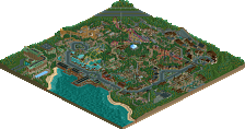
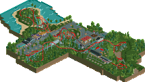
Park / Land of Adventure

Park_1926 Land of Adventure

12 Comments

  • Comment System%s's Photo
  • Jaguar%s's Photo
    This park deserved a score higher than 39%
  • Metropole%s's Photo
    15 people voted on the park, and the average score was 39%, thus confirming that this park did not deserve a higher score than 39%.
  • That Guy%s's Photo
    Posted Image
  • Jaguar%s's Photo
    Lets put it this way, this is a park I made awhile ago that recieved 43 points: http://www.nedesigns...ake-theme-park/

    If you compare that park to this one, this is of higher quality, yet it recieves a lower score.
  • geewhzz%s's Photo
    don't sell yourself short jag, i stand by my votes on this park and your park...
  • chorkiel%s's Photo
    I actually don't know what to really think of this park since I can't really tell what I dislike but I just do.
  • SlayMeGaga%s's Photo
    To me I really didn't care whether I got an bronze or not.I knew after the fifth vote it wasn't going to get anything,and also I know most of NE members thinks my style is bad. I will change alittle,but I just mostly build what comes to mind.
  • BelgianGuy%s's Photo
    it was not the style that made me vote 35% it was the lack of true theme, I mean there are a few cool ideas here but they're executed in a way it left me wanting for more, and I don't like that ;)

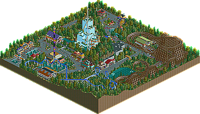
    for instance the LIM was a cool idea but only supports and a mountain that magically spawned water.... I think you could've done way more with the concept tbh, also the arrow, you drown it in trees but forget to actually theme the ride, also some parts where sloppy and with this I mean foliage architecture and mostly hacks, I thought this park lacked a certain level of skill with the game to make me go oh wow he knows what he's doing, I didn't have this, my reaction was more like, hey cool ideas! too bad he didn't take the time to use them to their full potential... also the drop tower station wasn't good for me, again here what I mean with skill and hacking, the Gee hack for invisible stuff is rather easy once used to it so why not use it to make a good drop tower station... things like this make me vote the way I did and I'll keep voting that way because I want to see the full package when I view a park and as I've said, it kept me wanting there was more...

    greets BG
  • Metropole%s's Photo
    I agree with BelgianGuy, you won't lose marks for a different style. I just felt the park was rather unrefined and in places uninspired. It had a couple of cool moments, but I felt it could have had so much more. Keep at it.
  • SlayMeGaga%s's Photo
    Thanks for the advice guys,but maybe next time I may get an bronze on my other park.
  • geewhzz%s's Photo
    nothing really grabbed my attention on this park. your last park was much nicer to me than this. you're on the right track though...keep practicing
  • Roomie%s's Photo
    THe coaster design in this was pretty nice but just didn't inspire me. The Hurler style woodie was the best. But the Arrow and Premier rides just came up short for me.

    Its certainly a step in the right direction and it shows supreme promise. :)
  • 39.23%(required: 50%)  Spotlight Submission
    Percentage of vote: 39.23%
    Milo 55%
    Louis! 50%
    Maverix 50%
    Roomie 50%
    turbin3 45%
    Wicksteed 45%
    inVersed 40%
    prodigy 40%
    BelgianGuy 35%
    Metropole 35%
    5dave 30%
    K0NG 30%
    Levis 30%
    Liampie 30%
    geewhzz 20%
    39.23%
  • 2 fans Fans of this park
  • Download Park 424
  • Objects 264
  • Tags