Park / Six Flags Santa Fe
-
 26-May 11
- Views 38,840
- Downloads 3,148
- Fans 20
- Comments 60
-

-
 90.00%(required: 80%)
 Spotlight

inVersed 100% yes Kumba 100% yes geewhzz 95% yes Maverix 95% yes Steve 95% yes 5dave 90% yes BelgianGuy 90% yes Liampie 90% yes Metropole 90% yes Roomie 90% yes Milo 85% yes RMM 85% yes turbin3 85% yes Louis! 80% yes Levis 70% no 90.00% 93.33% -
20 fans
 Fans of this park
-
 Full-Size Map
-
 Download Park
3,148
-
 Objects
443
-
 Tags
Tags
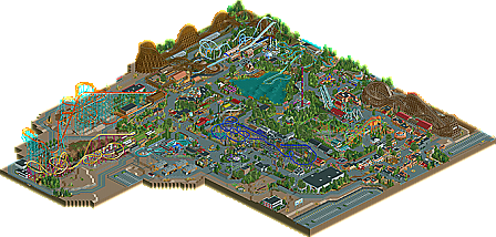
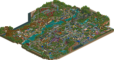
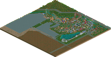
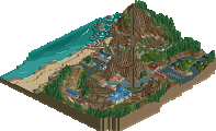

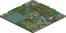
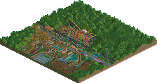
I really don't even know where to begin rob, I'll put together a better post later, but as of right now, I would've voted 95%, this is just astonishing.
I'm trying to think of a way I can summarize all the great things about this park, but I really can't. I wouldn't know where to begin. Robbie, I'll admit that in the past, I couldn't really get into your work like others could. I found most of it gaudy, over-detailed, and kind of unorganized. This park, however, just corrects every past fault I've had with your work. Every building is constructed with care and, most importantly, a plan. It was very obvious to me that, before building each individual shop/facade/etc., you had it visualized. While in the past, I feel like you used to kind of over-detail a simple box structure, you clearly steered away from that here. Each building on this map has personality, and can stand on its own without the usual gaudiness I’ve seen in your past work. Awesome job with that. For me, that was probably the most exciting thing about this map. Even the best can improve, and I feel like you did just that.
Overall, I feel like this park had an overwhelming sense of identity/personality. Just from viewing the park, I found myself envisioning the surroundings not seen on the map. While CP6 created that sort of road-side Six Flags park feel, you really made me believe that this was a flagship Six Flags park; maybe it wasn’t quite on the level of Magic Mountain or Great Adventure, but it really felt like a Six Flags over Texas or Six Flags over Georgia. I thought it was neat that both you and CP6 were able to do that with your parks. They clearly feel like they’re both in the same chain, but one is obviously the mega-park compared to the other. I also loved how you were able to give off a sense of expansion and growth throughout the years. To me, it was so cool to see that back left corner of the park with Leviathan and Medusa. The back-to-back opening years, as well as the sort of under-developed land under and around both coasters’ footprints really made me believe that the park kind of threw together a new area in order to accommodate two major rides. It also worked out that that back corner was also really bustling with peeps, which is something I would expect if this were a real park. Another area of the park I think really showed a sense of growth was the lake-front area around the Schooner Flume, Tempest, and Zoomerang. I don’t know if it was intentional, but this area felt a lot like the very back of Great Adventure, which stretches from the log flume all the way to Skull Mountain/Wiggles World. That part of the park is kind of more heavily-wooded than the rest, with more of an emphasis on natural landscaping and foliage than architecture and theming. While there was that sort of “sea-side theme” going on, it was never overwhelming. Also going with the growth and expansion thing, I loved the touch of having abandoned rides hidden throughout the park, usually just out of guests’ view. I assume that old Chaos was in the area by Leviathan? Awesome! And I can just imaging looking off the drop tower and seeing that hidden rotor ride haha. Such a cool touch. I’ve never seen it pulled off so well.
For a park to really blow me away (as this one did), the coasters really have to be kick-ass. These ones were. Man, were these good coasters. I kind of want to do a run through of each, I guess from my favorite to least favorite…
First is, without a doubt, Tempest. Dude, everything I wanted to do with my “Bat” coaster in Paramount’s Xtreme is what you did with this thing. Like, if I could pic “screenshot of the year” it would be of that helix wrapping itself around the foliage-enshrouded vertical loop sunken down there in the valley. How cool is that?! And wow, what a ride this would be. The crazy helix, the vertical loops, the tunnel, some awesome foliage: this thing really has it all. The station was so beautiful, as was the rides’ surroundings. Beautiful job with this ride.
Leviathan would be next, I think. Personally, I still kind of like how Phatage’s version of the Giovanola hyper appeared more menacing and colossal, but this one was really a fantastic ride as well. No problems with the supports—I thought they were great. Layout seemed spot on as far as I could tell. My favorite part of this, though, was the queue line. This is something I think so many players overlook. One of my favorite things to do while looking around a park is to check out the coaster queues. I think players often have the tendency to throw them together as an afterthought. I think, if done right, they can really define a coaster, as was done here. Like, I’m just picturing myself chilling up against a queue rail under all those misters, staring up in anticipation at the trains climbing that 200+ foot lift hill. It was obvious to me that you were thinking about this the same way. Another great thing about this ride was how it was designed from the peep’s perspective, rather than from the perspective of the viewer. For instance, that queue bridge over the road was built with super-high bamboo walls. The riders-to-be would still be immersed in the theme/experience, without ever knowing they were over a maintenance road. Also, the tunnel. I loved the façade, and how it gave the impression that you were about to crater into the earth, while in actuality, a simple ugly metal tunnel is all that lies on the other side. Oh, and the monorail path-borders. Awesome touch! By the way, what ever came of the B&M that previously occupied this spot?
Viper was great, also. I loved all the low-clearance areas, the greenhouse for park-shrubbery, and interaction with the Tempest. Honestly though, I think you could have gone bigger with this. It’s got a Balder lift hill with an El Toro layout. I would have loved to see a 170+ height on this, as you could have done more with the layout. It was a good layout, yeah, but felt a bit odd to me considering it started with that badass airtime hill, but then ducked right into some low-lying stuff. It would have been fine if you pulled an Intimidator and kept it close to the ground from then on, but it kind of rose back up and finished with a pretty big finale, featuring some nice drops. Not a bad layout, but it almost seemed out of order and kind of schizophrenic. Also, where’s the airtime??? I know the game stats are way off, but if you take them into account, the Santa Fe Cyclone was the more airtime filled ride haha. Oh well. I still loved this ride. It really felt like the big new coaster in the park, which I assume was what you were going for.
Medusa was another great one. Again, a great layout that stayed true to Georgia Scorcher. The station was fantastic, and I really liked how this felt like the park put a lot of effort into integrating the clone into a themed area. Like, I’m thinking about Medusa at Great Adventure and how it’s in the Wild West area of the park. Why?? You picked a perfect name/theme for this, and it really made me believe that this coaster would exist in this park. I know that sounds sort of confusing, but it’s the best way I can explain it.
Not much to say about Batman: The Ride. I thought you nailed the layout in every way, and gave it a station and queue that was completely appropriate/believable. The only complaint I have is that the riders entered and exited on the same side of the train? Either way, that exit path out the back of the station enclosed in the chain-link fence was enough for me to forgive you. That was such a cool touch.
I actually wasn’t a huge fan of Santa Fe Cyclone or Pandemonium. I thought Pandemonium took up too much room and kind of lacked the fun atmosphere I would have expected to surround it. Maybe a Big Spin would have been better-suited for the park? I think at least there would have been more options for theming. Santa Fe Cyclone, to me, just felt a bit fast. It was constructed well, but parts of the ride it was just hauling ass a bit too much. Also, the turn out of the station cut off the supports for the turn above, which created some floating support action. Not a big deal, but one of the few flaws I could find with the park.
As far as complaints, I have very few. I thought the entrance was a bit cramped, in the sense that it fed into two smaller paths without any true “plaza” area. This would have been fine for Six Flags Carolina, for instance, but I would have expected something larger for a mega park like this. Also, I’m not sure if I liked how a lot of your coasters exited the station directly into a flat 180 degree turn without ever dipping out from the station platform. This almost always led to an awkwardly slow lead-up to the chain lift. Another “flaw” that I thought of is not so much a flaw, but an opinion: I think you would have benefited from an Intamin rapids ride somewhere on this map. It’s rare to see a park this big without one, as they are such high-capacity rides that everyone can enjoy.I also think another B&M might have been good. A Superman: Ultimate Flight clone, maybe? And my final grievance is the random “Bugs Bunn” sign on the entrance lol. Clearly not intentional—but I didn’t figure that out until it gave me an error trapper when I right clicked on it.
Well, I have clearly written too much, but I really can’t explain how much I appreciate parks like this. People tend to complain about “realism” on occasion, but it’s parks like this that prove just how much planning and skill goes into making something appear like it might in real life. Congrats on the spotlight, Robbie. I look forward to seeing what you build next!
Yes, there are REALLY nice details here and there. Yes, the layouts are strong. Yes, the park is pretty much planned out to the max.
But all of that just didn't really do anything for me.
If I have to judge a park, I always envision myself going there. And to be honest... I would feel like being on a entertainment assembly line in those realistic american-style parks.
I wouldn't want to ride a coaster that stands on plain sand or that just goes over the parking lot. I wouldn't have any fun in a car ride that goes over the bare grass with some bushes here and there and just path to one side.
Call me a dreamer, but for me this release is lightyears away from Dreamport, Disney Parks and the likes , regarding its appeal.
A park only gets a Spotlight vote from me if I would like to be there in reality and if I can imagine myself to be pleased on all levels.
If I can't then I don't give it a Spotlight vote.
It'll be hard to beat this and SFC if anyone's striving for realism, and I can tell this just from the overview. Downloading now!
My main gripe from the first viewing is coaster pacing.For example 2:04 min ride time on viper.40 seconds from leaving the station to the brake run is just bad in my eyes.
Ill write a bit more after a few more views but currently this is my least favourite release from you
And this is where people forget that a Six Flags park is meant to be just that. He wasn't aiming to be another Dreamport, or Disney park. Robbie aimed to create a Six Flags park, one where coasters are just about thrown anywhere, rides over anything. This park is so good because it met the characteristics of a real Six Flags park.
The only complaint I have would be the lack of original coasters. Your parks are by far the most beautiful to look at, but I can spend 1 minute looking at the coasters then move on. I'd love to be looking at a coaster I've never seen before. But other than that guys, amazing park. It is truely stunning. A new top 5 RCT2 favorite.
If anything, Six Flags parks are actually good at having the vast size feeling because SF is rather inefficient with space (notice how a queue line for a Cedar Fair ride is essentially embedded within the ride's footprint, and yet these parks (with exception to CP) often receive criticism for feeling too small). Six Flags wouldn't invest the extra money on the higher capacity rides in a smaller park because the smaller park is smaller due to the fact that it doesn't draw in as many guests; essentially one way or the other, something doesn't add up with your park. The planning of this park in general feels awkward even apart from its size; the park doesn't feel like it was built up over time despite the storyline in the readme. Yes the architecture was nice and detailed, but it too is on such a small scale and the ride stations end up being by far the biggest structures in the park.
But still I go to Six Flags parks mostly for the coasters. I was upset with some of your concessions on the recreations of the clones, which aside from the plug 'n' play was every major coaster in the park. Batman was too extended in places it didn't have to be for the sake of looking better, but really it was the first wingover going the wrong direction that irked me because the fact that they go different directions on the real ride makes it that much more disorienting and awesome. For the Scorcher 'clone', it wouldn't make sense financially to change around the second half of the ride from the original unless it needed to navigate around terrain that was unique to the park, preventing easy construction of an exact clone, which didn't exist here (but did exist on the Schwarzkopf, meaning it was good that the layout was slightly modified ). Aside from that, Medusa was too tall and a lot of the track shaping could have been handled better. I did like Viper's first half, especially the twisting at the elevated terrain and thus at lower speed. The second half seemed uninspired and the ending not logical. The thing that really drove me crazy though was your willingness to make the Giovanola hyper's second helix upward. These rides' helices are notorious in the roller coaster world and a large part of why they are is because they are downward, speeding up as the element goes on. It really is the climax of Goliath/Titan but your rec seemed to just go through the motions without a sense of storytelling/purpose.
I agree with what a lot of people said in the replies in this thread and that the details were all very nice. Yet I feel you still have a lot to learn concerning this type of park that CP6 mastered with SFC. Yes I know you've had this on your hard disc for a year and a half and needed to finish it and I applaud you on your achievement, but I do not think this deserved spotlight. And the fact that it did is the reason behind the tone of this reply, it's nothing personal at all because you seem like a nice guy. I just don't think this park had it's priorities in order, whether it was more thought put into a coaster's supports than it's layout or the scale of the buildings and park size in general.
This is what I meant. I don't like Six Flags Parks, so I can't be convinced into liking a recreation of a Six Flags Park.
I'm sorry, but for me it's as simple as this. If I don't like every major aspect about it, I can't give it a Spotlight Vote.
Realistic or not I don't like the bigger woody and the orange (sorry forgot the name).
They looked just weren't my cup of tea I guess.
I loved the other layouts except the one for the splashboats though it couldn't bother me.
The architecture in this was really great ! I didn't find any flaws which made viewing this very enjoyable.
What I also loved was that you just cut out a part of this map. Which shows 'this is the park and I like it like this! Bitches can't see me rollin' more'.
I didn't like that half of this park was like forest-ish with a lot of foliage and such but then the other part was just in a desert!
overall a well deserved spotlight on which I like to congratulate you!
You deserve it !